The “Free” Fallacy: Why Simplicity Is The Real Price

What Complexity Actually Costs
You want to avoid paying for wedding software because you think free saves money. It doesn’t. Complexity is the tax you pay instead. When your itinerary has too many features, nested menus, or design flourishes, guests stop reading it. They text you questions about timing. You answer them individually. You spend three hours managing confusion that one clear page would have prevented. Economics calls this hidden cost a negative externality, and your digital itinerary generates it every time you add something guests don’t need.
The mechanism is straightforward: more options create decision fatigue, not liberation. Each feature you include multiplies the ways guests can misunderstand your schedule. A guest opens a complex itinerary, sees five ways to navigate it, and closes it without absorbing the core information. You’ve outsourced your communication problem to software instead of solving it with restraint. The free tool didn’t fail you. Your design choices did. Every added element compounds confusion exponentially, not linearly.
The Power Of Subtraction
Minimalism in wedding itineraries works because it removes the noise that dilutes signal. A single-page digital document with ceremony time, reception address, parking info, and contact number answers ninety percent of guest questions before they ask them. That’s not luck. That’s design through elimination. Guests scan, they find what they need, they show up. No friction. No follow-up emails. The effort you save on clarification redirects toward actual execution.
Simple execution also means you control the format. A plain PDF or Google Doc loads on every device without breaking. A complex interactive site fails on someone’s older phone. A minimalist itinerary scales across Android, iOS, desktop, and email without a single technical hiccup. Start with a blank document. Add only what guests must know to arrive on time and know where to be. Remove one thing at a time until removing another thing breaks clarity. That threshold is your design.
Digital Wedding Itinerary Free: The Bare Bones Blueprint
What Your Guests Actually Need To Know
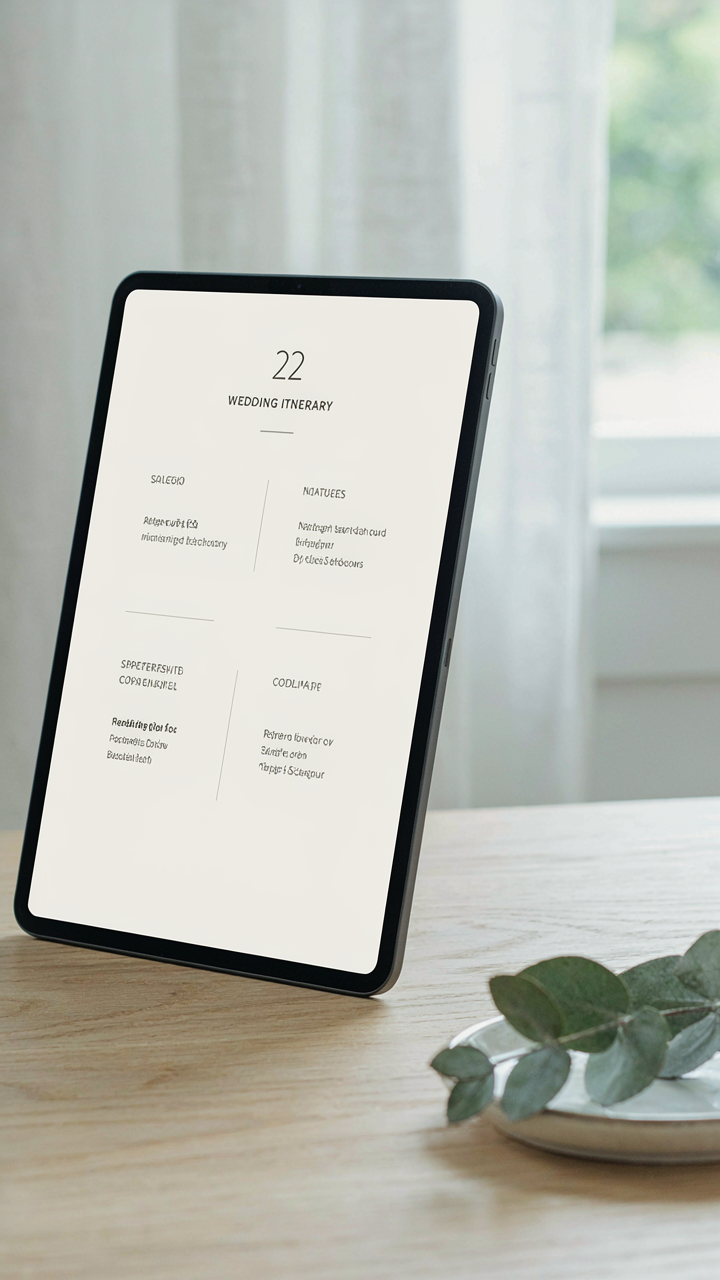
You want this to look effortless because you’re afraid if it doesn’t, guests will judge your planning. The real mechanism is cognitive load. Every detail you add forces your guests to parse, remember, and cross reference information they didn’t ask to hold in their head. Your job isn’t to be comprehensive. It’s to be the filter that removes what doesn’t change their behavior.

Guests need four things only: what time something happens, where it happens, what they should do when they arrive, and what to wear. Everything else is noise. Start there. A ceremony at 4 PM at the venue address. A reception at 6 PM at the same place. Cocktail hour between them. What they wear. Done. If you’re doing a rehearsal dinner the night before, add that. If there’s a morning getting-ready session with photos, add that. Nothing hypothetical. Nothing that might happen. Only what will happen.
Cut The Anxiety Generators
Most wedding itineraries fail because they treat the document like a portfolio piece instead of a tool. They load it with history, sentiment, acknowledgments, and clarifications that sound thoughtful but actually create doubt. Your guests don’t need to know why the ceremony is starting late or why you chose that specific venue. They need to know when to show up and in what condition.
Remove conditional language entirely. Don’t write “We recommend arriving by 3:45 PM if possible.” Write “Arrive by 3:45 PM.” Don’t explain “The reception will move outdoors weather permitting.” Either it will or it won’t. Make the call and state it flat. Your guests aren’t looking for a conversation. They want instructions that stick. The fewer words between the time and the action, the faster they absorb it and move on.
The Guest GPS Protocol: Navigating Your Wedding Day Timeline
Mapping Arrival Through Reception Flow
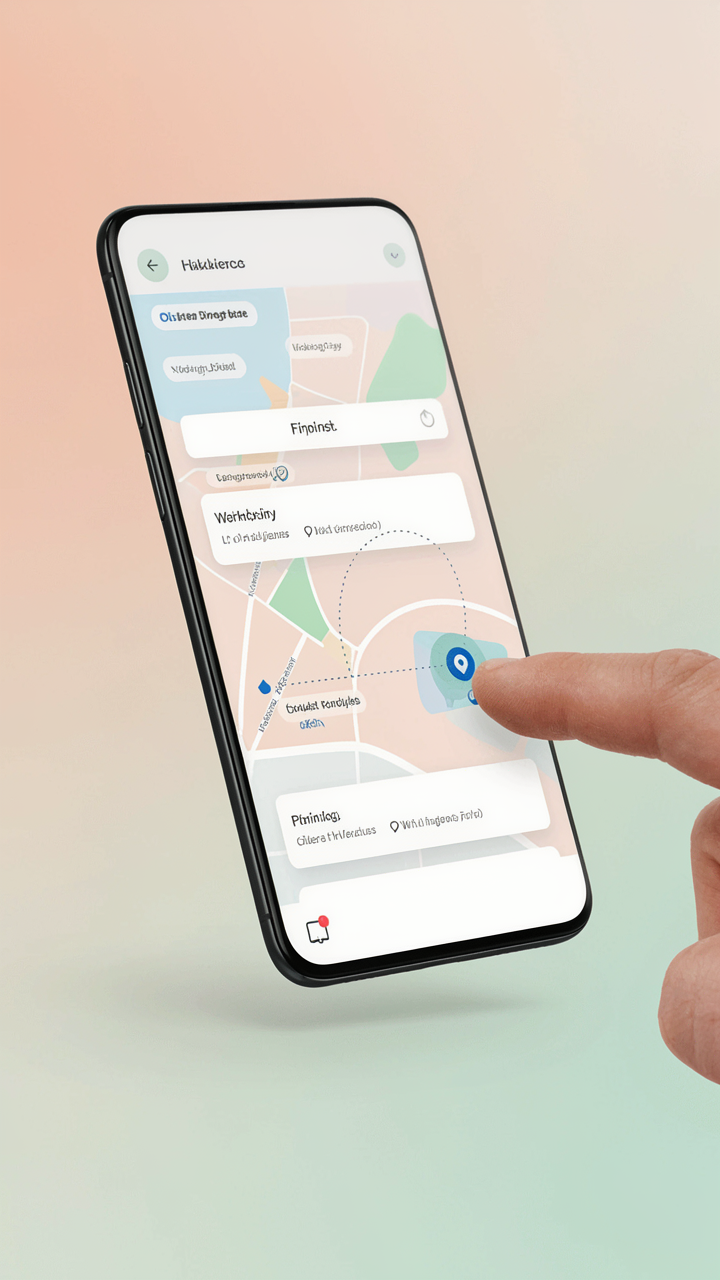
You want guests to feel like insiders, not confused stragglers hunting for the ceremony. The real mechanism here is cognitive load: every decision point a guest must make without information creates anxiety and resentment. Think of your itinerary like logistics in supply chain management, where “flow” means moving units through checkpoints without bottlenecking. Your digital itinerary removes decision friction by answering the three questions guests actually ask: where do I go first, what time do I arrive, and what happens next.

Start with arrival logistics. State the exact parking location, lot name or address, and walking time to the venue entrance. Include gate times if applicable. Then lock down ceremony start time with a 15-minute buffer notation like “doors open 3:45 pm, ceremony begins 4:00 pm.” Follow immediately with reception location and flow: where guests move after the ceremony ends, whether they’re ushered or self-directed, and the time the reception officially opens. No ambiguity. No assumption that everyone knows the building layout.
Transition Instructions Between Venues
The common advice here is weak: most wedding itineraries just list the next location and time. That’s not enough. Real transition information removes the guesswork that turns guests into obstacles. If your ceremony and reception are at different venues, your itinerary must state the travel time, parking instructions for the second location, and whether transportation is provided. If they’re in the same building but different spaces, give a specific route: “Exit the chapel through the main doors, turn left down the hallway, enter the ballroom through the archway marked with white flowers.”
Build in time buffers that reflect reality, not theory. A 15-minute travel window between venues needs to account for bathrooms, photo lines, and people who move slowly. Your digital itinerary should note “photography on the lawn from 4:30-5:15 pm, cocktail hour 5:15-6:00 pm” so guests know exactly when movement happens. Include a contact number for the day-of coordinator on the itinerary itself, labeled with a specific use case: “Questions about parking or directions, text or call [number].” This is your pressure release valve.
Crafting Your Wedding Itinerary Template: The Signal To Noise Ratio
Lead With What Matters Most
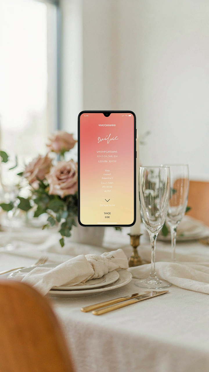
You’re worried guests will miss something critical and blame you for poor planning. Here’s the mechanism: human attention operates on scarcity. The more items you list, the less weight each one carries. Your brain treats everything equally when everything competes for space. Bury the ceremony time in a wall of text, and guests genuinely won’t see it, even if they read every word. Lead with the non-negotiables: ceremony time, reception location, dinner service start. Everything else comes after. This isn’t about hierarchy of information. This is about load capacity.

Most wedding itinerary advice says list everything chronologically. That’s wrong. Chronology serves the couple’s perspective, not the guest’s survival needs. A guest doesn’t care about timeline flow. They care about “when do I need to be where and what do I need to do.” Put those answers in the first three items. Alphabetical organization, thematic grouping, time blocks—these all obscure what actually matters. Guests skim itineraries in thirty seconds before they delete them. Spend your template design budget on that thirty-second window, not on decorative subsections nobody reads.
Design For The Thumb, Not The Eye
Digital wedding itineraries live on phones. Mobile screens demand ruthless constraint. Most couples pad their templates with design elements that look sophisticated on desktop but crush readability on a five-inch screen. One column. Generous line spacing. Type size that doesn’t require zoom. Sans-serif fonts like Arial, Helvetica, or system defaults process faster than serifs on screens. Your template shouldn’t feel minimal because you’re being artsy. It should feel minimal because your guests are scrolling one-handed while walking into a parking lot.
Test every template on your phone before you release it. Scroll through it. Try to find the ceremony time without using search. If it takes more than three seconds, redesign. Color contrast matters too. Black text on white background works. Dark gray on light gray fails. Avoid background images entirely. They tank readability and inflate file size on poor connections. Your template’s only job is to transmit information accurately from your phone to theirs. Decoration sabotages that transmission.
Beyond The PDF: Dynamic Wedding Invitation Ideas Digital

Interactive Elements That Actually Work
You want guests to feel special. That’s the real reason you’re reading this. The mechanism is simple: a static PDF makes your wedding feel like every other digital artifact in their inbox. Embedded interactive elements treat the itinerary as a tool guests use, not content they consume once and delete.
- Embedded Maps with Venue Locations: Link directly to Google Maps or Apple Maps so guests see directions, parking options, and travel time from their current location without leaving the itinerary.
- RSVP Links Inside The Itinerary: Place response buttons next to each event segment so guests confirm attendance for rehearsal, ceremony, reception, or brunch without navigating elsewhere.
- Clickable Contact Details: Make phone numbers dial and email addresses open default mail clients. This removes friction when guests need to reach vendors or coordination contacts.
- Image Galleries Per Event: Embed photos of the ceremony venue, reception space, or hotel accommodations so guests visualize each location before arriving.
- Dietary Preference or Transportation Buttons: Let guests select meal options or indicate ride-share needs directly in the itinerary, automating data collection into your planning system.

Every interactive element you add must reduce friction or provide information guests actually need at that moment. A clickable link that goes nowhere or a map that duplicates information they already have wastes their time and trains them to ignore your future communications. Test every link before you send the itinerary live.
Real Time Updates Without Chaos
Everyone tells you to send a static itinerary and call it done. That advice ignores the obvious: weddings change. Weather delays ceremony start times. Vendors shift locations. Hotels overbook and move guests to different rooms. The real mechanism here borrows from systems engineering: your itinerary needs feedback loops, not broadcast channels.
The difference between emergency alerts and panic is specificity. A message saying “ceremony delayed” creates confusion. A message saying “ceremony now starts at 4:15 PM instead of 3:30 PM, venue unchanged, photos moved to 5:00 PM” gives guests one clear action. Push notifications work if your platform supports them, but email updates to a tagged list work just as well. The key is versioning: guests need to know they’re reading version 2.3, not version 1.0. Date stamp every update and describe what changed since the last version.
The “Leverage Principle” In Wedding Itinerary Design
Force Multiplier Through Constraint
You want your guests to feel like you put thought into this, but you don’t want to spend six weeks building a custom site. That’s the real tension here. The physics principle of leverage applies directly: a broadfork moves earth by concentrating force through a narrow fulcrum, not by spreading effort everywhere. A digital itinerary works the same way. One structured format, delivered through one platform, moves guest behavior more than scattered information across email, text, and Instagram.

Most couples waste time personalizing every element of their itinerary when the actual leverage lives in removing friction points. The mechanism is constraint, not customization. You choose one tool, one visual hierarchy, one information architecture. Then you stop. Guests don’t remember your font choices. They remember whether they knew where to be and when.
Less Information Wins More Compliance
The common advice is to include everything: parking details, dietary notes, timeline contingencies, vendor contact info, weather backup plans. That’s wrong. Overloaded itineraries confuse guests into paralysis. They scroll past three sections and retain nothing. Strategic simplification means you identify the three pieces of information that actually change guest behavior, then cut everything else.
Here’s the protocol: list only arrival time, exact location with one-click navigation, and what’s happening next. Everything else goes into a collapsible FAQ or a separate “Reference” tab guests can ignore. This structure forces you to think like your guest instead of like the planner obsessing over details. Guests act on clarity, not comprehensiveness.
Distributing Your Digital Itinerary Template Free: The Delivery Dilemma
Where Your Guests Actually Look
You want this itinerary seen, which means you’re terrified it gets lost in the noise. The real mechanism here is channel friction: every platform has a different inbox gravity. Email sits in a folder guests check sporadically. Text demands immediate attention but feels invasive for wedding logistics. A dedicated website requires an extra click most guests won’t take unless you force the habit early. Pick one channel and own it completely instead of splitting your message across three places where it dies in transition.

Email remains the standard because it’s searchable, forwarding-friendly, and guests expect event details there. Text works for last-minute changes or reminders, not primary distribution. A dedicated wedding website only works if you’ve already built anticipation and given guests a reason to visit before the event. Most couples waste effort on all three and watch the itinerary get buried equally across each platform.
Timing Pushes The Mechanism
Communication timing in marketing follows the principle of temporal relevance: information has a decay curve. Send the itinerary too early and guests forget or lose the link. Send it too late and they’ve already made conflicting plans. The sweet spot sits between four to six weeks before the wedding for the main distribution, then one follow-up reminder two weeks out, and a final logistics check seven days before.
The first send should include the itinerary link plus a clear instruction on how to access it and what to do if they have questions. The second reminder targets guests who didn’t engage with the first message and surfaces any schedule changes. The final message hits three days before, addressing only what changed or what requires immediate action. This structure respects that guests operate on their own timeline and need repetition to actually absorb logistics, not because they’re forgetful but because attention is genuinely scarce.
Post Wedding Itinerary: The Unseen Benefits Of Clarity

No More Logistical Friction
You want people to remember your wedding, not the chaos of finding it. The real mechanism here is cognitive load—the mental energy your guests burn trying to decode logistics instead of experiencing the day. A digital itinerary post-wedding captures what actually happened and distributes it before the moment evaporates. No more frantic texts asking “where do we go next” or “what time was that thing.” You eliminate the gap between intention and execution.

When guests have a clear reference point, they stop hunting for answers. A shared digital timeline becomes the source of truth. They confirm details once, then focus forward. The friction disappears because you’ve answered the question before they ask it. This simple move separates intentional events from chaotic ones. Post-wedding itineraries work the same way—they become the definitive record, so nobody wastes mental cycles reconstructing what happened.
Memory Lives In The Details
Guests don’t retain moments they had to work for. They retain moments where friction was zero and presence was maximum. A digital itinerary post-wedding functions like an archive that lets people revisit the experience without reconstructing it from scattered photos and vague recollections. The itinerary becomes permission to stop managing and start remembering.
When you embed photos, timelines, and logistical details into a single reference, you create a coherent narrative. People don’t have to piece together the story themselves. They experience it again through structure. This is why printed programs work at funerals—they give grief a shape to hold onto. A digital itinerary does the same for celebration. Host it on a free platform like Google Sites or Notion, embed your media, and lock it. Guests bookmark it. They return to it months later, and the day feels intact instead of fragmented.
Your Greatest Enemy Isn’t A Missing Detail; It’s The Illusion Of Total Control

You don’t need a perfect digital itinerary. You need one that works. Stop engineering a system for guests who won’t read it twice. Pick a free tool today, dump your schedule into it, and send it out. The friction you feel right now comes from overthinking, not from missing features. Guests don’t care about the container. They care about showing up on time, and that’s it. Build it messy or don’t build it at all, but either way, move.