The Myth Of Budget And The Reality Of Time Scarcity

What You’re Actually Trading
You think this is cheap because the material cost sits under fifty dollars. That’s the trap. In economics, we call this opportunity cost: what you sacrifice by choosing one action over another. DIY printable seating cards don’t cost money. They cost hours you’ll never get back, hours you could spend on your partner, your family, or literally anything else that matters before the wedding.
Most people frame DIY as a financial win without measuring the actual expense. You’ll spend three to five hours designing templates, testing printers, cutting card stock, arranging layouts, and troubleshooting jams. At any reasonable hourly rate, that’s one hundred to two hundred fifty dollars in pure time. Add in the printer ink that costs more per milliliter than champagne, and your “budget” project now costs as much as ordering them professionally, minus the quality and plus the stress.
The Mechanism Behind What Actually Matters
The real cost lives in decision fatigue and project scope creep. You start thinking you’ll print fifty simple cards in an evening. By day three, you’re redesigning fonts, reprinting because the cardstock warped, and hand-cutting corners because the automated cutter didn’t work. Time compounds fast when you’re learning the constraint as you go.
Print your seating cards if you genuinely enjoy design work and have tested your printer with the exact materials you plan to use. Otherwise, accept that outsourcing this task frees your attention for decisions that actually move the needle on your wedding day. The mechanism is simple: protect your energy for what only you can do, and pay someone else to handle the technical execution of something anyone can do.
The “Print At Home” Fallacy: Hidden Variables
Ink, Paper, And The Calibration Problem
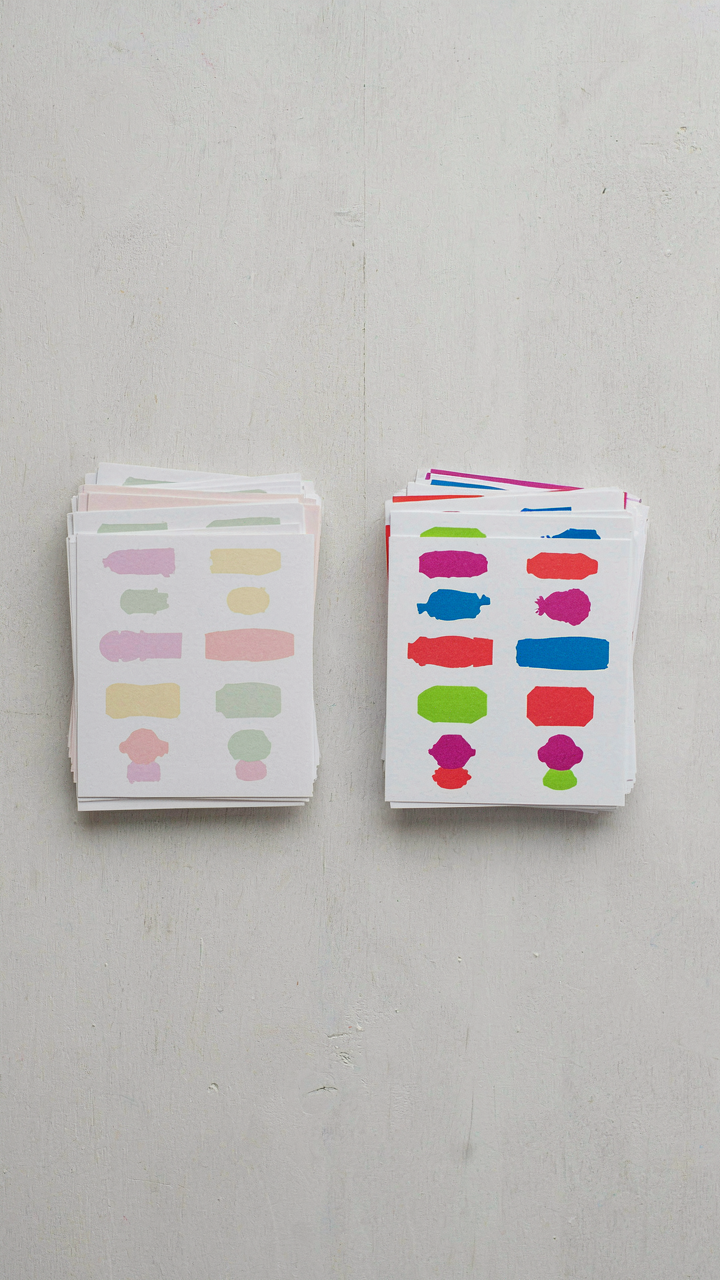
You think printing at home saves money. The real cost is consistency you can’t control without understanding what actually happens between your design file and the physical card in your hand. Printing is a supply chain problem: ink viscosity, paper absorbency, and printer nozzle alignment all interact. Change one variable and your colors shift, your text gets fuzzy, or your cardstock jams. Most people print their first batch, see acceptable results, then print a second batch three weeks later using a different paper stock and different ambient humidity. The cards look like they came from two different weddings.
The mechanism is simple: inkjet printers calibrate to specific paper types. Standard copy paper and cardstock have different surface finishes and thickness tolerances. When you switch materials, the printer’s spray pattern and drying time no longer match. You get either pooling ink that bleeds into the paper fibers or ink that sits on top and smudges. The solution requires you to run a test print on every new paper batch before committing to your full order. Print five cards, let them dry for thirty minutes, then check for feathering along the edges and color accuracy under natural light.
Design Software Mastery Takes Time You Haven’t Budgeted
Everyone recommends Canva or Adobe Express because they’re free or cheap. That advice skips over the actual friction: template-based design tools force your thinking into their grid, and when you need to deviate even slightly from a preset layout, you hit a wall. You waste two hours figuring out how to adjust kerning or remove a built-in element that won’t delete. This is different from traditional design software like Adobe InDesign or Illustrator, which have a steeper initial climb but move faster once you know the interface. The learning curve matters because seating cards need precision: exact measurements, bleed zones for cutting, and text placement that accounts for card stock thickness if you’re folding them.
Template dependency creates a hidden cost: your cards look like everyone else’s cards. If multiple guests’ families use Canva, your wedding’s table cards end up in the same visual family as their kids’ school project. You avoid this by either investing time in learning actual design software or commissioning a designer for two hours to build a template you can then batch-produce yourself. The protocol is this: either commit to twenty hours of learning a real tool, or budget two hundred dollars for someone else to build the template once. Anything between those options is false economy.
The Place Card Template Free Printable Paradox: Freedom Or Constraint?

When Templates Become Invisible Walls
You want a template because you’re terrified of starting blank. That’s the real tension here. Templates solve the paralysis problem, but they also lock you into decisions someone else made about your wedding. This is a constraint-versus-leverage problem borrowed directly from engineering: every system has input parameters that determine output range. Your template’s dimensions, font choices, and layout grid become the parameters. You can only move within them.

Most templates ship with dead-end decisions built in. Margin sizes, card stock thickness assumptions, fold lines positioned for mass-market cardstock—these aren’t neutral. They’re choices that worked for the template designer’s printer and aesthetic, not necessarily yours. The paradox is real: the template that saves you from design paralysis also prevents you from solving your actual problem, which is making cards that match your wedding’s visual system. Free templates especially tend toward the generic middle because they need to offend no one and serve everyone, which means they serve no one well.
Aesthetic Coherence Requires Constraint, Not Escape
The common advice here is wrong: “use a template for consistency.” Consistency isn’t the goal. Coherence is. Consistency is mechanical repetition. Coherence is when every element reinforces the same visual logic. Your seating cards don’t need to match a template—they need to match your invitation, your color palette, your typeface system, and your venue’s actual lighting conditions.
Start by auditing what you already control: your invitation’s typography, weight, and spacing. Your color palette’s actual RGB values on your monitor. Your venue’s material surfaces—metal, wood, linen, marble. Then reverse-engineer the template. Extract only the structural skeleton: card dimensions that fit your printer’s bleed settings, fold lines positioned for your specific cardstock weight. Delete everything visual. Rebuild it using your established palette and type hierarchy. The template becomes scaffolding you disassemble and rebuild, not a finished product you accept.
The “Event Horizon” Protocol: Streamlining Your DIY Printable Seating Cards Workflow

Constraint As Your Competitive Advantage
You’re worried about looking cheap. That’s the real fear underneath this. But here’s what military strategists call resource allocation: you have a fixed budget, a fixed number of guests, and a fixed timeline. Treat your seating card project like a commander treats troop deployment. You don’t send everyone everywhere. You send the right resources to the right positions. Your constraint isn’t a limitation. It’s your operating system. Work inside it or waste money pretending you don’t have one.

The mechanism is this: define your hard numbers first. Guest count. Tables. Cards per table. Printing capacity per day. Once these are locked, every decision that follows becomes automatic. You stop deciding and start executing. Most people reverse this, which is why their DIY projects balloon into chaos. They print without knowing how many they actually need. They design without measuring their printer’s output limits. They order paper without calculating waste. Fix the variables before you touch the design file.
The Supply Chain From Spreadsheet To Table
Most advice says “organize your guest list.” That’s incomplete. You need a three-stage pipeline: data input, production scheduling, and physical assembly. Stage one is your master spreadsheet. One column for guest name. One for table assignment. One for card status (not printed, printed, cut, folded, placed). This isn’t busy work. It’s your control system.
Stage two is production scheduling. Calculate your printer’s output. Standard inkjet prints about 20 to 30 full-color seating cards per hour when you account for paper feeding and drying time. If you have 120 guests, that’s four to six hours of printing across multiple days. Space this out. Batch print on separate evenings. Stage three is assembly. Set a table. Lay out cards. Cut them. Fold them if needed. Box them by table number. The spreadsheet tells you exactly which cards go where and when. This linear flow eliminates the scrambling that happens the night before.
Table Name Cards Vs. Individual Place Cards: A Hierarchy Of Needs
What Your Guests Actually Need To See
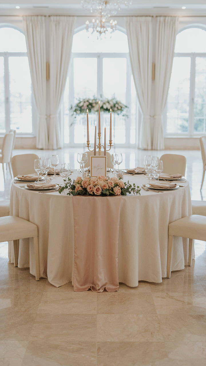
You’re worried people will feel lost at your reception. That’s the real fear hiding under this choice. The mechanism is simple: your guests need a visual anchor the moment they enter the room. Table name cards sit at the center of each table. Individual place cards sit at each seat. One scales information load. The other eliminates it entirely.
Table name cards work when your guest count stays under 75 and your seating arrangement follows a logical flow. Individual place cards work always, but they demand more printing, more setup, and more precision. The economics here are brutal. Each additional card costs paper, ink, and 90 seconds of assembly time. At 120 guests with 10 tables, table cards mean 10 pieces to print and position. The same wedding with individual place cards means 120 pieces. That’s not a preference. That’s a labor calculation masquerading as a style choice.
Where Congestion Actually Happens
Event logistics borrowed a term from traffic engineering: bottleneck. A bottleneck in your seating strategy is the moment between a guest entering the room and sitting down. Table name cards create a single bottleneck at the table itself. Guests read the table number, find their seat by scanning. Individual place cards eliminate the second search entirely.
The real confusion happens not when guests find their table but when multiple people reach their table simultaneously and must hunt for their assigned seat among eight settings. Individual place cards solve this in under three seconds per person. Table cards stretch that to ten to fifteen seconds, often with hesitation and social friction. If your wedding timeline has a cocktail hour before dinner seating, table cards work fine. If guests move directly from ceremony to assigned seats, individual cards prevent the crowding and awkward standing that kills the energy of your reception entrance.
Beyond Basic: Leveraging Free Printable Name Place Cards For Impact
Typography Choices Convey Tone
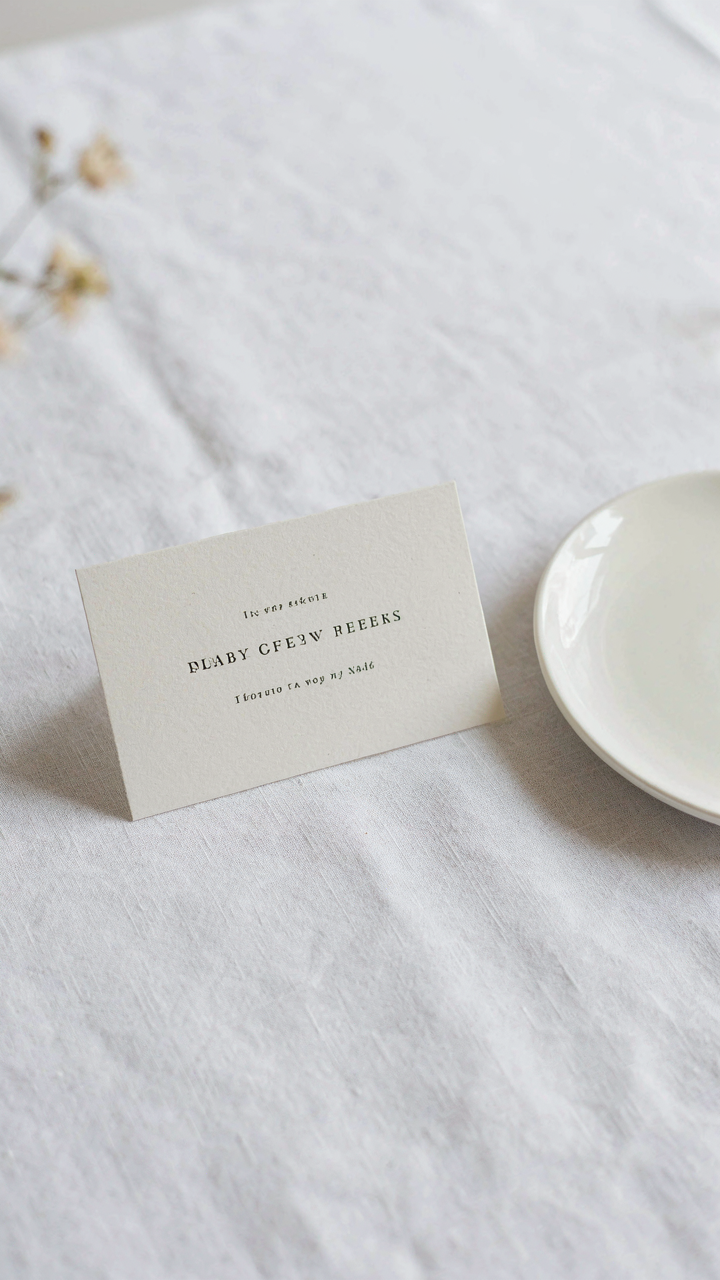
You want your guests to feel the wedding’s personality before they sit down—that’s the real reason you care about font selection. Typography works like a linguistic signal: it communicates before content does. Sans-serif fonts (Helvetica, Arial, Verdana) read modern and minimal. Serif fonts (Georgia, Garamond, Times New Roman) read formal or classical. Script fonts read romantic or playful. Your choice isn’t decoration—it’s the opening statement of your event’s atmosphere.

Most DIY printable card advice says pick something “elegant” and calls it done. That’s lazy. The mechanism is contrast and consistency. If your invitation used a serif font, repeat it on your seating cards. If your venue is industrial concrete, a delicate script font contradicts that space and looks off-key. If your color palette is muted earth tones, an aggressive sans-serif in hot pink creates visual friction that works only if intentional. Match the typeface to the room energy, not to generic wedding defaults.
Subtle Branding Maintains Visual Cohesion
Your wedding has one theme—use it everywhere or nowhere. Partial theming looks accidental. This doesn’t mean printing logos on every card; it means repeating one visual element from your invitation suite onto your place cards. A decorative border, a specific color combination, a repeated motif—one thing that makes guests recognize this card belongs to your event.
Free templates often include generic flourishes that clash with whatever brand you’ve built. Download a template, yes, but strip out elements that don’t appear elsewhere in your printed materials. If your invitations feature watercolor washes, add a similar wash to your cards. If your invitations use hand-drawn lettering, match that style on the place cards. The constraint is the strength: every repetition deepens recognition and makes the wedding feel intentional rather than assembled from stock parts.
The True Value Of A Marque Place: More Than Just A Name
The Signal You Send Before They Sit
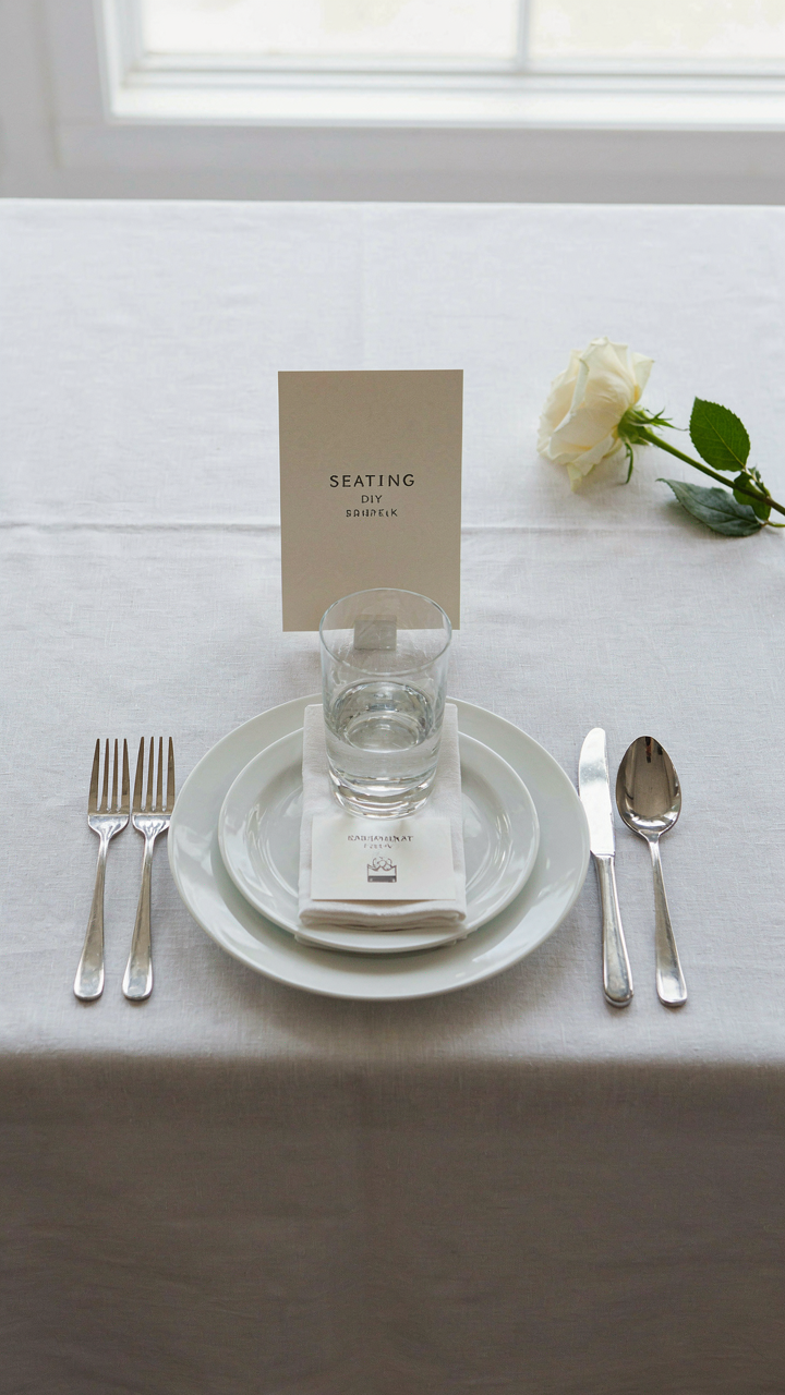
You want people to think your wedding was expensive. That’s the real reason you care about seating cards at all. Here’s the mechanism: a printed card at each place setting functions as a status signal in environmental design. It tells guests three things instantly—that you planned this, that they matter enough to assign, and that you have standards. The card isn’t decoration. It’s proof of intentionality.

Most people think seating cards are optional flourishes. They’re wrong. A bare table looks like you ran out of time or money. A printed card, even a basic one you made yourself, signals control. Guests notice the difference between a venue that throws bodies into chairs and a host who decided where each person belongs. This distinction costs nothing extra if you print at home, but the psychological impact scales with guest count.
Making Someone Feel Assigned, Not Shuffled
The common advice says personal touches make guests feel special. That’s incomplete. What actually works is removing the friction of uncertainty. When a guest walks into a reception, they don’t want to hunt for their table or stand awkwardly deciding where to sit. A printed card with their name solves this problem before it exists.
The real leverage comes from the name itself. Print their actual name on the card, not a table number. Research in behavioral psychology shows that people process their own names faster than any other text. When a guest scans the table, their name pulls attention like a magnet. This is why hand-written cards beat generic printed ones—they feel addressed to that specific person. DIY printing lets you customize each card for under a cent per unit. That’s the trade: ten minutes of setup work against sixty seconds of guest comfort per person.
Card Templates Free: The Shortcut To Mediocrity?
When Templates Replace Decisions
You want free templates because you’re afraid of making the wrong choice and wasting money. Here’s the mechanism: free templates are pre-solved design problems. Someone else already made every decision for you—font, spacing, color, layout. This feels like efficiency. It’s actually outsourcing your judgment to a stranger who knows nothing about your wedding, your guests, or what will actually land on your tables.

The real cost isn’t the template price. It’s the cost of blending in. Every template site hosts the same 200 designs. Canva templates get used at thousands of weddings. Your guests have seen them before. Generic doesn’t save money—it trades visibility for convenience, and you lose the exchange.
The Differentiation That Costs Nothing
Customization isn’t about adding more. It’s about removing what doesn’t matter and amplifying one thing that does. Think of it like signal to noise in communications theory: your seating card is the signal, everything else is noise. A template gives you maximum noise. You need maximum signal.
Start by stripping the template down. Delete the decorative elements you didn’t choose. Replace the default font with one that matches your invitations or your venue aesthetic. Change the color palette to three colors that actually work together, not the template’s five. Add one specific detail—your names, a date, a inside joke—that only your people would recognize. This takes thirty minutes per card design and costs zero dollars. It transforms a generic object into a signal that you made a choice, and you made it with intention.
The Minimalist Manifesto For DIY Printable Seating Cards

What Actually Matters On The Card
You care about this because you’re worried your cards will look cheap and reflect poorly on you. Stop. The mechanism is simple: a seating card’s job is to tell one person where to sit. Nothing else. Everything beyond that is friction you’re paying for with time and money.

Function demands three elements and three only. The guest’s name must be legible from arm’s length. The table number or location must be unmistakable. The card stock must not bend or tear during handling. Every other detail—calligraphy, watermarks, metallic accents, custom illustrations—is theater masquerading as necessity.
- Guest Name: Printed at 18-24pt minimum in a readable sans-serif or serif typeface. Positioning should be centered or left-aligned with consistent spacing across all cards.
- Table Number or Location: Displayed as prominently as the name. Use the same font family but can adjust size relative to name based on design intent.
- Card Stock Weight: 80-110lb cardstock prevents warping and handles. Lighter paper curls under humidity; heavier stock becomes rigid and expensive to print.
- Fold or Stand Mechanism: Tent-fold (folded in half) is most stable. Flat cards require place card holders, adding cost and complexity.
- Margins and Spacing: Minimum 0.5 inch margins prevent text cutoff during printing. Consistent spacing between name and table number creates visual order.
Your template should have one fold line, two text fields, and a blank background. That’s it. Print on your home printer, fold once, place on table. The card does its job. Your guests sit down. Your wedding progresses.
Remove The Noise, Keep The Signal
Everyone says minimalist design means white space and breathing room. That’s not wrong, but it misses the point. Minimalism in this context is about eliminating every design choice that competes with the seating instruction. When a guest reaches for a card, they should decode it in under two seconds without mental effort.
A common mistake: adding a decorative border, monogram, or color gradient. These force the eye to process visual information before finding the table number. That’s delay. That’s confusion at table assignment time, which ripples through your reception. A stark, clean card with black text on white or cream stock moves faster through your guest’s brain. No decoration should appear unless it reinforces legibility. A thin rule above the table number actually helps—it creates a visual hierarchy that speeds comprehension. Everything else is waste.
Outsourcing The Obvious: When To Pay For Perfection

When Professional Printing Solves The Real Problem
You’re worried people will notice your cards look cheap. That’s the real question here, and the answer depends on whether printing at home actually solves it or just delays the problem. Professional printers use offset or digital machinery that maintains consistent ink saturation, card stock weight, and edge quality across 100+ cards. Your inkjet printer doesn’t. It dries differently. The edges curl on humidity shifts. Color variance compounds card to card.
The mechanism is simple economics: you’re trading time and reprints against a per-unit cost that scales. A local printer charges 50 cents to a dollar per card for stock cardstock with consistent finish. You spend three hours troubleshooting your printer, replacing nozzles, and eating reprints because card stock fed crooked. One of those is work. The other is solved. Professional printing makes sense when your timeline is tight or when 50+ guests means visible defects matter more than the marginal savings.
Design Help Without The Learning Curve
Most people think hiring a designer means overpaying for someone to make things “prettier.” That’s wrong. A designer fixes the structural problems your cards have before you print them. Typography rules are not matters of taste. Font pairing, hierarchy, and spacing follow information architecture principles borrowed from UI design. Your seating card needs one primary element (the guest name), one secondary element (table number or seat position), and potentially a tertiary element (meal choice code). Poor hierarchy makes people read them twice. Good hierarchy makes them readable in three seconds while standing.
Design services range from templates with custom text to full custom work. Canva Pro runs 13 dollars monthly and includes thousands of tested card templates. A freelancer on Fiverr charges 50 to 200 dollars for custom design. Hire a designer when you have more than 75 guests, when your wedding theme requires consistency across multiple printed materials, or when you want cards that look intentional rather than generic. The output isn’t aesthetic padding. It’s the difference between readable and readable at a glance under noise and dim lighting.
The Only Thing Holding You Back From Effortless Elegance Is Your Own Overthinking

You don’t need a stationery designer or a $200 vendor contract. You need to stop waiting for permission and open Canva right now. Pick a template, swap the names, print one test card, and see how it actually looks. Your guests won’t remember the cards. They’ll remember the meal, the music, the way you weren’t stressed enough to ruin the night. Elegance isn’t about perfection. It’s about showing up.