The Unseen Cost Of “Unlimited” Options

When Too Many Templates Paralyze You
You think more options mean more control. They don’t. Decision fatigue is the real cost, borrowed from economics and psychology: the paradox of choice states that beyond a certain threshold, additional options decrease satisfaction and increase decision paralysis. Free template sites offer 50, 100, sometimes 500 wedding program layouts. You scroll, compare, second-guess, and end up spending three hours choosing between templates that are functionally identical. The mechanism is simple: generic templates remove constraints, and constraints are what force decisions.
A blank canvas feels like freedom until you realize it demands judgment calls on every element. Most couples don’t know what they want until they eliminate what they don’t. Free templates that promise customization actually promise nothing because they don’t commit to any aesthetic choice. You inherit someone else’s indecision baked into the design. The path forward isn’t finding the “perfect” template. It’s selecting one that commits to a specific visual direction, then editing only what matters to your ceremony.
Programs That Say Everything Say Nothing
Bloated wedding programs are invisible the moment guests sit down. The common advice says to include ceremony details, song lyrics, readings, and biographical notes on the wedding party. This is wrong. Most free templates encourage maximum content because the designer assumes more information equals more value. It doesn’t. Your guests don’t need the full history of how you met or the complete musical arrangement credits. They need to know when to sit, stand, and applaud.
Programs that try to tell your entire story distract from the actual ceremony happening in front of them. Guests skim program text for two seconds if they look at it at all. The tighter your content, the higher the retention. One sentence about each reading. Names of the wedding party. Ceremony timeline. That’s the architecture. Free templates bloat because they charge nothing, so they compensate by offering infinite space for content. You save money on the template but waste time culling text that should never have been there.
Why Free Wedding Programs Demand Better Design

Information Hierarchy Stops The Confusion
You’re worried people will think your wedding looks cheap because you used a free template. That fear is backwards. The real cost of a bad program isn’t perceived value—it’s guest confusion. A free template that fails to organize information creates friction at the moment you want none.
Most free wedding program templates dump every detail into equal visual weight. Ceremony times, names, readings, logistics, dedications—all the same size, all competing for attention. This is a failure of information architecture, not budget. Your guests need to know three things immediately: what happens next, when it happens, and what they do. Everything else is secondary.
Restraint Reads As Intentional
The common advice says free templates look bad because they’re “too plain.” That misses it entirely. A program that uses white space, readable fonts, and one visual accent doesn’t look plain—it looks controlled. Restraint is a choice. Overdesigned templates that cram decorative elements around every margin signal the opposite of sophistication.
Free templates succeed when they respect the page as a container, not a billboard. One font family, black text on white or off-white stock, one color accent if needed. Your guests process this instantly. They know where to look, they know what matters, and they move through the sequence without friction. That’s not minimalism as a style choice—that’s minimalism as a usability protocol.
The Minimum Viable Program Protocol
What Your Guests Actually Need To Know
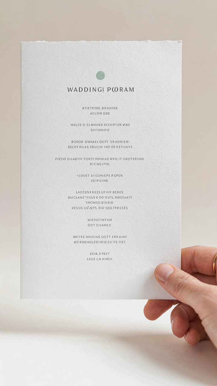
You want your program to feel substantial without looking like you sweated over it for weeks. That’s the real fear here—that a simple program signals you didn’t care. The mechanism is different: guests retain three pieces of information max. A wedding program is a navigation tool, not a memoir. Your job is identifying which three things matter and cutting everything else.

The ceremony order, the names of people involved, and any logistics that prevent confusion—those are your load-bearing walls. Everything else is decoration masquerading as content. Most templates bloat programs with poems, family histories, and thank you speeches that guests skim for thirty seconds then forget. Strip it to signal clarity, not laziness. Ruthlessness looks intentional.
Edit Until Only Necessity Remains
Common advice says to include a personal message or write detailed bios. That’s incomplete guidance. Your program’s job ends the moment the ceremony starts. After that, a crumpled program becomes a fan or scrap paper. Guests don’t return to it for reflection. They use it during the event, then discard it.
List what actually prevents confusion: ceremony timeline, names of the officiant and attendants, a note about phones if necessary, and that’s the frame. A free template gives you layout structure; your edit removes everything that doesn’t earn its space. When you finish, someone unfamiliar with the wedding should move through the ceremony without guessing what happens next. That’s the protocol: template, strip, verify.
Ditch The Generic: Personalizing Your Wedding Ceremony Programs Template Free

Your Story Beats The Template
You want people to think your wedding feels intentional, not like you downloaded it at 11 PM the night before. That’s the real motive here. The mechanism is simple: a generic template tells guests nothing about who you are. Your actual story does. The difference between a forgettable program and one people keep is specificity. Not sentiment. Specificity.
Pull three concrete details from your relationship that nobody else has. How you met. A shared inside joke. What you both do on Sunday mornings. These details go into the program’s opening or scattered through the order of ceremony. They work because they create cognitive friction. Your guests have to pay attention instead of skimming. Most couples skip this step because it feels risky. It’s actually the only safe move.
The Voice That Sounds Like You
The common advice here is wrong: your program should not sound like a greeting card. Strip out the reverent tone. Remove the gratitude speech disguised as formatting. Your voice in the program should match your voice in conversation. If you’re direct, be direct. If you’re playful, be playful. The template is just the container. The words inside determine whether guests experience you or a simulation of a wedding.
Test this by reading your program draft out loud. If you wouldn’t say it to a friend, delete it. Rewrite it in language you actually use. This includes your vows preface, any readings you’ve written, and how you introduce the people in your wedding party. Keep sentences short. Avoid words you’d need to look up. When guests read your program, they’re reading you, not a performance of matrimony.
The “Less Is More” Economics Of Wedding Program Ideas

What Your Guests Actually Remember
You’re worried a simple program looks cheap. That’s the real fear under this decision, and it’s backwards. Economics calls this opportunity cost: every design element you add competes for attention and retention. Your guests won’t remember the program’s layout. They’ll remember whether they knew when to sit, stand, and clap. A free wedding program template that does this cleanly wins over a cluttered custom design that confuses them.
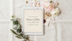
The mechanism is simple: cognitive load determines experience. Guests arrive stressed about logistics. A program that answers three questions fast (who, when, what) lets their brain relax. Ornamental fonts, unnecessary graphics, and extra sections steal that cognitive space. Strip it down. Test this yourself by comparing how long you look at a dense program versus a clean one. Your eyes stop searching faster on the simple version.
Perceived Value Through Strategic Omission
Scarcity doesn’t just apply to limited inventory. In design, scarcity is the principle that exclusion increases perception of value. A free wedding program template that includes only essential information signals confidence and control. Programs stuffed with every possible detail signal panic and indecision. Your guests notice this subconsciously. They equate restraint with intentionality.
What you leave out is the actual design decision. Most couples add every piece of information available because templates allow it and they fear missing something. This is lazy thinking. A one-page program that names the couple, lists the ceremony timeline, and credits the key vendors outperforms a three-page booklet cluttered with readings, sponsor lists, and decorative borders. The constraint forces clarity. Use that constraint to anchor your program around one central purpose: guide the guest through the event without distraction.
Hacking Your Welcome Ceremony Program Template
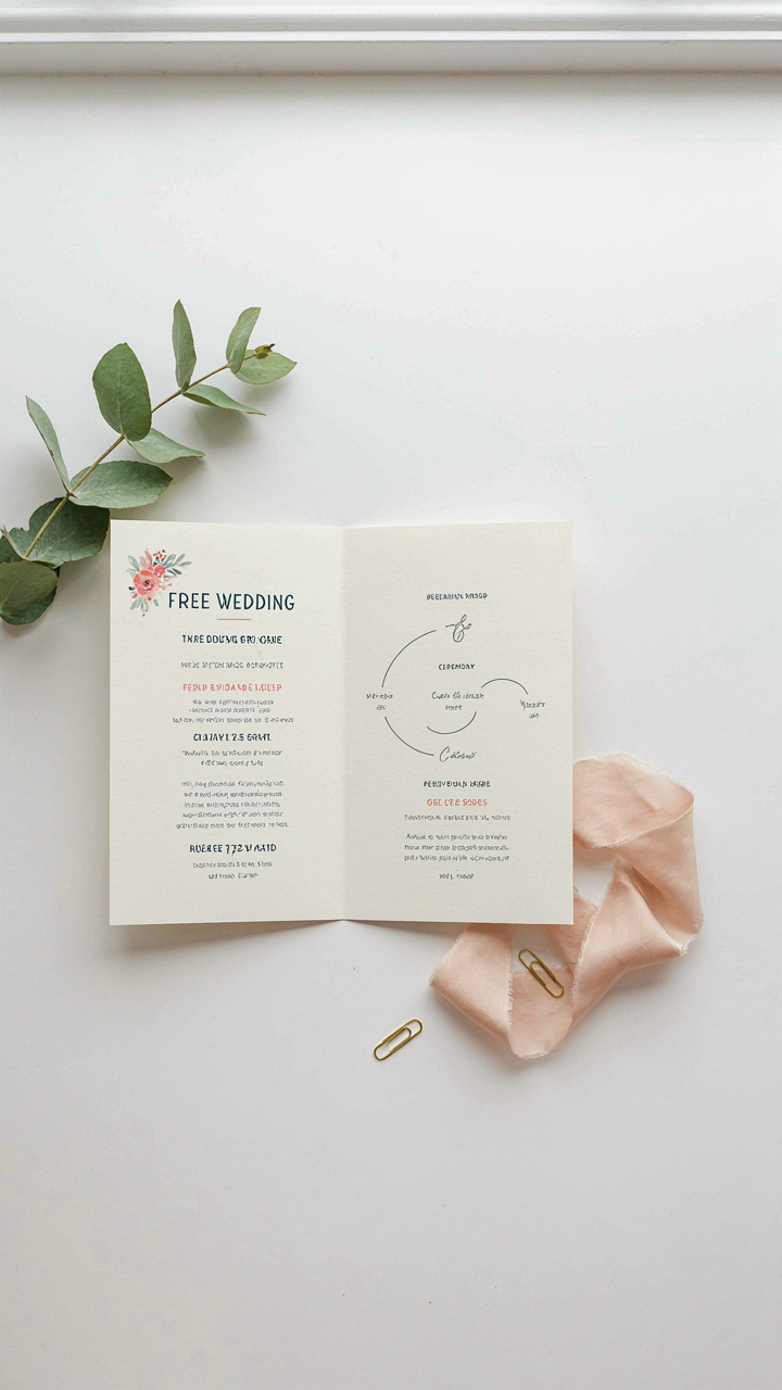
Explain It Like Your Guests Have One Brain Cell
You want your program to feel sophisticated, but you’re actually terrified guests won’t understand the order of events. The mechanism is simple: clarity beats elegance every time. Strip your welcome program to one job per sentence. Name the event, name the person, state what happens next. No nested clauses. No decorative language. A guest should understand the entire flow in under thirty seconds of reading.

Most templates fail here because they prioritize looking formal over being useful. They bury ceremony order in ornamental text, force guests to hunt for speaker names, or use vague phrases like “Special Remarks” instead of “Father Michael’s Blessing.” Your free template should read like an instruction manual, not a poem. Cut every word that doesn’t answer who, what, or when. Test it on someone who hasn’t attended a wedding in five years.
Information Placement Determines Guest Experience
Military strategy treats information hierarchy as a weapon, and your program template operates the same way. Front-load critical data: ceremony start time, processional order, and reader names. Bury secondary details like “Printed on recycled cardstock” at the bottom. Guests need to know what’s happening now, not your paper sourcing philosophy.
- Ceremony timeline first: List every major moment in chronological order so guests never wonder what’s coming next or if they missed something.
- Speaker names and roles together: Pair “Sarah Mitchell reads Corinthians 13:4-7” not “Reading: Sarah Mitchell” in one section and the passage elsewhere.
- Processional order on page one: Guests recognize family and close friends by name before they see them walk down the aisle, creating instant emotional connection.
- Recessional details if different: If the exit order differs from the entrance, state it plainly rather than assume guests will intuit the change.
- Acknowledgments relegated to back: Thank vendors, parents, and planners after the ceremony information. Guests skim the program during the actual ceremony, not before.
Your template’s layout physically trains attention. Top third contains what happens during the next fifteen minutes. Middle section holds participant names and roles. Bottom third holds gratitude and logistics. This is not aesthetic preference. This is functional design that respects how human eyes and brains actually process information under the stress of a live event.
DIY Wedding Programs Template Free: Your Editing Advantage

Learn Design Tools Without The Learning Curve
You want to skip the expensive designer markup and keep the polished output. That’s not laziness—that’s leverage. Design tools operate on constraint and hierarchy, the same principle typographers used decades before software existed. A free wedding program template gives you the constraint. Your job is learning which three buttons control 90% of the visual impact.
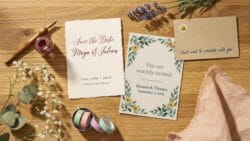
Google Docs, Canva, and Microsoft Word all handle program templates identically: they lock the structure, free you to swap text and colors. Start by opening a template and changing only one element at a time. Adjust font size, then stop. Change the color palette, then stop. This prevents decision paralysis and teaches you cause and effect. Within an hour, you’ll recognize what controls emphasis and balance.
Printable Templates: The Real Efficiency Win
Printable templates aren’t a compromise—they’re the mechanism that separates actual execution from endless tweaking. Most couples never print their program because they keep editing it. A template forces you to finalize. Download, edit your names and details into the template, set print settings to 8.5 by 11 inches or 5 by 7 inches folded, then send to the printer or your home machine.
The constraint is the feature. You get a finished product instead of a perpetual draft. Print shops charge three to eight cents per folded program if you handle the design yourself. This beats custom designer rates by 80 to 90 percent while maintaining readability and structure. Set a deadline: edit for two hours maximum, then print.
The Post Ceremony Proof: What Guests Actually Remember

What Your Program Actually Does
You want proof that the free wedding program template you chose matters. It doesn’t. Not in the way you think. Guests forget paper the moment they sit down. What they remember is whether the ceremony moved fast or dragged, whether they knew what was happening, and whether they felt included in something real. The program’s actual function mirrors information architecture in design: it reduces cognitive load. Your guests arrive confused about timing, speaker order, and family dynamics. A clear program eliminates that friction before it becomes resentment. That’s the entire mechanism.

Most couples treat programs like decoration. They’re not. They’re operational infrastructure. A program that lists speakers without timing creates ambient anxiety. Guests wonder if they’ll be trapped for hours. A program that signals pacing, ritual structure, and endpoint? Guests relax. They actually pay attention instead of checking their phones. Free templates work because they follow this pattern already built in. You’re not paying for design polish. You’re paying for reduced friction that your guests will never consciously notice but will absolutely feel.
The Real Retention Layer
People don’t remember programs. They remember how the program made the ceremony feel. This is about narrative structure, borrowed from screenwriting. Most ceremonies lack a coherent three act structure: setup, conflict, resolution. Your program either supports that arc or undermines it. If you list random readings between vows and the pronouncement, you’ve killed momentum. If you signal the structure so guests know when to expect emotion, when to expect ritual, when to expect release, they track the whole thing as one story instead of disconnected events.
The program becomes a souvenir only if guests glance back at it years later. But they don’t. What sticks is the feeling of coherence. Did I understand what was happening? Did I feel connected? Did time move right? Free templates solve this because they’re built on proven ceremony flows. You’re not inventing pacing. You’re following a structure that works. Edit the template for your people, your readings, your timing. That’s the only edit that matters. Everything else is secondary.
The Real Obstacle Isn’t Your Budget; It’s Your Inability To Edit
You already have the template. You have the tool. What you don’t have is permission to stop waiting for perfect and start shipping. Open one of those free templates today, change three things that actually matter to your wedding, and call it done. Most couples waste months paralyzed by options when they should spend thirty minutes making something real. Your guests don’t care how many revisions you did. They care that you showed up.