The “Cheap” Lie: Why DIY Wedding Invitations Are Not About Saving Money
You’re Not Actually Trying To Save Money
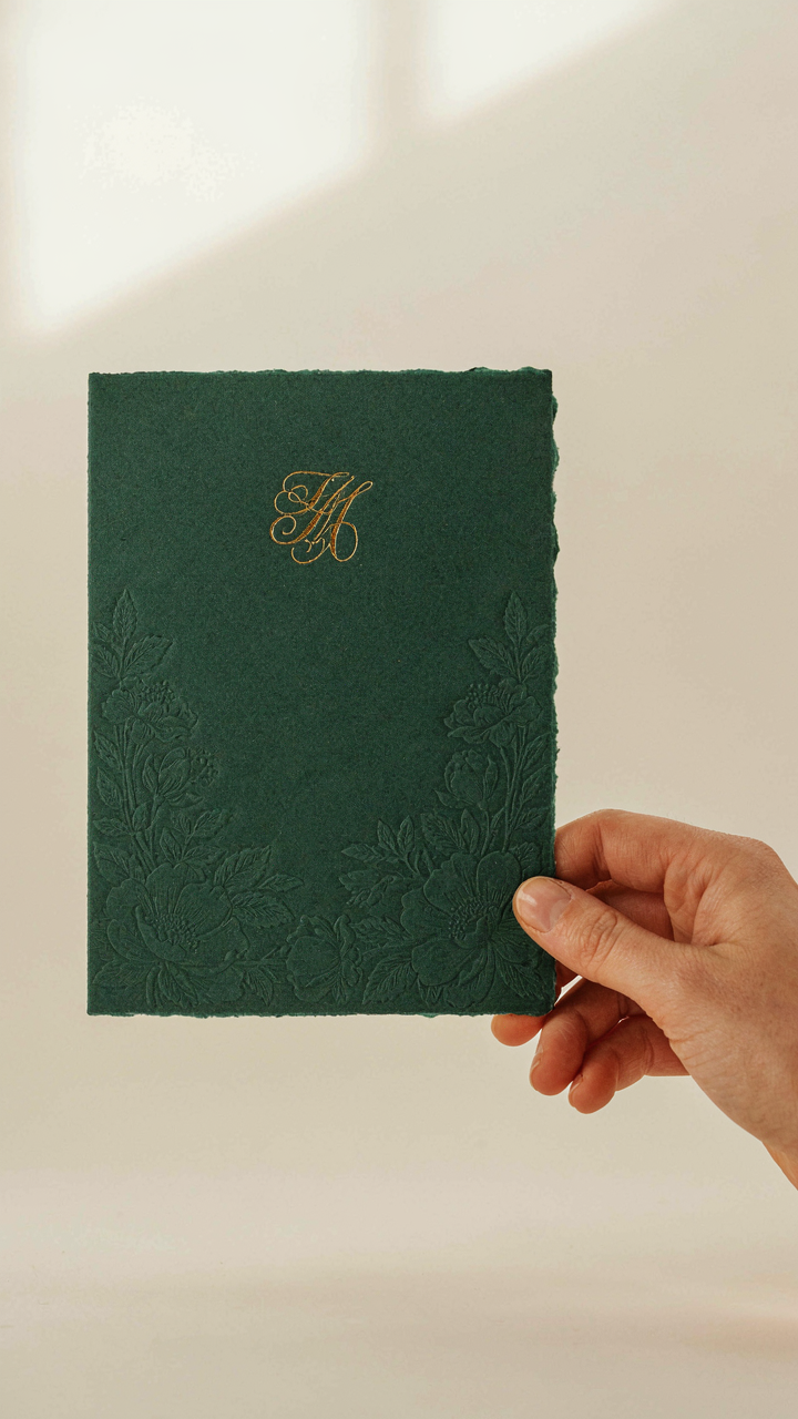
You want people to know you made something yourself. That’s the real driver. The cost angle is the socially acceptable excuse, but what you’re actually after is proof that you have taste, intention, and control over the narrative your wedding tells about you. The mechanism is simple: mass-produced templates are invisible. They signal nothing about you except that you ordered from the same vendor as five hundred other couples. A handmade suite signals curation.
Your invitations are not cost-reduction tools. They’re positioning devices. Every choice you make during production—paper weight, typography, finishing detail—becomes legible to your guest the moment they open the envelope. That legibility is what you’re paying for with your time. You can’t buy that signal from a vendor. You have to build it.
The Template Problem Nobody Names
Generic templates create a recognition problem in guest perception psychology. When someone receives an invitation using a purchased template, they recognize it. They’ve seen it before. That recognition is a small cognitive bump that says “mass produced,” and it lasts the entire time they hold the piece. DIY work bypasses this entirely because even imperfect execution reads as intentional.
The common advice says “use a template to save time.” That’s incomplete. The real issue is that templates were designed for maximum marketability to the widest possible customer, which means they eliminate all rough edges, all personality, all decisions that could alienate someone. DIY means you get to make those alienating decisions on purpose, and they become your brand. Start with one design variable you actually care about—paper texture, a specific typeface, a particular color—and build outward from there instead of building outward from a template’s constraints.
Deconstructing The Suite: Components You Actually Need For Your Diy Wedding Invitation Suite
What You’re Really Afraid Of Cutting
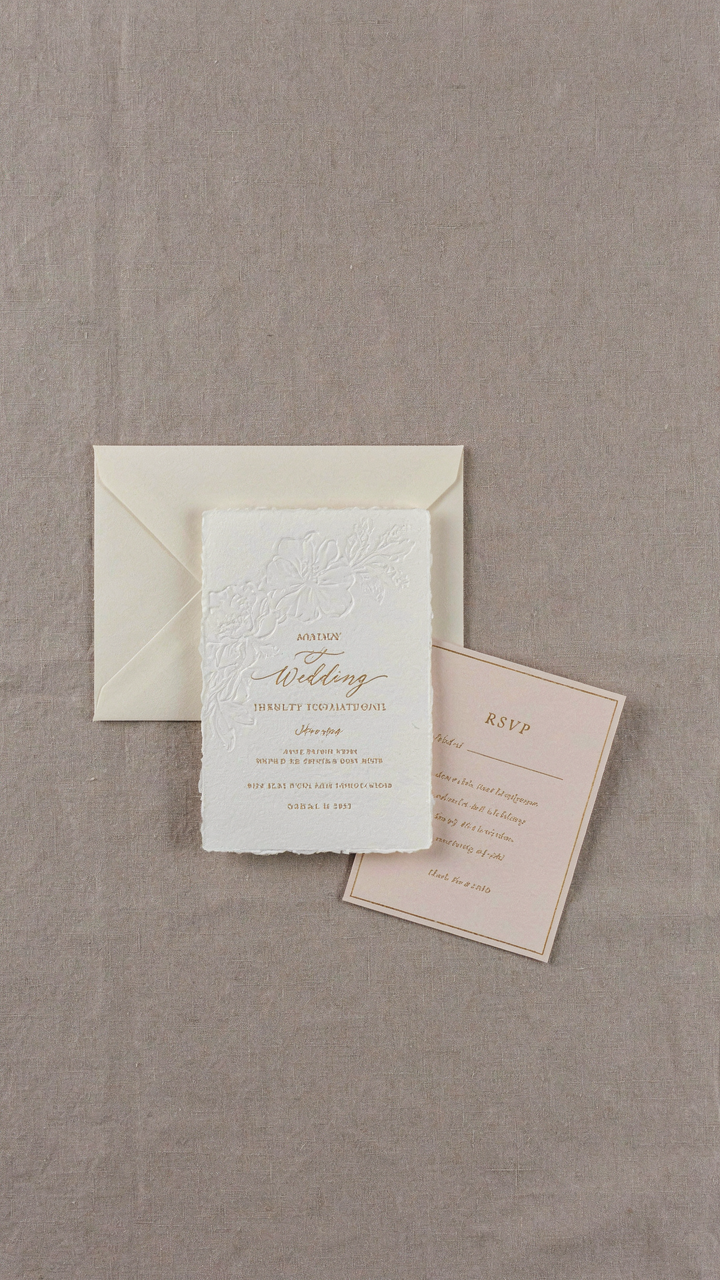
You’re worried guests will think you’re cheap. That’s the real reason you’re reading this. But here’s the mechanism: invitation suites bloated with extras aren’t a status signal—they’re a waste tax on your budget. Most guests throw extra cards away before the wedding anyway. The paper industry spent decades convincing couples that more inserts equal more sophistication. It’s marketing, not etiquette.
Direction cards, reception cards, accommodations cards, maps, and tissue overlays exist because printers needed to justify higher prices per order. None of them are mandatory. Your guests need one thing: to know when and where to show up. Everything else is friction you’re paying to add. Cut the noise first, design intentionally second.
Invitation And Response: The Actual Foundation
The core of any suite contains exactly two working pieces: the invitation itself and a way for guests to respond. Think of this like signal-to-noise ratio in telecommunications—you want maximum information density in minimum material. Your invitation card states date, time, location, and formality level. Your RSVP mechanism collects the one data point you need to execute: headcount.
- Main Invitation Card: Carries all critical logistics (date, time, location, formality). Typically 5×7 inches or A5 size. This is your only guaranteed read.
- RSVP Card: Postcard or card-and-envelope combo. Guests write yes or no and mail it back. Collect names and meal selections here if needed.
- Return Envelope: Pre-addressed, postage-paid envelope for RSVP cards. Dramatically increases response rate. Standard business-size works.
- Outer Envelope: Houses the invitation and RSVP inside. Protects contents and carries guest names and address. Kraft or cardstock.
- Invitation Envelope: Optional inner envelope that traditionally accompanied formal invitations. Now mostly decorative unless you’re following black-tie protocol exactly.
Start with invitation plus RSVP card. Add outer envelope because it protects your work and signals intentionality. Everything beyond that—inner envelopes, tissue paper, direction cards, meal selection inserts—is optional and requires a specific reason to exist. Before you add a piece, ask: what does the guest actually need from this? If the answer is “nothing,” remove it.
The Material Selection Protocol: Where To Invest For Impact, Not Expense

Paper Stock: Weight, Texture, Color
You’re scared this will look cheap. That’s the real reason you’re reading this section. The mechanism is simple: paper stock operates like leverage in economics. A thin, flimsy sheet signals poverty. A dense, substantial sheet signals intentionality. The weight of the paper does the heavy lifting before anyone reads a word.

Most people choose cardstock blindly. They grab whatever’s labeled “cardstock” without understanding the game. Paper weight matters tactically. A 110 lb cover stock feels professional. Anything below 80 lb feels like junk mail. The texture compounds the effect: smooth cardstock reads corporate and safe, while felt or linen texture adds perceived craft without adding cost. Color is where amateur moves happen. Pure white feels sterile. Cream, natural white, or soft gray feels intentional. One strategic color choice beats three mediocre ones.
Embellishments That Earn Their Place
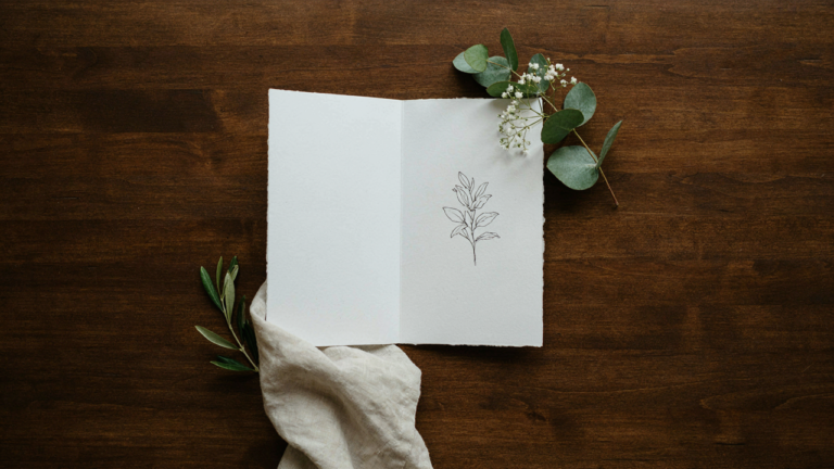
Skip the instinct to add glitter, foil stamping, or die-cuts. Those tactics scream “I’m trying too hard.” Strategic embellishment means one detail that serves a function, not decoration for its own sake. Letterpress, gold leaf, or perforated edges work because they change how the paper physically feels or functions.
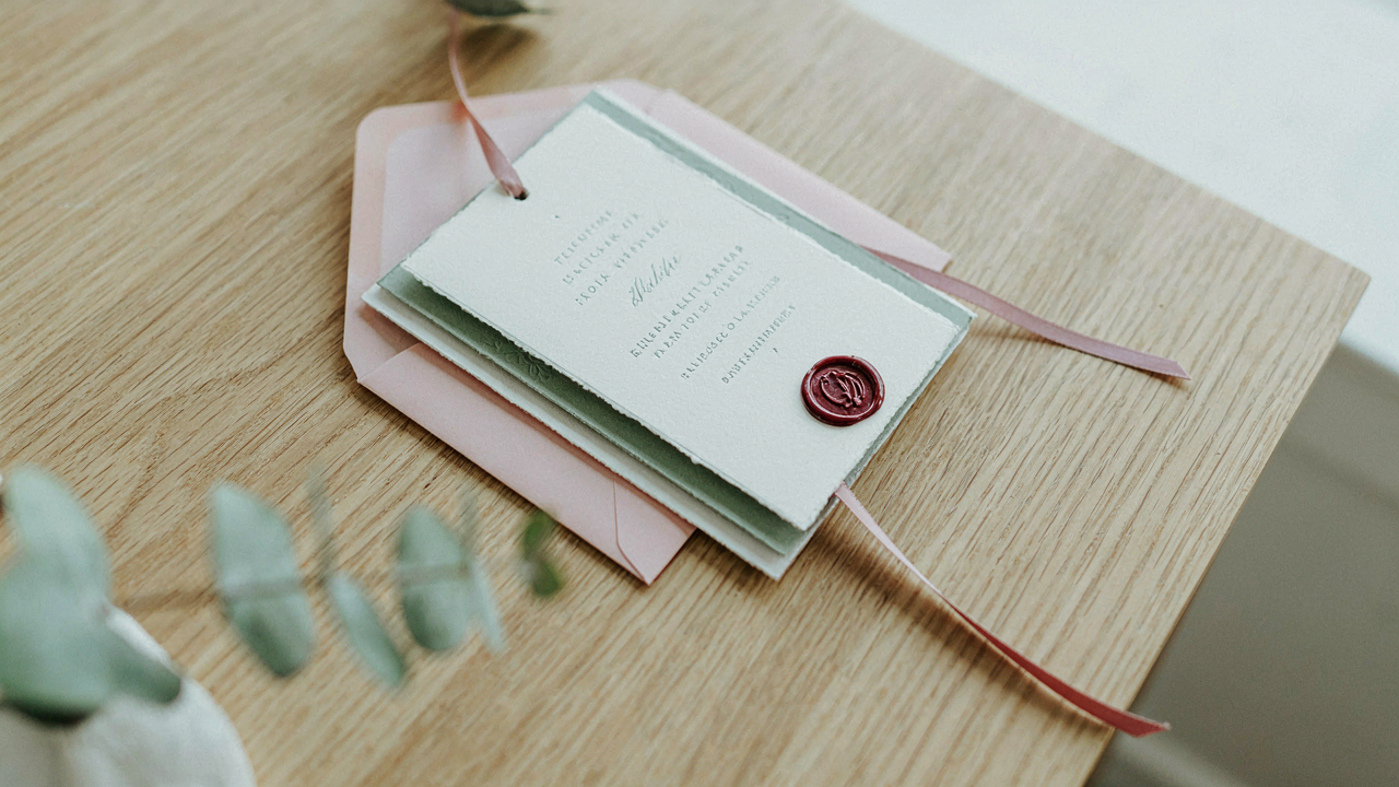
The real leverage point is restraint with precision. A single line of metallic ink on the envelope flap costs almost nothing to execute at home with a stamp or pen, but transforms perception. Vellum overlays or layered cardstock add depth without expense. Embellishments should announce that you made a deliberate choice, not that you spent money. Your constraint forces you to pick one element worth doing right, then execute it cleanly. That discipline creates more impact than a invitation drowning in effects.
How To Design Rustic Wedding Invites: Beyond Burlap And Mason Jars
Texture And Natural Elements That Actually Work
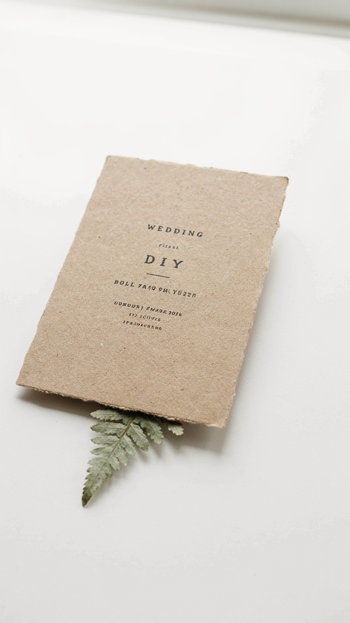
You want rustic because it signals authenticity and cost-consciousness without admitting you’re budget-constrained. Here’s the mechanism: texture creates perceived value by forcing the eye to slow down and register craftsmanship. When a surface has dimension, people assume labor happened. In materials science, this is called “surface roughness”—the deviation from a perfectly smooth plane. Apply this to your invitations: roughness signals intentionality, not default.
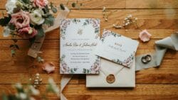
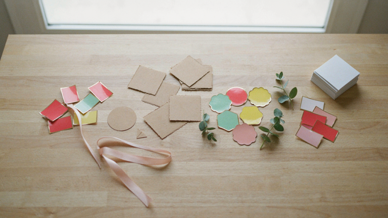
Use kraft paper as your base, not because it’s trendy, but because its fiber structure is visible and it accepts ink inconsistently, which reads as handmade. Pair it with one genuine natural element: pressed flowers between layers, subtle wood grain from actual veneer sheets, or handmade paper embedded with seeds. Skip the decorative burlap strips and fake mason jar imagery. One authentic texture beats ten imitation attempts. The inconsistency becomes the proof.
The Right Typeface Tells The Truth
Everyone says “use serif fonts for elegance and sans-serif for modern,” which is incomplete advice that leaves you with nothing distinctive. Typography in rustic design works differently because authenticity depends on honesty, not category. Choose a typeface that existed before 1950—Garamond, Caslon, Baskerville—because historical legitimacy matters more than novelty here. These fonts were designed for ink on paper and degrade beautifully, which means they’ll look right when printed on textured stock.
For headers, consider wood-type fonts like Clarendon or a slab serif: they mimicked actual carved letterforms, so they carry the weight of handcraft without you faking it. Pair your header font with a single body font and stop. Mix one display typeface with one reading typeface. Avoid script fonts entirely unless you’re actually hand-lettering the calligraphy yourself. Print a test run on kraft paper to see how the ink sits before committing to full production.
The ‘Less Is More’ Design Philosophy For Simple Wedding Invitations
Confidence Through Restraint
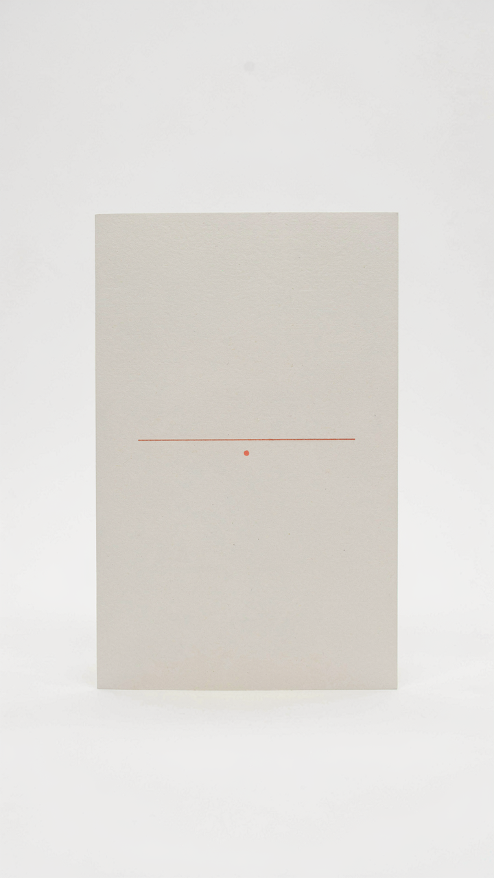
You’re worried that a simple invitation looks cheap. That’s the real fear underneath this whole section. But here’s the mechanism: in design, constraint operates like scarcity in economics. Remove options and the remaining elements gain weight. Luxury brands don’t clutter. They subtract. A minimalist invitation signals you’re secure enough to let blank space breathe, which costs nothing but reads as intentional.
The psychology works because our brains equate emptiness with exclusivity. When every pixel serves a purpose, nothing screams “mass-produced template.” Minimalism separates handmade invitations from bulk print jobs instantly. You’re not designing for visual noise. You’re designing for attention. The fewer elements you include, the harder each one has to work, which means you’ll naturally eliminate the weak details.
Whitespace As The Primary Design Element
Whitespace isn’t empty space. It’s active negative space that shapes how the eye moves across the page. Typography alone cannot carry an invitation. The gaps between text, margins, and breathing room do the heavy lifting. Most DIY designers make the same mistake: they fear blank space and fill it compulsively. Stop. Strategic emptiness is harder to execute than clutter, which is why it reads as deliberate.
Test this on your layout: remove half of what you think you need. Then remove a quarter more. Place your type in one corner or centered with aggressive margins. A single typeface in two weights, white space, and one accent color outperforms decorated templates every time. The mechanism is perceptual weight. Your eye settles on the content because nothing fights for dominance. Print a test version and hold it against a typical invitation. The difference becomes obvious.
Printing Precision: Maximizing Quality From Your Home Setup For Diy Wedding Invitations Ideas

Your Printer Is Not The Bottleneck
You’re worried your home printer will betray you and make your invitations look cheap. That’s backwards. Your printer is capable. The real issue is that most people never calibrate their machine or understand what settings actually control output quality. You’re not fighting hardware limitations. You’re fighting settings you’ve never touched. The mechanism here borrows from calibration in manufacturing: every printer has a baseline drift from factory settings. You correct this drift before production begins, not during it.

Start by running a nozzle check on inkjet or a test page on laser before any invitation work. This clears clogs and confirms ink flow. Then print a color reference card at actual size on your intended paper. Compare it to your screen. If colors shift, your color profile is mismatched to your paper type. Adjust in your printer’s driver settings, not in your design software. Most people skip this step entirely and waste material on failed runs. Print one test invitation first. Evaluate before committing to full production.
Paper Knows Your Printer’s Limits
Stop assuming heavier paper means better results. Paper thickness, finish, and coating interact with your printer’s feed system and ink application in specific ways. Laser printers handle cardstock reliably up to 110 lb cover stock. Inkjets struggle above 110 lb unless the machine has a manual feed slot designed for thick media. The coating matters more than weight. Matte finishes dry faster and produce richer color. Glossy finishes show ink more vividly but require slower output to prevent smudging. Uncoated cotton-blend papers accept ink differently than commercial cardstock.
Load paper into your printer exactly according to the machine’s specifications. Adjust the paper thickness dial if your model has one. If using manual feed, insert one sheet at a time, perfectly straight. Run a test batch of five sheets before committing to fifty. Measure drying time on your chosen stock in the humidity level of your workspace. This is not a variable. If you print 150 invitations and stack them wet, they will stick together and your edge coloring or hand-applied details will smudge. Execute this protocol once and document your settings for future batches.
The Logistics Loop: Assembly Line Thinking For Diy Wedding Invitations
Stop Treating This Like Craft Time
You want to avoid feeling like you’re still making wedding favors at midnight three days before the event. The real mechanism here is borrowed from biology: ant colonies don’t optimize individual ant performance, they optimize the system’s throughput. Your invitation suite has stations, not tasks. Each station processes one input into one output. You move inventory through stations in batches, not pieces. The difference between this and “just doing it” determines whether you finish in eight hours or eighty.
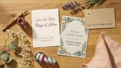
The constraint everyone misses is setup time. Most people believe the actual printing or folding takes forever. It doesn’t. Setup, cleanup, tool switching, and mental context-switching consume 60 percent of your timeline. You eliminate setup time by batching identical operations and never returning to them. Print all components at once. Cut all components at once. Fold all components at once. Then assemble. This is the only way the math works.
Running The Station Sequence
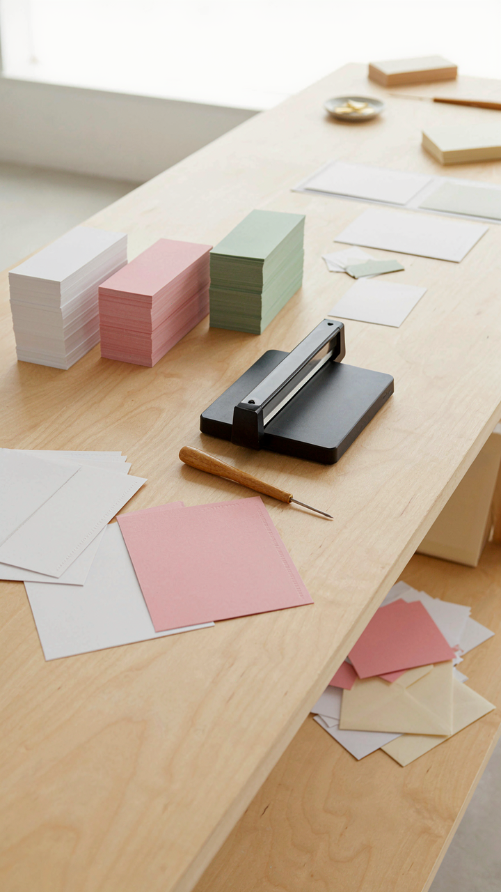
Everyone says “create a workflow” and leaves you hanging. Here’s the actual protocol: establish five discrete stations in a line across your workspace. Station one handles printing all card stock, envelopes, and inserts in a single pass. Station two cuts every printed piece to size using one cutting tool, one method, one measurement. Station three folds or scores everything that needs folding. Station four assembles components into complete invitations without any printing or cutting happening simultaneously. Station five packages and labels finished invitations for mailing.
Move all inventory from one station to the next before starting the next operation. This prevents bottlenecks and lets you spot quality issues in batches rather than discovering them scattered across incomplete pieces. Dedicate one person per station if you have help, or work through all stations sequentially if solo. Time each station first without trying to optimize. You’ll see which station creates the actual constraint. Then you optimize only that station. Attempting to speed up every station equally wastes effort on stations that aren’t the bottleneck.
Beyond The Envelope: Personalizing Delivery For Wedding Invitation Ideas Diy
The Hand Address Versus Automation Trade
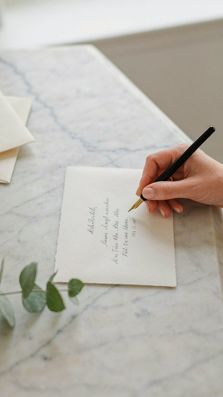
You care about this because you’re afraid your guests will judge you for cutting corners, and you’re right to worry—but not for the reason you think. Addressing envelopes is a signal recovery mechanism. In economics, signaling theory explains how you communicate trustworthiness when information is incomplete. Hand-addressed invitations signal intentionality. Digital printing of addresses signals efficiency. The mechanism isn’t about which looks better—it’s about what your guests infer about your effort allocation.
- Hand-addressing with consistent penmanship: Requires 1-2 hours per 50 invitations. Use black or navy fountain pen on white or cream stock. Works for guest lists under 100. Establishes clear visual hierarchy between design and personalization.
- Hand-addressing with calligraphy: Demands practice or hiring a calligrapher. Modern pointed-pen style is learnable in 10-15 hours of deliberate practice. Digital calligraphy printed onto envelopes mimics the effect at 80 percent cost.
- Digital printing addresses in complementary font: Print addresses in the same font family as your invitation body text one shade lighter or darker than the primary color. Achieves cohesion. Guest sees intentional design choice, not automation.
- Hybrid approach with return addresses: Hand-address guest names only. Print return addresses digitally using your printer’s settings. Cuts labor in half while preserving the signal where guests actually see it first.
- Label method as false economy: Preprinted labels ruin the signal entirely. They telegraph cost-cutting more obviously than any digital option. Avoid completely.

The decision depends on your guest list size and your hand consistency. Under 40 guests, hand-address everything. Between 40 and 80, use the hybrid method. Over 80, design a complementary digital font treatment and print it directly. The goal is visual coherence, not proving you suffered.
Postage Stamps As A Design Extension
Stamp selection is not decoration. It’s the final design decision your invitations make. Most people default to whatever’s cheapest or grab standard forever stamps without thinking. That’s a wasted opportunity because stamps are the one element every single recipient touches. They notice it.
The mechanism here is repetition with variation. Your invitation system has one visual language—your color palette, typography, illustration style. The stamp either extends that language or disrupts it. A botanical-themed wedding invitation paired with a standard flag forever stamp feels incomplete. Pair it with botanical stamps from USPS’s recent releases and the system feels intentional. You don’t need themed stamps—you need stamps that don’t contradict your design. Choose vintage botanical, mid-century modern, or geometric patterns that echo your invitation’s aesthetic. Avoid bright primary colors if your invitations use muted earth tones. Avoid novelty stamps unless your entire suite embraces irreverence. One vintage 37-cent or 10-cent stamp sourced from local post offices or online stamp dealers adds visual weight that matches hand-addressed envelopes. Order early—seasonal or limited-run stamps sell out by mid-month.
Post Send Assessment: What Your Diy Wedding Invite Says About You
The Intentionality Signal
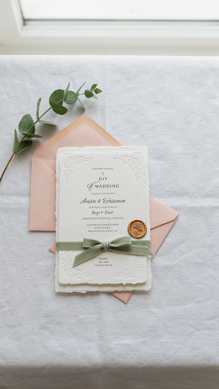
You’re worried people will judge your invitations as cheap. That’s the real fear underneath this section. Stop there. What actually happens is guests read intentionality, not budget. In design psychology, this maps to signal theory from economics: the invitation communicates not your spending but your decision-making. A homemade suite with consistent typography, cohesive color choices, and clean production signals you chose every element deliberately. Mass-produced templates signal the opposite, even at higher cost.

Guests notice margins, paper stock consistency, and whether your font pairs work together. These details live in the realm of craft, not expense. Mismatched fonts or bleeding ink reads as rushed. Aligned text and one deliberate color accent reads as considered. The mechanism is simple: consistency across all pieces (envelope, card, RSVP, thank you) compounds the perception of intentionality. Guests assume someone thought through the system, not just the single card.
Production Quality Without The Mistakes
Most DIY guidance says print on nice paper and call it done. That misses the actual failure point. Your invitations fail not from the paper choice but from execution errors that announce themselves: misaligned cuts, inconsistent ink saturation, smudged edges, or text that shifts between prints. These are preventable through a simple protocol, not through spending more.
Test every element before full production. Print five complete suites on your chosen paper, let them dry fully (ink needs time), then assess. Trim one set by hand to verify your cut measurements. Run your printer’s cleaning cycle before starting the production batch. Check halfway through production to catch ink issues early. This costs nothing and prevents the visible mistakes that scream amateur.
The Real Obstacle Isn’t Your Budget, It’s Your Willingness To Break Free From Convention

Most people don’t make a DIY wedding invitation suite because they believe they can’t. The truth is uglier: they won’t risk looking different. You’re competing against a lifetime of conditioning that tells you expensive equals legitimate. Stop waiting for permission. Open Canva today, pick a template that makes you uncomfortable, and customize it in a way that actually reflects who you are. Your guests came for you, not for a piece of cardstock that cost three times what it should.