Beyond The Pinterest Illusion: Why DIY Wedding Seating Chart Display Fails
The Aesthetics Trap Costs You Everything
You want your seating chart to look impressive because you’re terrified guests will judge your wedding as cheap or poorly planned. Here’s the mechanism: you optimize for visual appeal instead of information hierarchy, which means guests spend three minutes decoding your display when they should spend thirty seconds finding their table. A seating chart is a wayfinding tool first, decoration second. Most DIY versions fail because they treat typography, color, and layout as equally important when only one thing matters: can a guest locate their assignment without squinting or asking staff for help?
The common advice says to add lighting, use calligraphy, or mount your chart on a statement piece. That’s backwards. Those elements work only after you’ve solved the core problem: legibility at arm’s length. Poor contrast between names and background, inconsistent font sizing, cramped spacing, and unclear table numbering create friction. Guests become bottlenecks at your entrance. Staff gets pulled into logistics they shouldn’t handle. The fix is ruthless: eliminate every design choice that doesn’t serve readability, then add refinement only where it doesn’t compromise function.
Guest Flow Demands Ruthless Prioritization
Wayfinding operates on one principle borrowed from industrial systems design: reduce cognitive load or watch people fail. Your seating chart must minimize the mental steps required to move from point A (guest enters) to point B (assigned table). Most DIY displays violate this by grouping names alphabetically, by family, or by aesthetic convenience instead of by how guests actually move through your venue. If your reception space has a front entrance leading to a left dining area and right lounge, your chart should mirror that geography, not force guests to scan a random arrangement.
The mechanism is simple: guests read top-to-bottom and left-to-right instinctively. They expect tables to be organized spatially or sequentially, not creatively. A chart that mirrors your actual room layout beats one with better visual design every time. Test this by standing at your display location and pretending you’ve never seen it. If you hesitate more than two seconds before finding your table, your organization is wrong. This determines whether your display works or whether it creates a thirty-minute traffic jam while guests cluster near the entrance searching for their names.
The “Guest Flow” Protocol: Designing For Seamless Seating
Where Guests Enter Matters More Than Table Design
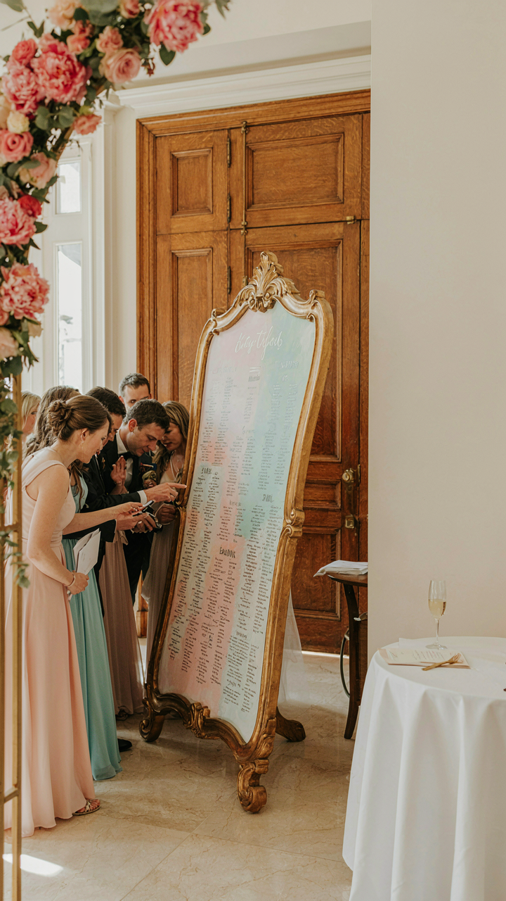
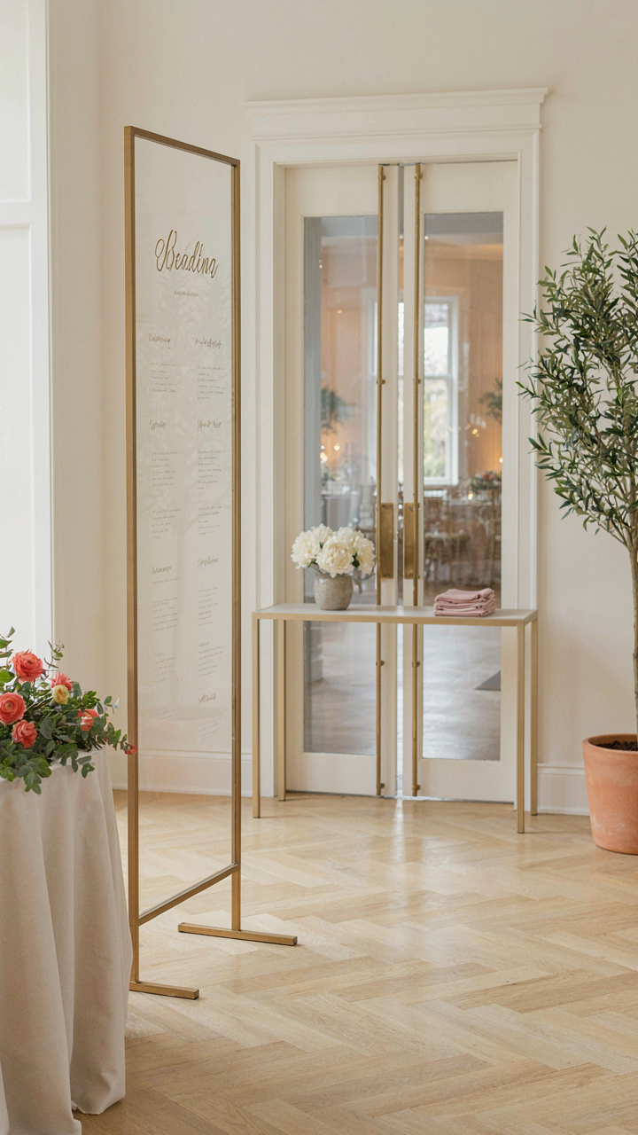
You want people to find their seats without forming a bottleneck at your display. Borrow from retail traffic flow analysis: the goal is to move people through a space without friction. Most DIY seating charts get placed in the worst spot—directly in the reception entrance—creating a jam. The mechanism is simple: guests bunch up, crane their necks, block others behind them, and the entire arrival experience feels chaotic before they even sit.

Position your display at least six to eight feet from the main entrance, off to one side where the natural traffic pattern already curves. This works because people instinctively flow around obstacles rather than stopping dead in front of them. If your venue has multiple entry points, place smaller secondary charts near those entrances so guests don’t all converge on one location. The single highest-impact move: angle your display so it faces into the flow, not perpendicular to it.
Visibility Wins When You Stop Decorating It
Everyone assumes seating charts need to be beautiful, so they add calligraphy, frames, and ambient lighting. Wrong. Readability kills aesthetics every time when guests are tired, tipsy, and in a hurry. A chart nobody can read from three feet away is decoration masquerading as function.
Use high-contrast colors: dark text on light background or vice versa, never pastels on pastels. Font size matters more than font choice. Names should be legible from five feet away without squinting. Test this by standing back and reading a sample before finalizing. Matte finishes eliminate glare; glossy surfaces reflect overhead lights and make text disappear when someone stands at certain angles. Physical placement height is critical—the center of your display should sit at eye level for the average standing person, roughly 58 to 62 inches from the ground.
Deconstructing The ‘Diy Seating’ Myth: Essential Materials, Zero Fluff
What Actually Costs Money Here
You want this to look intentional without dropping three hundred dollars on a designer piece. That’s the real fear underneath. The mechanism is simple: people confuse material quality with visual impact. A cardboard frame painted matte black reads expensive. A plastic stand sprayed gold reads expensive. What costs money is solving the wrong problem first.

Most guides bloat their material lists with redundant items or premium versions nobody needs. You don’t need specialty cardstock when standard poster board works. You don’t need a Cricut machine when scissors and templates function identically. Strip away the noise and you’re left with five categories: the base structure, the display surface, the lettering medium, the fasteners, and the finishing layer. That’s it.
- Foam Board or Poster Board: Lightweight structural backbone. Standard 20×30 inch sheets cost three to eight dollars. Accepts paint, markers, and adhesive without warping under moderate weight.
- Paint or Spray Paint: Acrylic or spray enamel creates finished appearance with minimal effort. One or two cans typically cover a full display. Matte finishes hide imperfections better than gloss.
- Card Stock or Cardboard: Medium-weight paper for name cards. 110 lb cardstock cuts clean and holds ink without feathering. Standard printer paper tears too easily under handling.
- Wood Dowels or Metal Rods: Structural support for hanging or standing displays. Half-inch dowels cost under ten dollars for a pack. These prevent sagging on larger builds.
- Adhesive Options: Hot glue works fast for temporary bonds. Spray adhesive creates even contact on large surfaces. Wood glue handles structural joints that bear weight.
The real cost control happens when you choose one display method and commit to it. Hybrid displays that combine five different techniques end up costing more because you buy partial quantities of each material. A single coherent design uses fewer inputs and hits harder visually.
The Tools Nobody Mentions Matter Most
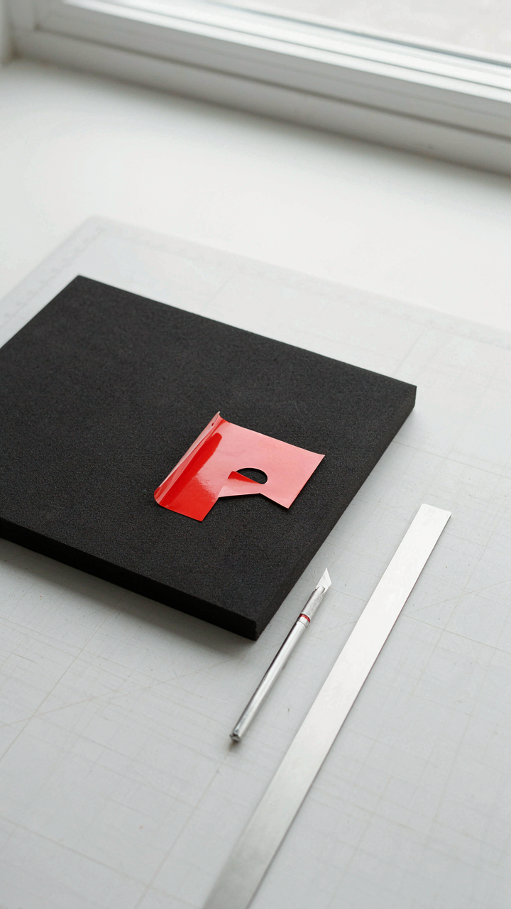
Everyone lists basic tools like scissors and rulers, then skips the actual constraint: precision saves time and prevents waste. Think of tool selection like aviation maintenance protocols. Pilots follow checklists not for safety theater but because missing one step cascades into catastrophic failure. Your tools either enable clean cuts and straight lines or they sabotage your timeline.
You don’t need power tools for a wedding seating display. You need tools that create repeatable results without fatigue. A metal straightedge guides your knife in a straight line. A cutting mat protects your work surface and prolongs blade life. A bone folder scores cardstock cleanly before folding. A level ensures your display stands vertical. These four items cost under thirty dollars combined and eliminate the majority of fixable errors that force rework.
The Information Architecture Of Table Assignment Ideas
Make Names Scannable Before Guests Sit Down
You want people to find their table without asking staff or looking confused. That’s the real goal here, and it matters because confused guests create bottlenecks at your entrance. Think of information architecture like military command structure: each level must filter down without losing critical data. Your seating chart operates on the same principle. Guests need to scan one element first, then one secondary element, then locate their seat. No branching paths. No decisions.

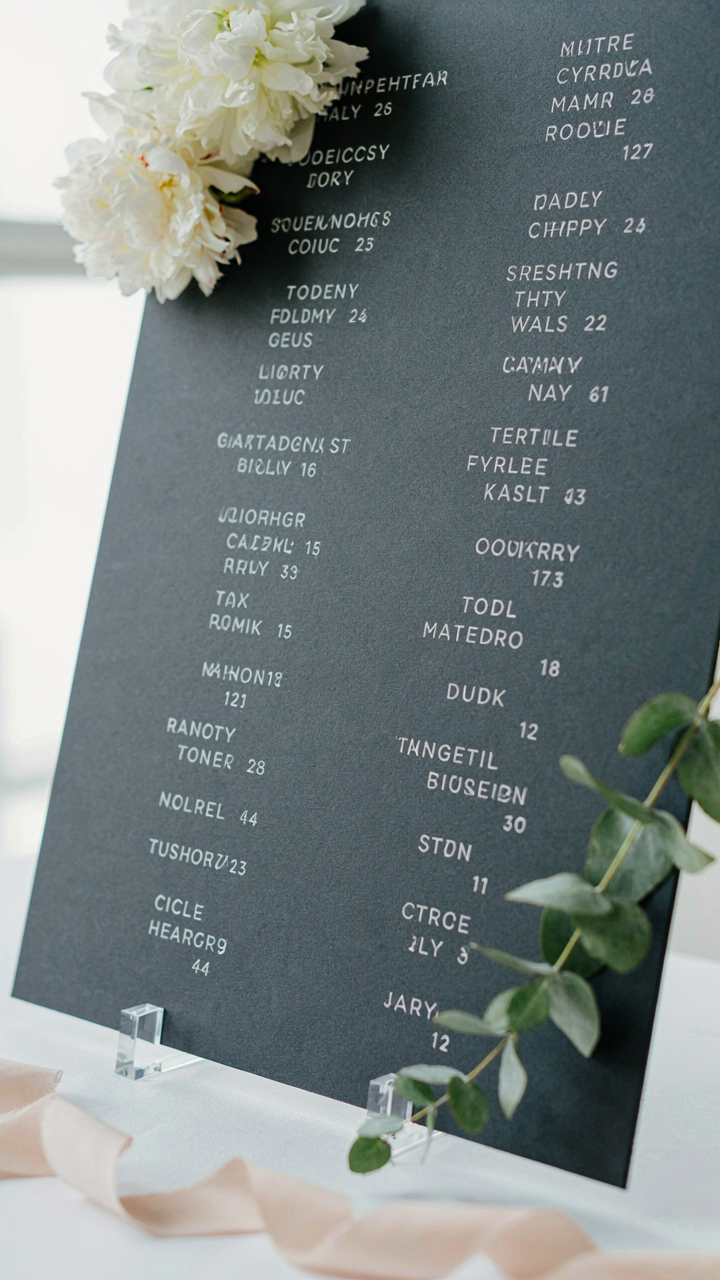
Start with guest names as the dominant visual element. Names must occupy the most space and contrast sharpest against your background. Everything else sits in support. Table numbers come second. Seat assignments come third, if you include them at all. This hierarchy forces the eye to move in the order that matters for speed. When you reverse this, guests stare at your display longer, miss information, and back up.
Contrast Wins Over Everything Else
Most seating chart displays fail because people prioritize aesthetics over readability, then panic when guests can’t read it. That’s a choice, not an accident. Contrast is the mechanism that determines speed. High contrast between text and background lets eyes process words faster. Low contrast forces the eye to work harder, creating cognitive load you didn’t intend to add.
Black text on white background remains the fastest to read in varied lighting. White text on black works too. Gold text on white or light backgrounds fails. Pastels fail. Anything that reduces the difference between text color and background color slows comprehension. If your seating chart sits indoors under consistent lighting, you can push contrast limits slightly. If it sits near windows or outside, you need maximum contrast or guests will squint at it from six feet away.
Military Strategy For Wedding Table Seating Chart: The Force Multiplier
Logistics Of Deployment: Setting Up The Display
You’re stressed about guests seeing their names and not judging the arrangement. That’s backwards thinking. What actually matters is whether people find their table without bottlenecking at your display. In military logistics, “supply lines” determine whether troops reach objectives. Your seating chart is the supply line—it routes human traffic. The mechanism: guests need one clear entry point to the display, readable names from arm’s length away, and immediate sightlines to table numbers across the venue.

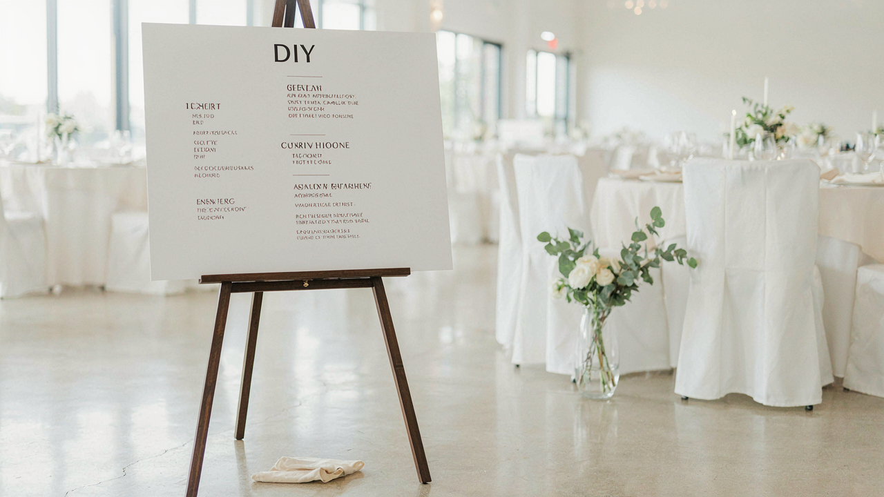
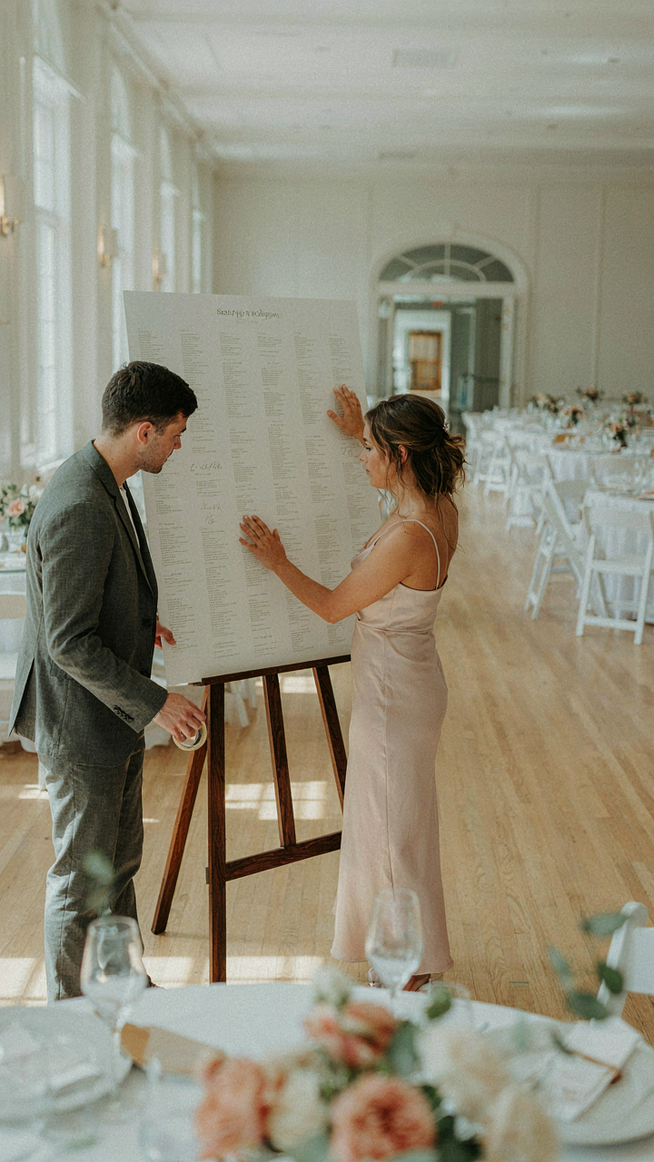
Mount your display at the venue entrance where foot traffic naturally funnels. Use lettering or print large enough to read from five feet back. Position table number signs at matching heights so guests can navigate without searching. Attach your display to a stable stand or wall, not a flimsy easel that moves when someone leans. The setup takes thirty minutes. Do it during rehearsal when the space is calm, not an hour before guests arrive when you’ll rush and miss sight lines.
Contingency Planning For Last Minute Changes
Most advice tells you to have a backup display ready. That’s incomplete. The real problem is that late changes cascade—someone can’t attend, plus two others want to sit together, plus your plus-one count changed. You need a system that absorbs edits without rebuilding the entire display. Create your chart in layers: anchor the table assignments permanently, but keep guest names on removable elements like cardstock cards or adhesive labels. This separates the structural problem from the surface problem.
When changes hit, you update only the name assignments, not the table layout. Keep a second identical blank display in your hotel room or the bride’s getting-ready space. If a critical error surfaces one hour before dinner, swap displays rather than trying live edits. The protocol: any change after seventy-two hours goes only on removable cards. Any change after the rehearsal gets written on a temporary printed sheet you hand to the venue coordinator. Never improvise during the event—route all changes through one person with the backup materials.
Beyond “Cute”: Functional DIY Wedding Seating Chart Display
Match Display Type To Venue Layout
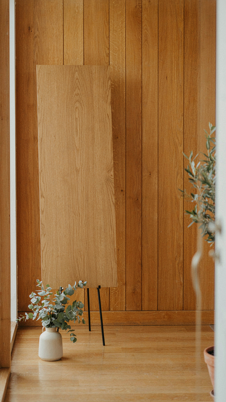
You want people to think you’re organized. That’s the real motive here. The mechanism is simple: a seating chart only works if guests can actually read it without creating a bottleneck. Venue layout determines display type, not aesthetic preference. A narrow entryway demands a vertical display. A wide lobby can handle horizontal. A small cocktail space needs something guests can reference from across the room without walking toward it.
The wrong display in the wrong space creates chaos at arrival. Guests cluster, miss their table numbers, ask staff repeatedly. Your carefully arranged names become invisible because the physical setup fights against human movement patterns. Test your display location during your venue walkthrough. Stand where guests enter. Can you read every name from ten feet away? If not, the display fails functionally before it succeeds visually.
Integrate With Existing Color And Material Language
Don’t fight your venue’s existing palette and materials. Most wedding advice says “make it pop” or “match your theme.” That’s incomplete. Integration means your display uses colors and materials already present in the space so guests perceive it as part of the venue, not an add-on you created. A venue with wood paneling and brass accents needs a display that echoes that language, not one that introduces new competing materials.
Your display becomes invisible when it belongs. Guests see seating information, not “the DIY project.” Use the venue’s existing color scheme as your primary palette. If the space has natural wood, incorporate that. If there’s brass or copper, use those metals for stands or frames. Match the venue’s material choices, then add your text hierarchy on top. This approach takes more observation but eliminates the common mistake of making a display that feels like it was transported from a different wedding.
The “Effortless Execution” Framework For Wedding Seating Chart Display Diy
Building The Display From Ground Up
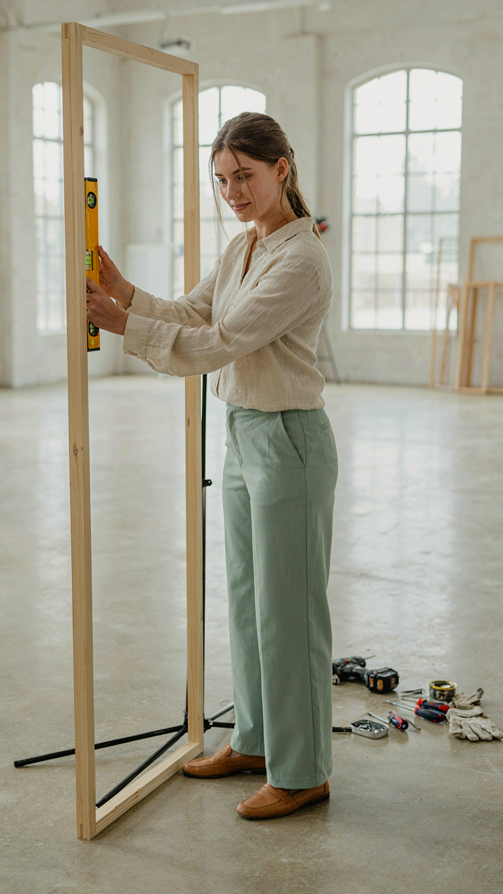
You want this to look like you didn’t sweat it. That’s the real fear here—that guests see effort and assume desperation. The mechanism is simple: a seating chart display is just a structure plus a labeling system. Treat it like construction, not decoration. You assemble the frame first, then mount the guest cards. No shortcuts. No “creative chaos.” The structure holds everything, so it has to be load-bearing and stable before you touch aesthetics.

Start with your base material. Wood frames, foam core, pegboards, and wire grids all work. Pick one based on your venue’s lighting and wall surface. Drill pilot holes before fastening anything. Use a level—not by eye. If your display leans, every card looks crooked, and guests notice. Mount hardware rated for the weight you’ll actually hang. A standard seating chart with 150 guest cards weighs more than people think. Secure it to studs when possible. Test the structure empty before filling it.
Command And Control During Setup
The common advice is to delegate everything equally, which fails because nobody owns the outcome. Instead, designate one person as the display lead—someone who understands the full chart and has authority to make calls on the day. This person does a walkthrough 30 minutes before guests arrive. They verify every card is legible, properly positioned, and actually matches your master list. That single role prevents the chaos of three people working blind.
Your lead should have a printed master seating chart at the display itself. Cards shift. Guests ask questions. Someone needs to answer them without hunting for information. The lead also coordinates with catering and venue staff so they know where the display lives and can direct confused guests to it. Assign a secondary person to handle last-minute card adjustments or reprints if a guest cancels. This stays decentralized until something breaks. Then ownership is clear and action is fast.
Reception Seating Chart Ideas: Avoiding Common Headaches
The Real Cost Of Last Minute Changes
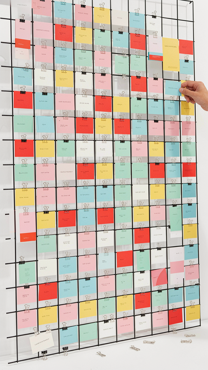
You’re afraid people will judge you for an empty seat or think you didn’t plan properly. Here’s what actually happens: every confirmed guest who cancels after your chart is printed forces you to either manually edit the display or leave a visible gap that screams “someone bailed.” This is a logistics problem, not a social one. Build your chart on a system that accommodates deletion without reconstruction. Use a modular display like individual place cards clipped to a board, magnetic tiles on a metal frame, or a digital screen. Physical rigidity kills you. The moment someone RSVPs no at day-four or a relative brings an unexpected plus-one, a fixed printed poster becomes worthless.

Treat seating like inventory management. Keep a master list separate from the display itself. Print the names on removable elements, not directly onto the backing. When the caterer calls with a final headcount that’s three people short, you swap out three cards instead of reprinting everything. The display stays intact. Your timeline stays sane. The guests see a finished product, not evidence of chaos.
Breaking Down Fast Matters
Most couples treat seating chart breakdown like cleanup day: a vague future problem. That’s wrong. The mechanism here comes from production efficiency. Your display uses materials that require specific handling. If you’ve built with magnetic tiles, they need sorting and storage that prevents demagnetization. If you’ve used a foam board with glued elements, careless removal damages both the board and the cards. If you’ve rented a display structure, the rental company charges for damage or missing pieces. Plan the teardown protocol before the reception starts, not at midnight when you’re exhausted.
Assign one person to manage the seating chart takedown sixty minutes before the final dance. Have them photograph the full chart first, then remove elements in reverse order of installation. Store cards in a labeled envelope. Bag any reusable materials separately. For rented displays, document their condition with photos before and after. This takes thirty minutes and prevents disputes with rental companies or lost cards you might want to preserve. The mechanism is simple: controlled disassembly prevents damage and keeps your options open for future events or keepsakes.
Easy Wedding Seating Chart Ideas: The Minimalist Approach That Works
Design That Doesn’t Apologize
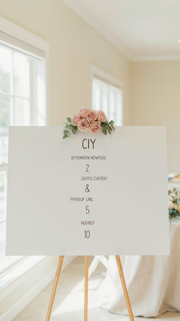
You want your seating chart to look effortless so guests think you didn’t stress over it, which is the real fear underneath. The mechanism is constraint: remove every visual element that doesn’t solve the problem of getting people to their tables. A minimalist seating chart uses negative space as a design tool, not a budget excuse. White background, readable font, one accent color maximum. That’s the full toolkit.

The template you’re actually copying is Swiss design from the mid-twentieth century, which solved information problems by stripping away everything decorative. Apply the same logic here. Your guests need to find their name and table number in under three seconds. Florals, cursive fonts, and decorative borders don’t speed that up; they slow it down. Use sans-serif typeface at minimum 24-point size. Dark text on light background or reversed. That’s not boring—that’s functional.
Clarity Before Ornamentation
Most seating chart advice tells you to “add personality” and “make it Instagram-worthy,” which is how you end up with a display nobody can actually read. Organize names alphabetically by last name or by table number, not by how cute the grouping looks on the display. Guests will search by their own name first, so alphabetical saves them time and frustration. Your job isn’t decoration. Your job is logistics that doesn’t feel like logistics.
Use a single material for the entire display: foam board, wood, or glass. Consistency beats variety. If you’re printing names on cardstock, use one weight and finish. If you’re hand-lettering, use one pen and one hand-size. The constraint forces clarity. Mount the display at eye level, roughly 58 to 64 inches from the ground. You’re not creating an art installation. You’re creating a functional system guests move through without friction.
The Real Obstacle Was Never The Craft, But Your Insecurity Masked As Indecision

You don’t need permission to build your seating chart display. You don’t need it to be Pinterest-perfect. You need to stop researching and start hammering wood or gluing cardstock today. The couples who actually pull this off aren’t craftier than you. They just decided the imperfect version mattered more than the perfect fantasy. Your guests care about the free dinner, not whether your display cost forty dollars or four hundred. Stop waiting for confidence and build it instead.