The “Less Is More” Seating Arrangement Wedding Fallacy
Minimalist Design Means Fewer Mistakes
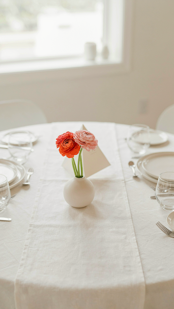
You want a seating chart that looks effortless because you think that signals sophistication and saves money at the same time. Here’s what actually happens: constraint forces clarity. Borrowing from information architecture, your seating chart operates like a navigation system—every node (table, seat, guest) either guides people smoothly or creates friction. Fewer table options don’t mean less work. They mean every placement decision carries weight. A five-table layout has no room for filler or social band-aids.
The real mechanism is ruthless editing. When you strip down to essential tables, you can’t hide weak social combinations behind volume and movement. You stop pretending that shuffling people around solves incompatibility. Instead, you face the actual constraint: which guests genuinely need to sit near the bar, the entry, or the kitchen? Which groups stabilize each other without conflict? Budget seating works because limitation forces you to map actual human dynamics instead of aesthetics.
When Constraints Actually Sharpen Choices
The conventional advice says “fewer options reduce decision fatigue.” That’s incomplete. Decision fatigue only matters if you’re making arbitrary choices. The real mechanism comes from economics: scarcity produces pricing signals. When you have 12 table options, you waste mental energy debating round versus rectangular. When you have two, that question answers itself.
Constraint also exposes your actual data. A tight seating budget forces you to ask hard questions: Who must be separated? Which relationships actually strengthen a table? What’s the actual guest count versus your estimate? These answers don’t emerge from brainstorming sessions. They emerge from friction. The seating chart isn’t minimalist because less looks better. It’s minimalist because it’s the only version that works.
Beyond Pinterest: The Seating Chart As Social Engineering
Strategic Placement For Real Outcomes
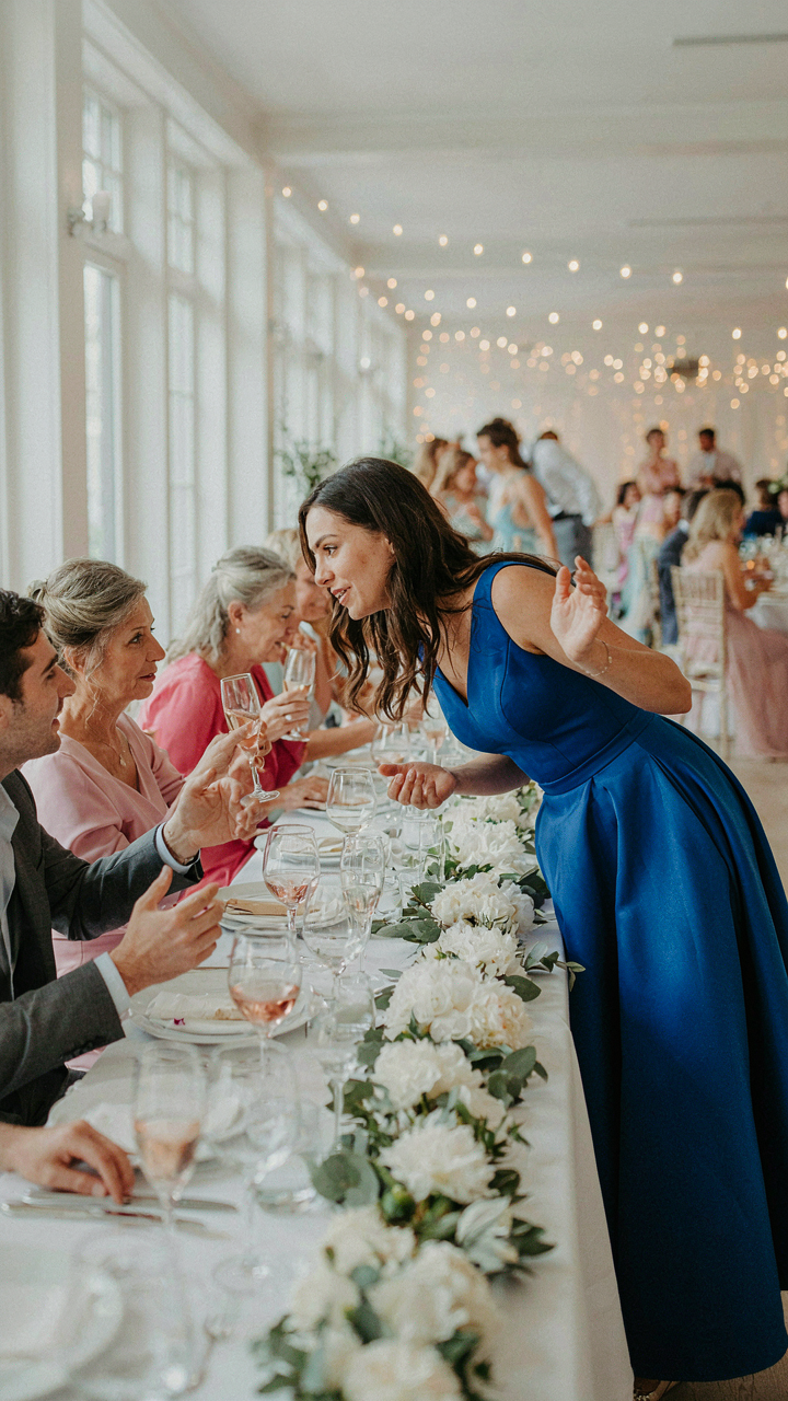
You want your seating chart to look effortless, like guests naturally gravitated to their seats. What you’re actually after is control without visibility. The mechanism is borrowed from network theory: you’re creating nodes and bridges. In network terms, a bridge is a connection between otherwise separate groups. Your seating chart places specific people as bridges—they carry conversation across tables that would otherwise sit silent or fractured.

Most advice says seat friends together. That’s backwards for a reception. You seat one person who knows both tables at the intersection, then build around them. This person becomes the transmission point. They talk to table A, drift to table B, pull someone back to A. The table moves. Without this bridge, you get isolated pods. Budget seating charts fail because they’re random or too predictable. Strategic placement costs nothing but requires you to actually know your guests.
Micro Groupings For Organic Interaction
Forget the round table as your unit. Your real unit is the pairing or trio. Sociology calls this the “triad stability principle”—groups of three hold conversation better than groups of two or four. Three people stabilize each other. Two people create pressure. Four people split into pairs. A budget reception that seats eight at a table should actually be two triads with one mediator between them, not eight random people.
Plant one mediator at each table who can talk to both subgroups. This person doesn’t have to be charming. They just need to move physically and ask real questions. The table then organizes itself around natural affinities instead of assigned places. You’re not forcing interaction. You’re removing friction from interaction that wants to happen anyway. Map out your triads before you place names on a chart.
The Cognitive Load Reduction Protocol For Wedding Seating Plan Ideas Layout
Strip The Decision Tree Down To Three Variables
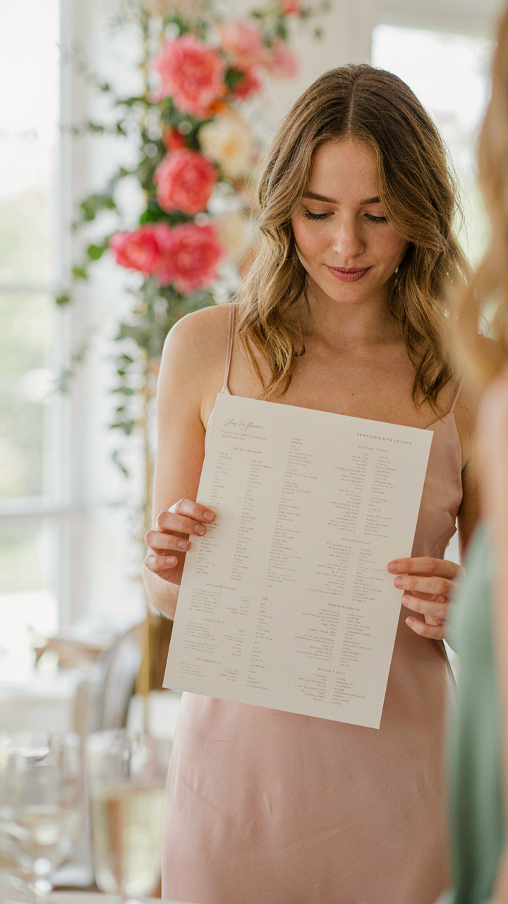
You’re avoiding the real work of deciding who sits where, so you’re drowning yourself in options instead. Cognitive load theory from psychology shows that humans process information through bottlenecks, and your seating chart is no exception. Cap your decision-making to three constraints: table size, guest category, and one wildcard spot per table. Every other variable collapses into these three. Stop collecting Pinterest boards and start eliminating choices.

The mechanism is throttling, not expansion. Most couples think they need a seating matrix with fifty moving parts. They don’t. Build your chart by first assigning family units to tables based on size alone. Then slot friend groups by type: work friends, college friends, local friends. Leave two seats per table unassigned until the end. This removes the paralysis of infinite permutation and forces you into a system that actually moves.
Group By Relationship Density, Not Alphabet
Common advice says to seat people alphabetically or by table number. That’s lazy and wrong. Batching in economics means clustering similar units to reduce transaction costs, and your seating chart operates the same way. Guests who already know each other create their own social friction buffer. Seat them together and they entertain themselves. You eliminate the need for strategic spacing and buffer guests between conflicting parties.
Build tables around existing relationship clusters first. If four people came as a wedding party unit, they sit together. If a friend group attended together, keep them on the same table or adjacent ones. Mix in solo attendees or couples who don’t know the group yet, but anchor each table with a core of people who already function as a unit. This reduces your decision load from managing fifty individual placements to managing eight or nine social clusters instead.
Unconventional Wisdom: Wedding Guest List Ideas Seating Charts
The Real Reason You Need Guest Triage
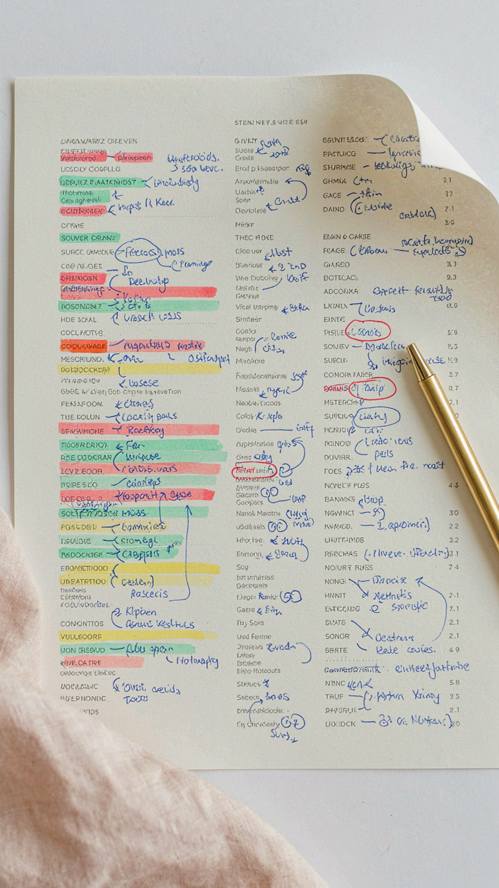
You want the seating chart to feel effortless because a messy one signals poor planning to people whose opinions matter to you. Here’s the mechanism: guest triage works like hospital intake. You sort guests into conflict vectors and affinity clusters before you assign tables. Most people skip this and seat by availability or aesthetics alone, which creates friction points that ripple through the entire reception. You need to identify who talks to whom, who avoids whom, and who carries tension into the room.

Start by listing every guest with one marker: their primary relationship to the couple. Blood relative, spouse’s friend, work connection, childhood friend, spouse’s family. Then add one line of context if conflict exists. This isn’t about drama inventory. It’s about understanding gravitational pull. When you know that your dad’s second wife doesn’t speak to your mom’s sister, you seat them at opposite ends with neutral buffers between them. The chart becomes a tool for reducing friction, not a decorative seating puzzle.
Breaking The Traditional Family Table Model
Most couples seat by family unit because that’s what their parents did. That model fails on a budget because it concentrates conflict and creates social dead zones. Instead, classify guests by function: connectors, anchors, and bridges. Connectors are people who know multiple groups and drive conversation. Anchors are comfortable in silence and put others at ease. Bridges are new to the couple’s circle and need strategic placement. You distribute these roles across tables rather than stacking families together.
This approach stretches your budget by using fewer “activity tables” and still maintaining energy. Connectors at each table mean less awkward silence, which feels more expensive than it is. You seat each table with one strong connector, two anchors, and fill the rest with guests who benefit from that dynamic. The mechanics matter more than the headcount. One well-composed table of eight outperforms two tables of eight where people sit in uncomfortable silence or defensive clusters. Build seating lists by role assignment, not by relationship labels.
Creative Seating Charts: Borrowing From Evolutionary Biology
How Species Cluster Under Resource Constraints
You want this section to make you feel smart about your seating chart, like you’ve cracked some hidden code that justifies why you’re not just throwing people at tables randomly. Here’s the mechanism: evolutionary biology teaches that organisms cluster near resources. Apply that to weddings. Guests naturally gravitate toward food access, bathrooms, and social proximity to people they recognize. A budget seating strategy maps these clusters before guests arrive, eliminating the chaos of people standing, wandering, or creating bottlenecks.

The common advice says to “mix and mingle” or “seat strangers together for conversation.” Wrong framing. You’re not trying to engineer friendships. You’re trying to prevent friction points that waste money on extra staff, longer bar lines, or food running cold while people search for seats. Map your room’s physical reality first: where’s the kitchen exit, the bar, the bathroom door? Then seat your clusters in rings around those resources, not against them. Your budget shrinks when people stop moving and complaining.
Table Flow Optimization: The Circulation Pattern
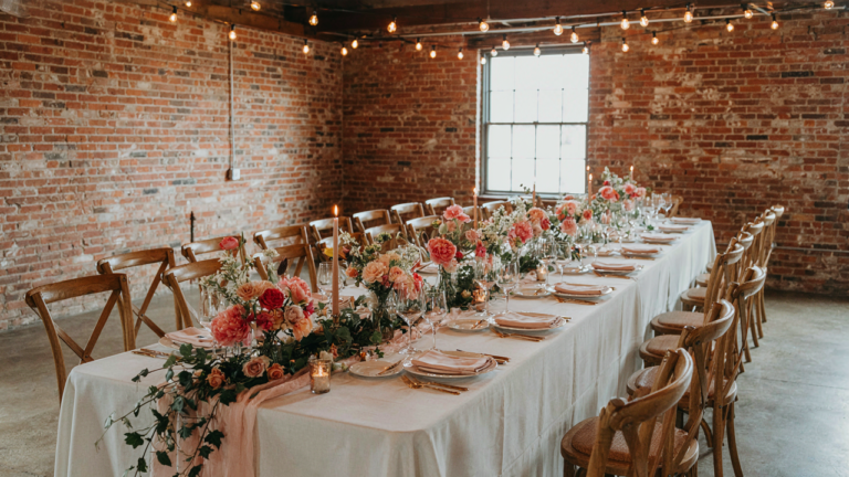
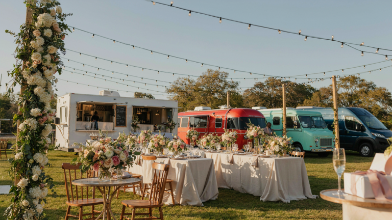
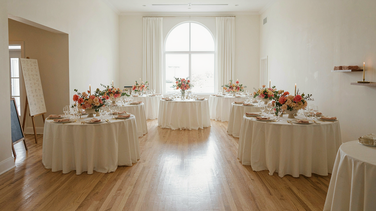
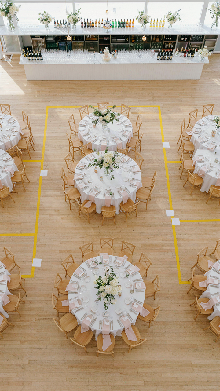
Table placement isn’t decoration. It’s traffic engineering applied to your reception space. Efficient table flow means guests move through the room without colliding, waiting, or creating dead zones where food piles up uneaten. The mechanism is simple: stagger table heights and positions so sightlines open, pathways exist between clusters, and staff can move serving trays without squeezing past seated guests. A ten-by-ten room with six tables arranged in a line creates gridlock. The same room with tables in two offset rows cuts friction in half.
Budget seating chart ideas succeed when you treat the reception space as a functional system, not a canvas. Tables at the edges of your room create a perimeter where staff circulate freely. Center tables waste floor real estate and trap both guests and service staff. Measure your space, mark the exits and service points with tape on the floor, then build your table arrangement around those fixed constraints. This single protocol drops stress and lets you cut back on hired helpers without sacrificing service.
Seating Ideas For Wedding: The “Flow State” Configuration
How Guests Actually Move Through Space
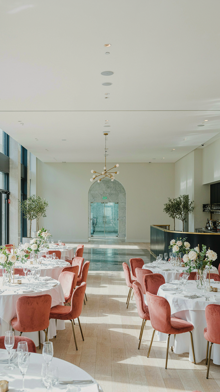
You’re worried people will feel cramped or lost, and that reflects poorly on you as the host. Here’s the mechanism: bottlenecks kill momentum. Borrow from traffic engineering—the science of pedestrian flow treats guests like particles moving through a system. Narrow aisles, blocked sightlines, and tables positioned perpendicular to natural walking paths create friction. Wide, obvious routes between entrance, bar, dance floor, and restrooms keep movement fluid. Budget constraints force this clarity anyway—you can’t hide poor layout with expensive decor.

Position tables in rows or gentle curves aligned with the room’s longest sight line. Never grid them in tight formations. Leave at least six feet between table clusters for comfortable passage. The bar and bathrooms should have dedicated clear paths, not routed through the middle of your seating. This costs nothing but attention during your layout walk-through. Test it by imagining yourself at table six trying to reach the restroom without navigating an obstacle course.
Eliminating Awkward Moments Before They Happen
The real problem most couples face isn’t seating itself—it’s the moment someone reaches their assigned table and feels exposed or uncomfortable before sitting down. That discomfort compounds throughout the night. Remove friction by creating natural entry points where guests orient themselves and scan for their seat without stopping cold in the middle of the room. Table numbers visible from ten feet away matter more than place cards. Keep the perimeter tables within two or three steps of the edges so latecomers don’t cross an open dance floor to find their spot.
Assign larger tables near the kitchen and service areas, smaller ones toward the edges. This balances sound levels naturally and keeps conversations at center tables from competing with plate clanking. Never put the kids table in a corner where parents lose sight lines—visibility prevents discipline issues and lets you actually enjoy the reception. Mark a clear path from entry to coat check to seating area. The fewer decisions a guest makes while standing, the faster they settle in and relax.
Ideas For Seating Chart At Wedding: The “Anti Hierarchy” Approach
Every Seat Becomes A Good Seat
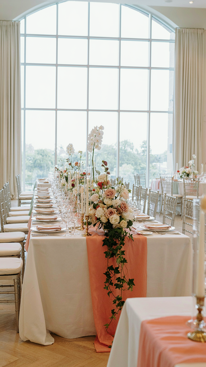
You’re worried about looking cheap because someone sits at the back. That’s the real issue. But the mechanism is simple: perceived value comes from symmetry and sightlines, not proximity to the head table. When every table has equal access to the dance floor, bar, and bathroom, no seat reads as punishment. Borrow from theater design: the best seats aren’t always closest to the stage. They’re the ones with unobstructed views and balanced acoustics.

The head table itself is the culprit. It signals rank. Remove it entirely or rotate seating so no single spot dominates the room. Replace hierarchy with function. Position tables equidistant from the focal points that actually matter: music, food service, restrooms. This costs nothing extra. In fact, it often saves money because you stop paying premium for “premium” table placements that nobody cares about once the meal starts.
Stop Calling Tables By Numbers
The table number system trains people to feel ranked the moment they see their card. Replace numbers with names: streets from your hometown, favorite songs, inside jokes as a couple, or constellation names. The label stops signaling status and becomes a navigation tool instead. This single change eliminates the silent comparison game people play before they sit down.
- Hometown Streets: Use street names from where you grew up, making every table feel personal rather than hierarchical or transactional.
- Song Titles: Name tables after songs meaningful to your relationship, turning them into conversation starters and memory anchors.
- Inside Jokes: Pull from your friend group’s shared history, ensuring people bond over the reference before they order drinks.
- Constellation Names: Use star maps or mythology, creating visual cohesion when printed on cards and signage across the room.
- Destination Names: Reference places you’ve visited together or dream vacations, making seating feel like shared adventure rather than assigned rank.
The psychology shift is immediate. When a guest reads “Orion Table” instead of “Table 8,” they’ve already moved past the mental arithmetic of what that number means. You’ve reframed seating as organization, not social sorting. Guests relax because the framing device itself removed the comparison framework. Print these names large and consistently across place cards, table tents, and your seating chart display.
Table Seating Ideas: The “Controlled Chaos” Method
Break The Assigned Seat Trap
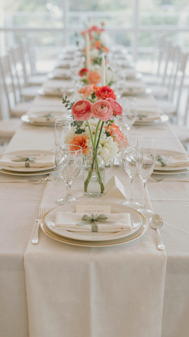
You want people to mingle without the social friction of forced interaction, and you’re hoping a seating chart solves that without costing extra. Here’s what actually works: borrow from network theory, where connection strength depends on weak ties, not proximity. Your budget seating chart isn’t about keeping people comfortable in their existing social clusters. It’s about placing strangers within two degrees of each other so conversations happen naturally, not because you engineered them.

The mistake most people make is treating a seating chart like a checklist of avoiding conflicts. That’s incomplete. You’re not just preventing Uncle Mark from sitting near Aunt Linda. You’re architecting which new conversations happen and which don’t. Random assignment looks cheap but produces nothing. Strategic randomness costs the same and produces unexpected business relationships, new friendships, and stories people actually remember. The mechanism is simple: seat people next to someone from a different social circle, but ensure they share at least one mutual connection at the table.
Mix Signals Before The Event Starts
Organic seating dynamics fail because people arrive expecting assigned seats to match their comfort zone. Stop waiting for natural flow and create it beforehand. Three days before the wedding, send a brief message asking each guest one question: “Who at the wedding do you want to definitely connect with?” Not “sit with,” but connect with. People name their actual interests, not just their safe groups.
Use those answers to build tables of six where two people get their wish, two get a planned surprise connection, and two serve as connectors who know someone at the table already. This isn’t random. It’s precise. Print a simple seating card at each place showing the guest’s name and one conversation starter fact about the person sitting to their right. They arrive, read it, and start talking before the appetizer lands. The mechanism works because you’ve removed the silence that kills conversation before it starts.
Wedding Seating Chart Display: The Invisible Hand Presentation
Let Guests Find Themselves
You want people to think the seating happened by accident, not by your design. That’s the real fear underneath asking about display methods. The mechanism borrowed from economics is information asymmetry: you know the chart solves a problem, but guests shouldn’t feel managed. A seating chart display works when it feels like it’s helping them navigate, not steering them toward a predetermined outcome.

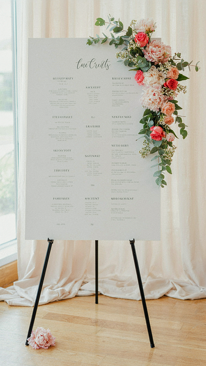
Post the chart at the entrance where people encounter it naturally, before they commit to a table. Use a single poster board or printout, nothing elaborate. The goal is clarity, not decoration. Most couples overcomplicate this by treating the display itself as a design element when it’s just functional infrastructure. Guests need to locate their name, find their table number, and move forward. Everything else is waste.
Cardstock Over Complications
Skip the calligraphy, skip the frame, skip the decorative stand that screams “look at me.” Cardstock mounted on foam board costs ten dollars and reads from six feet away. That’s the entire calculation. The common advice says a display should match your theme or color scheme. That’s wrong. A display should disappear after serving its purpose. No one remembers how they found their seat. They remember the food and the conversation.
Print names in a font size guests can read without glasses or leaning in. Organize by table number, not by family or guest type. Use a grid format that lets the eye scan left and right quickly. Laminate the poster if you’re outdoors or in a humid space. Position it perpendicular to foot traffic flow so people don’t cluster and block each other. The display vanishes the moment everyone sits down.
Reception Seating Chart: The “Guest Experience First” Mandate
Proximity Breeds Conversation
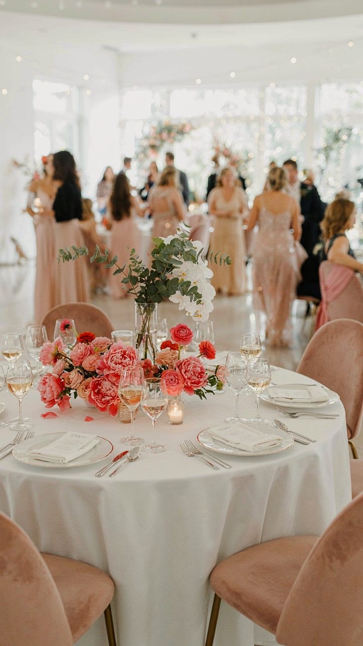
You care about this because a bad seating chart makes you look like you didn’t think. The real mechanism is borrowed from urban planning: density. Architects know that foot traffic and spontaneous interaction spike when destinations sit within walking distance. Your reception works the same way. Guests won’t cross the room to talk to someone. They talk to whoever sits near them. Close proximity removes friction from socializing.
Table size and shape directly control conversation flow. Round tables seat six to eight people and force eye contact across the center. Rectangular tables favor the ends and create dead zones in the middle. Budget constraints often push couples toward longer rectangular tables to fit more people per table. This is a mistake. One round table of six beats two long tables of six in terms of actual dialogue. If your budget is tight, reduce headcount per table rather than sacrificing the shape.
How Guests Shape What Comes Next
Asking for feedback post-event sounds like generic advice. It’s not. The mechanism is feedback loops from systems theory. A loop only works if you close it. Most couples collect feedback but don’t change anything, so the loop breaks. You need to identify which seating decisions actually shifted guest behavior, then apply that knowledge to future events you plan or influence.
Hand out a single-question card at the exit or email a survey within 48 hours while memory is fresh. Ask this: “Who did you sit with, and did that conversation change your experience of the night?” Don’t ask if they had fun. Ask what proximity produced. The answers tell you whether your seating logic matched your guest mix. Repeat the layout that worked. Scrap what didn’t. Seating decisions compound only when you measure them against reality, not intention.
The Real Problem Isn’t Your Budget; It’s Your Inability To Define What Truly Matters
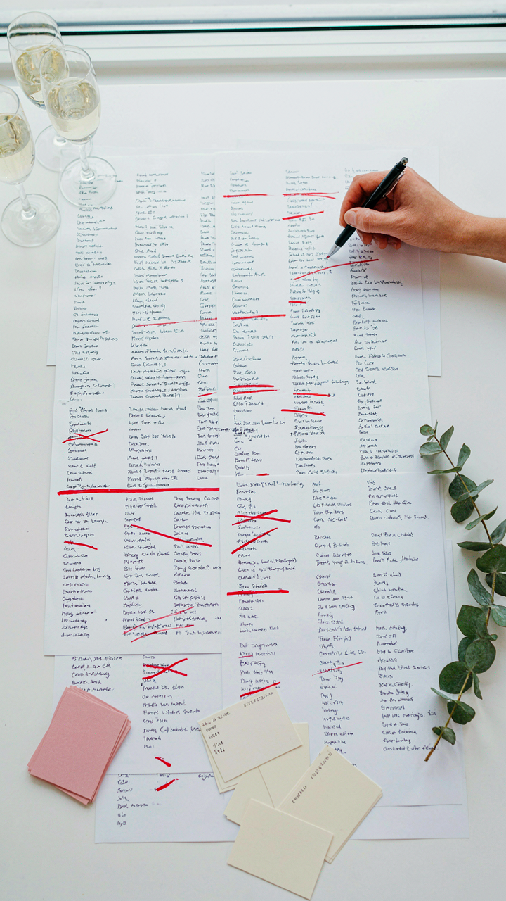
Most couples waste money on seating charts because they never decided who actually matters at their wedding. You’re overthinking logistics when you should be ruthless about your guest list first. Today, write down the non-negotiables: who makes the day better by being there? Build your seating around those people, not around some arbitrary budget formula. The cheapest seating chart is the one that seats fewer people who genuinely deserve to celebrate with you.