Beyond Pinterest: The Scarcity Principle Of Budget Photowall Wedding
Constraint Creates Signal
You’re afraid people will think you cut corners. That’s the real fear. But here’s what actually happens: constraint forces design decisions. When you have unlimited budget, you add more. When you don’t, you remove noise. Economics calls this the scarcity principle—limitation forces prioritization. Apply it to your photowall and you eliminate the visual clutter that makes cheap setups feel cheap. You’re not building less. You’re building tighter.
The difference between a budget photowall that lands and one that screams “we spent nothing” has nothing to do with dollar amount. It’s about intentionality. A wall with twelve carefully selected, well-printed photos at consistent sizes beats a wall of forty random shots in mismatched frames. Guests notice coherence first, price tag never. The mechanism is simple: fewer elements demand higher quality per element. That’s where your budget actually goes.
The Frame Hierarchy Problem
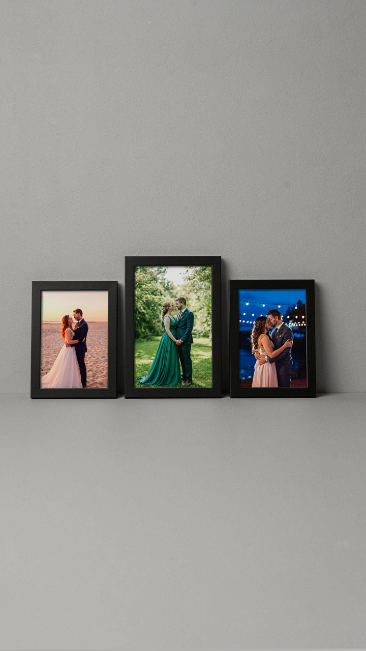
The common advice says “mix frame styles for visual interest.” That’s backwards and makes budget walls look scattered. What actually works is establishing one clear frame story, then breaking it strategically. Most people see a budget constraint and default to matching everything, which reads as either sterile or cheap depending on execution. Instead, pick your dominant frame style, commit to it for sixty to seventy percent of the wall, then introduce a secondary style in one deliberate zone. This creates rhythm instead of chaos.
The execution matters more than variety here. If your dominant frame is simple black wood, all pieces must sit flush to the wall at the same depth. No crooked hangs. No mixed orientations. The secondary frame style—maybe metal or acrylic—goes in a bounded section, not scattered throughout. This discipline costs nothing but attention. When guests see alignment and intentionality, they assume investment happened, regardless of frame cost. The real tell isn’t what you spent. It’s whether every piece has a reason for existing where it exists.
The “Memory Minefield” Method: Curating Wedding Photo Wall Ideas

Filtering Photos Before The Wall Goes Up
You want the wall to look intentional because you’re terrified it will look like a scrapbook exploded. Here’s the mechanism: curation is signal compression. In information theory, signal-to-noise ratio determines how much meaning gets through to the viewer. Every photo you add either reinforces the story or dilutes it. Most people dump 80 photos on a wall and hope proximity creates narrative. It doesn’t. The wall becomes visual clutter that registers as “tried too hard” in under three seconds.

Start by sorting your wedding day photos into three buckets: ceremony and vows, celebration and movement, and intimate moments. Keep only the sharpest, clearest shot from each moment. Delete alternates immediately. Then count: aim for 12 to 18 photos maximum for a standard wall. Fewer photos force better selection and create negative space that lets each image breathe. The constraint is the design tool, not the limitation.
Emotional Weight Over Head Count
Stop treating photo walls like space you need to fill. The actual goal is to anchor viewers in one feeling for three to five seconds per photo. Psychology calls this affect priming, and it works whether you stack 40 images or 15. Most budget reception photo walls fail because they treat quantity as proof of investment. It’s the opposite. One perfect photo of your first dance in clean light beats five mediocre shots of appetizers.
Build the wall around three anchor photos: one from ceremony, one from your first moment together after the vows, and one from peak celebration. These form the emotional spine. Fill the remaining wall space with supporting moments that echo those feelings. Use consistent framing and similar lighting to create visual rhythm. The viewer’s eye moves through the story in order, not chaos. End your selection process by removing any photo where you hesitate for more than two seconds. Hesitation means it doesn’t belong.
Deconstructed Backdrop: Wedding Backdrop Design Indoor Simple
Raw Materials As Visual Anchors
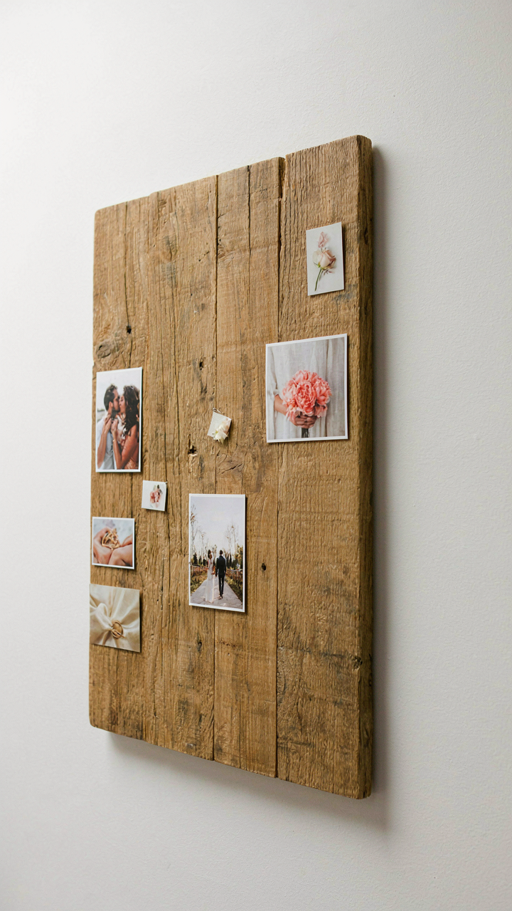
You want people to think you spent money you didn’t spend. That’s the real game here. The mechanism is contrast: your brain registers expensive materials against cheap ones and assumes competence. Photography’s rule of thirds mirrors this in design. One strong anchor material does the heavy lifting while everything else recedes. This isn’t decoration. It’s visual hierarchy.

Start with one material that stops the eye. Reclaimed wood, exposed brick, or a single sheet of quality fabric creates the anchor. Everything else becomes supporting cast. The material must be real, not printed or faked. Your camera catches the texture. Guests see depth. The cost stays low because you’re not filling the entire wall. You’re placing one element where it matters most. Measure the wall first. Position your anchor where 40 percent of photos will frame it.
Negative Space As Strategic Emptiness
Empty space isn’t wasted space. Industrial design calls this principle “reduction,” where omission becomes the design itself. Most budget backdrops fail because they cram too much into too little room. They look desperate. The opposite move works better: leave most of the wall bare. One or two visual elements against plain wall reads as intentional, not cheap.
Pick a backdrop wall that’s already plain. Paint it matte white or soft gray if needed. Cost is minimal. Position your anchor material in one corner or centered, depending on your photo flow. The rest stays empty. This creates visual breathing room and forces attention onto your couple. Photographers call this “compositional silence.” It makes their job easier and your photos stronger. The wall becomes invisible. The people become unavoidable.
The “Echo Chamber” Effect: Amplifying Wedding Picture Walls
How Sound Principles Shape Visual Placement
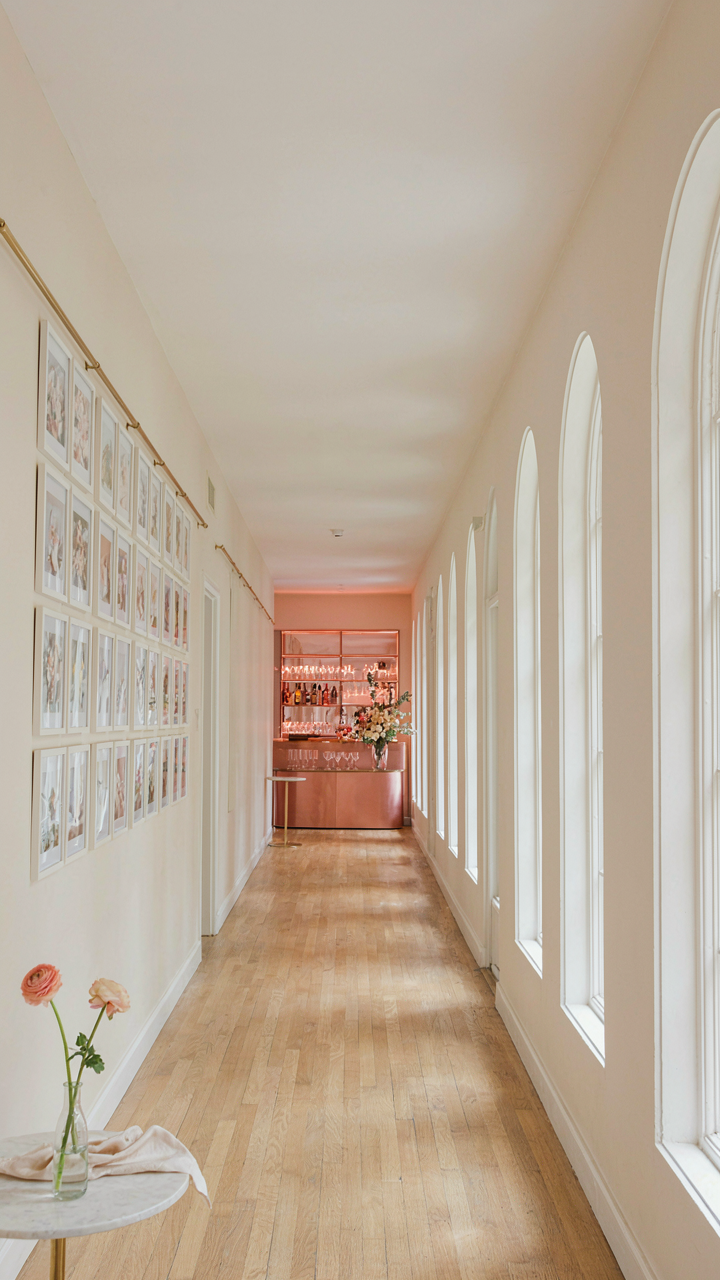
You want people to linger at your photo wall because you believe it proves the wedding mattered. That’s the real reason. Here’s what actually works: borrow from acoustics. In sound design, resonance happens when a space reflects and amplifies waves at specific frequencies. Your photo wall needs the same treatment visually. Guests need physical and visual paths that funnel them toward the display, not scatter them away. The wall itself doesn’t work in isolation. Its impact depends entirely on what surrounds it and how people move through that space.

Sight lines matter more than the photos themselves. Most couples hang their wall on any available surface and hope for engagement. Wrong move. Place your photo wall where guests naturally pause or transition between spaces. A hallway leading to the bar. The wall opposite the food table. Anywhere you’ve already observed foot traffic patterns at events. The physics principle translates directly: you’re creating a visual corridor that concentrates attention instead of dispersing it. The wall becomes unavoidable, not optional.
Distance And Density Drive Viewer Stops
Strategic placement means reading the room’s geometry first, not your preference. Guests won’t cross a crowded dance floor to see your photos. They will stop if the wall sits at a natural rest point. Three to five feet of clear space in front of the display lets people actually stand there without blocking others or feeling cramped. Most budget walls fail because they’re either crammed into corners or positioned where people can only glance from across the room. Neither works. The distance between the viewer and the wall determines how much detail registers. At eight feet, only broad compositions matter. At three feet, individual faces and moments become legible. You control engagement by controlling proximity.
Density of images creates the stopping mechanism itself. A sparse wall of five photos feels incomplete and gets ignored. A dense grid of thirty to forty smaller prints creates a visual event that compels people to inspect it. Budget constraints force you to think small format, which actually serves this principle. Multiple four by six prints clustered together create more visual weight than two large prints spread across the same wall space. Arrange your photos in a grid pattern or salon-style layout with consistent spacing. This removes the burden of “will people notice” and replaces it with a structural guarantee: the accumulated visual mass demands attention.
Digital Vs. Tangible: The Wedding Photo Walls Illusion
Why Physical Prints Still Matter
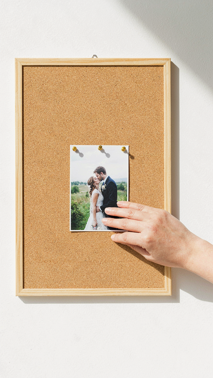
You want permission to skip the prints because screens feel more modern and less work. Here’s what actually happens: paper creates friction that forces guests to slow down and engage. Print permanence triggers a different neural pathway than scrolling does. Your brain treats physical objects as more real, more valuable, more worth remembering. This isn’t opinion. It’s how humans process information differently based on medium.

Printed photos cost less than most couples think, especially at budget scale. A 4×6 print runs fifteen to thirty cents. A poster-size print from a bulk printer costs two to five dollars. The real expense isn’t materials—it’s the labor of organizing, printing, and hanging them. One five-hour Saturday with a friend and a staple gun gets the job done. Guests photograph the wall anyway, so the physical presence creates both a moment and content.
When Digital Displays Actually Work
Digital displays follow what economists call the “attention economy” principle: they compete for cognitive bandwidth. On your wedding day, a screen enters a crowded field of distractions. Most digital walls fail because they’re passive—photos cycle without interaction. Couples install them expecting guests to watch like a slideshow. That’s backwards thinking. A digital display only works when guests control it or when it serves a practical function beyond decoration.
- Photo booth integration: Connect live booth output to a display so guests see themselves immediately after capture. This creates active engagement instead of passive viewing.
- Interactive touchscreen: Mount a tablet or screen guests can swipe through, filtering by photographer or time period. Engagement requires participation.
- QR code system: Use a digital frame that updates when guests text photos to a number. The wall becomes a collaborative tool, not a broadcast.
- Live social feed: Pull hashtag posts from Instagram or a wedding app. Guests want to see their own contribution displayed in real time.
- Countdown or timeline display: Show photo sequences tied to the day’s schedule, like getting-ready shots evolving into ceremony images. Context adds meaning.
The mechanism that determines success is whether the display creates a feedback loop. If guests contribute to it, it holds attention. If it only displays what the couple selected beforehand, it becomes decoration that most people ignore within minutes. Print walls win on budget because they cost less and don’t require power or troubleshooting. Digital walls win only when they’re interactive or serve a functional purpose beyond aesthetics. Most couples pick digital for the wrong reason—thinking it looks more current—then wonder why nobody looks at it.
Beyond The Frame: Innovative Wedding Photo Display Tactics
Make Your Guests Participate In The Display
You want your photo wall to feel like something guests talk about after leaving, not something they walk past. The real mechanism here is engagement economics: passive viewing costs attention, but participation creates memory. A static wall with photos pinned to it dies the moment someone scrolls their phone. The difference between a display that registers and one that vanishes is whether guests interact with it or just absorb it.
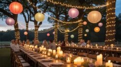
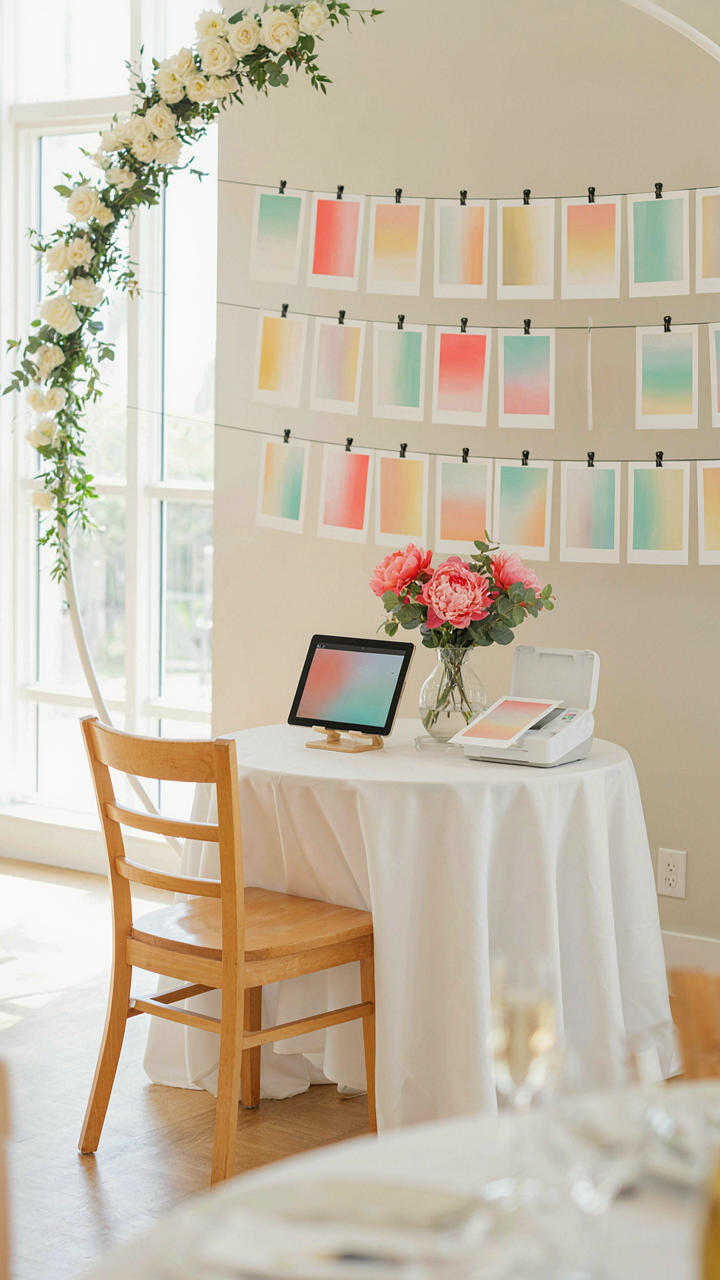
Build a station where guests add their own phone photos to the wall in real time. Use a simple system: a small printer connected to a tablet or a QR code that feeds guest submissions into a shared album displayed on a monitor. Guests become collaborators instead of spectators. This turns a photo display into an event within the event, and it costs almost nothing beyond the printer or QR setup you’d likely justify anyway.
Work With What The Venue Already Built
Most venues have architectural features nobody thinks to use because the standard advice is to cover walls with photos. That advice is incomplete. A ceremony arch, exposed brick, tall windows, or even a dark accent wall becomes functional if you treat it as your frame instead of fighting it.
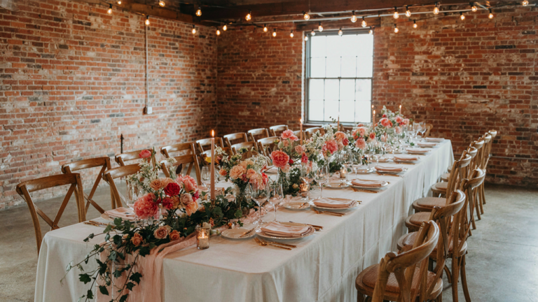
Mount photos directly onto existing structures using fishing line, removable adhesive strips, or clips that grip without damaging surfaces. A brick wall needs no backdrop because the texture becomes part of the composition. Windows create natural backlighting if you position photos against them. Architectural details you’re already paying for through venue rental suddenly serve double duty. Confirm with the venue which surfaces allow adhesive or mounting hardware before the event day.
The Anti Glamour Gala: Authentic Photo Wall For Wedding
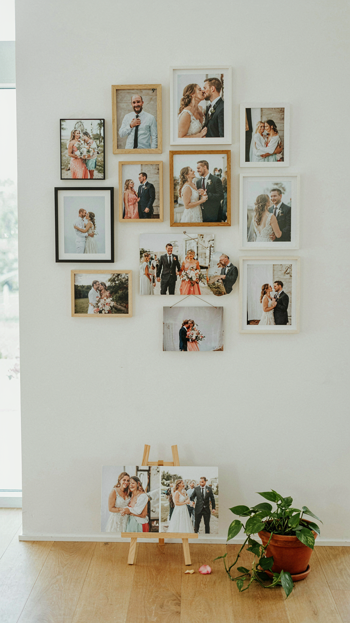
Why Messy Photos Outperform Polished Ones
You want your photo wall to feel expensive without the expense. That’s the real motive. The mechanism is contrast. In visual hierarchy, imperfection creates cognitive friction that forces attention. Polished, curated walls blend into background noise. Your guests scroll past them. Messy walls stop scrolling because the brain registers inconsistency as signal. Bent corners, slightly faded prints, candid moments mid laugh, blurry shots that capture motion instead of stillness—these elements work because they demand interpretation. Guests lean in. They linger. They actually remember what they saw.

The common advice says “make everything matchy and clean.” That’s wrong. Museums learned this decades ago. Gallery spaces with intentional asymmetry, mixed frame sizes, and layered compositions drive longer engagement than uniform grids. Budget reception photo walls that embrace this principle cost less because you stop spending money trying to hide imperfections. You stop printing test batches. You stop over editing. You print once, you hang once, you move on. The constraint forces authenticity, and authenticity is what reads as expensive to the human eye.
Stories Beat Aesthetics Every Single Time
Personal narratives drive retention in neuroscience. When a photo tells something specific about the couple or their relationship, the viewer’s brain fires differently than when viewing a generic sunset. Your photo wall should anchor on moments that only those people understand. That inside joke. The terrible photo from their first date where they both look awkward. The one where the groom’s mom is laughing so hard she’s crying. These aren’t beautiful. They’re true. Truth is cheaper to produce than beauty. You don’t need a photographer at every moment. You don’t need expensive equipment. You need screenshots from text conversations, polaroids from a decade ago, blurry phone pictures nobody bothered to delete.
Hang these photos with minimal framing or staging. Clothesline and clips work. Masking tape works. The sparse presentation makes the narrative louder. Guests read the story, not the frame. You can print photos at any drugstore. Costs drop to cents per image. The narrative layer—what makes people actually connect to the wall—costs zero. It’s information your couple already owns. The mechanism is simple: specificity triggers memory in the viewer. Memory triggers emotion. Emotion triggers the photo being shared, talked about, and remembered. This is how a budget wall becomes more valuable than a designer wall.
The “Un Wedding” Backdrop: Wedding Picture Backdrop Ideas
Why Standard Backdrops Fail You
You want your photos to look intentional, not rented. That’s the real concern here. Most couples default to prefab backdrops because they’re visible and easy, but they signal the opposite of what you’re trying to communicate. Standard backdrops train the eye to expect mass production. They flatten personality. The mechanism at work is contrast: your photos stand out only when the backdrop doesn’t compete for attention or scream “wedding industry product.”

Real backdrops work through subtraction, not addition. Remove the branded tension, the forced elegance, the stuff that costs money without adding meaning. A blank wall costs nothing and does more. A textured surface pulls focus without demanding it. The cheapest backdraft idea is always the one that doesn’t announce itself as a backdrop. Your guests shouldn’t notice the background. They should notice who’s in front of it.
Surfaces That Carry Weight
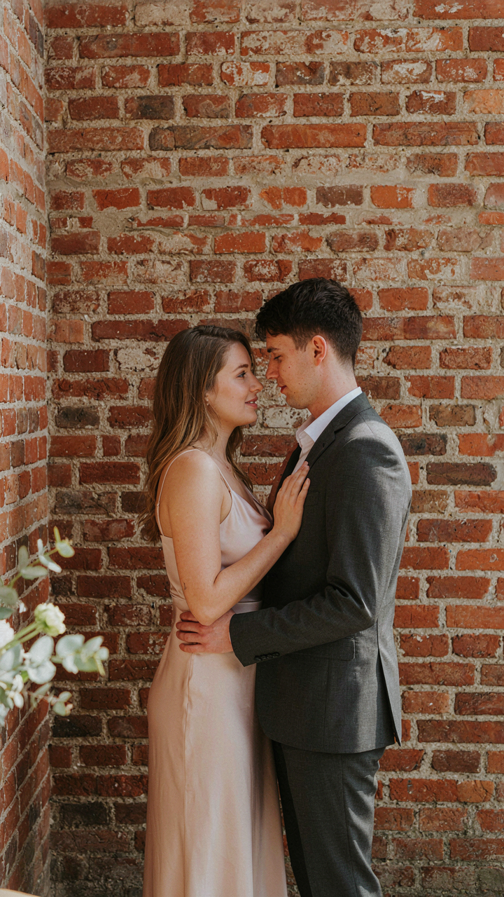
Brick, concrete, and reclaimed wood aren’t trendy because they’re pretty. They’re used because they anchor a frame. In photography, weight refers to visual density: how much a surface absorbs or reflects light and holds a viewer’s attention. An exposed brick wall achieves weight through texture without expense. Concrete delivers the same through raw finish and neutral tone. Both materials communicate intentionality because they exist independent of the wedding itself.
Hunt for these surfaces at venues you already control: lofts, barns, gardens with fences, warehouses. Skip renting fabric or constructing frames. Repurpose what’s already there. A weathered fence becomes a backdrop by placing it ten feet behind your subjects and lighting it differently than the space around it. Paint matters less than structure. The cost difference between a generic white sheet and existing architecture is the margin between looking planned and looking lucky.
The Real Obstacle Isn’t Your Budget; It’s Your Fear Of Standing Out

You’re not avoiding a DIY photo wall because you lack money. You’re avoiding it because you fear your guests will judge you for doing something different. That fear costs more than any photo wall ever will. It costs you authenticity. Stop waiting for permission to build something that reflects who you actually are. Spend thirty minutes today sketching your vision on paper, no budget attached. Your wedding reflects your choices, not your apologies.