Beyond Pinterest Boards: The DIY Wedding Sign Project Mindset Shift
Your Sign Doesn’t Need Permission
You’re scrolling through 10,000 identical chalkboard signs because you want validation that yours will look acceptable. Here’s the mechanism: Pinterest trains you to mistake trends for taste, and consensus for correctness. Your actual job is to stop hunting for approval and start noticing what your venue, your wedding, and your guests actually need.
The DIY wedding chalkboard sign isn’t a decoration problem. It’s a communication problem wearing a decoration costume. Every generic sign you see fails because it was built to match a template, not to solve a specific moment. Your sign has one real job: deliver information or emotion at the exact point where your guests need it. That specificity is your competitive advantage. Generic loses to intentional every single time.
Constraints Are Your Design Editor
In physics, constraints don’t limit motion, they direct it. A river doesn’t flow everywhere at once. It flows harder, faster, and more efficiently because the banks force it into a single path. Your DIY sign has real constraints: budget, materials, display time, readability distance, and the fact that you’re probably making it yourself without a design degree.
Most advice tells you to work around constraints. That’s backward. Use them. A $15 budget forces you to pick one typeface instead of five, which makes the sign stronger. A chalkboard medium forces legibility and restraint. Limited time before the event forces you to finish instead of overthink. Identify your three hardest constraints, then make decisions that use them as guides. This is how amateurs make work that looks intentional.
Deconstructing “Chalkboard Wedding”: The Core Materials Myth
Surfaces That Actually Work Beyond Black Paint
You want people to think you spent more than you did. That’s the real reason you’re reading this section. The mechanism is simple: surface texture creates perceived value faster than color alone. In economics, this is called the signaling problem—you’re competing against the audience’s assumption that DIY means cheap. The surface you choose signals craft or laziness before a single word lands on it.

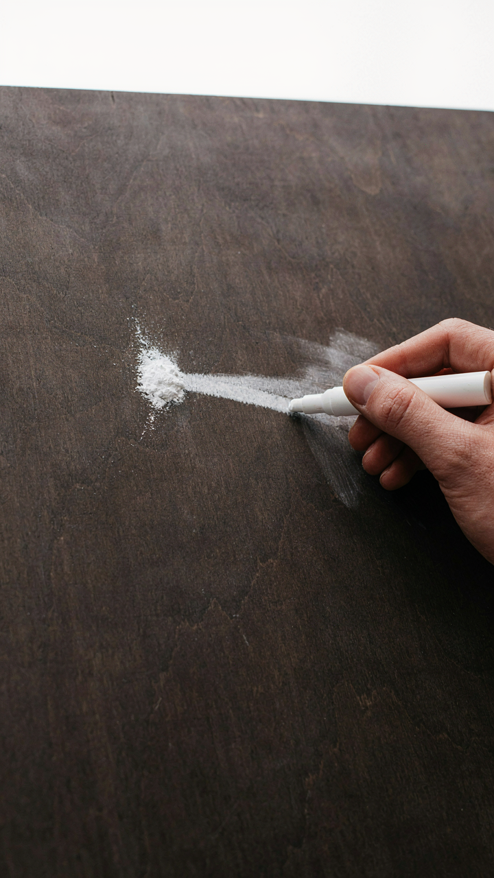
Black chalkboard paint is the consensus trap. It works, but it’s not the only path, and pretending it is leaves money on the table. Plywood primed with matte black exterior paint holds chalk just as well and costs less. Reclaimed wood stained dark, then sealed with matte polyurethane, accepts chalk markers without the prep work of specialized paint. Concrete boards, slate tiles, and even darkened MDF all function identically for chalk adhesion while shifting the visual weight of the piece entirely.
Chalk Markers: The Quality Gap Nobody Names
Not all chalk markers behave the same, and the difference sits in pigment load and binder chemistry, not brand mythology. A cheap marker floods the surface with weak pigment that ghosts and smudges before the ceremony ends. Quality markers use higher pigment concentration and synthetic binders that cure slightly into the surface. Liquitex and Posca markers maintain opacity under low light and don’t fade after two hours of handling—this matters because your sign gets touched, adjusted, and photographed repeatedly.
Test every marker on your exact surface before the wedding day. A marker that flows perfectly on glass performs entirely differently on textured wood. The binder chemistry that works on primed plywood won’t behave the same on sealed concrete. Buy one marker of each type you’re considering, write test blocks on samples of your actual surface material, let them sit for 48 hours, then wipe them with a dry cloth to see what remains. This step eliminates guesswork and prevents the sign from becoming illegible three hours into the reception.
The “Less Is More” Protocol For Wedding Welcome Sign Chalkboard Diy

What Actually Needs To Live On Your Board
You’re afraid people won’t understand what the sign is for, so you’re planning to cram it full. That’s the real problem here. The mechanism is information hierarchy: every element competes for attention, and when everything screams equally, nothing registers.

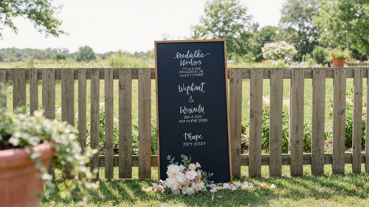
A wedding welcome chalkboard needs exactly three things: the couple’s names, the date, and one directional cue if the space demands it. Everything else dilutes impact. Guests spend three seconds looking at a sign during entry. Make those three seconds count by eliminating noise.
The Power Of Empty Space On Chalk
Graphic designers call this “negative space,” but think of it in terms of contrast, borrowed from photography and visual hierarchy. The white or black void around your text is not wasted real estate; it’s the amplifier that makes the actual words visible and memorable.
Most DIY chalkboards fail because they try to justify every inch of surface area. Leave half the board empty. Your eye needs rest. The welcome message lands harder when it’s not fighting for dominance against flourishes, decorative borders, or secondary information that could live elsewhere on a different sign.
How To Create Chalkboard Wedding Signs: The Typography Tactics
Pairing Fonts Without Creating Visual Noise
You care about this because mismatched fonts make you look like you don’t know what you’re doing. Here’s the mechanism: typography works like contrast in design systems. You need one dominant typeface and one supporting typeface that differ in weight or structure, not both. Sans-serif pairs with serif. Thin pairs with bold. Never pair two decorative fonts or two fonts fighting for attention at the same visual weight.

The old advice says “just pick fonts you like.” That’s how you end up with five typefaces on one sign. Instead, choose your primary font first—the one for your core message like “Mr and Mrs.” Then select your secondary font for details like date or time. They must have different jobs. One handles hierarchy. The other fills it in. Test them at actual size on your chalkboard material before committing.
Hand Lettering Without Being An Artist
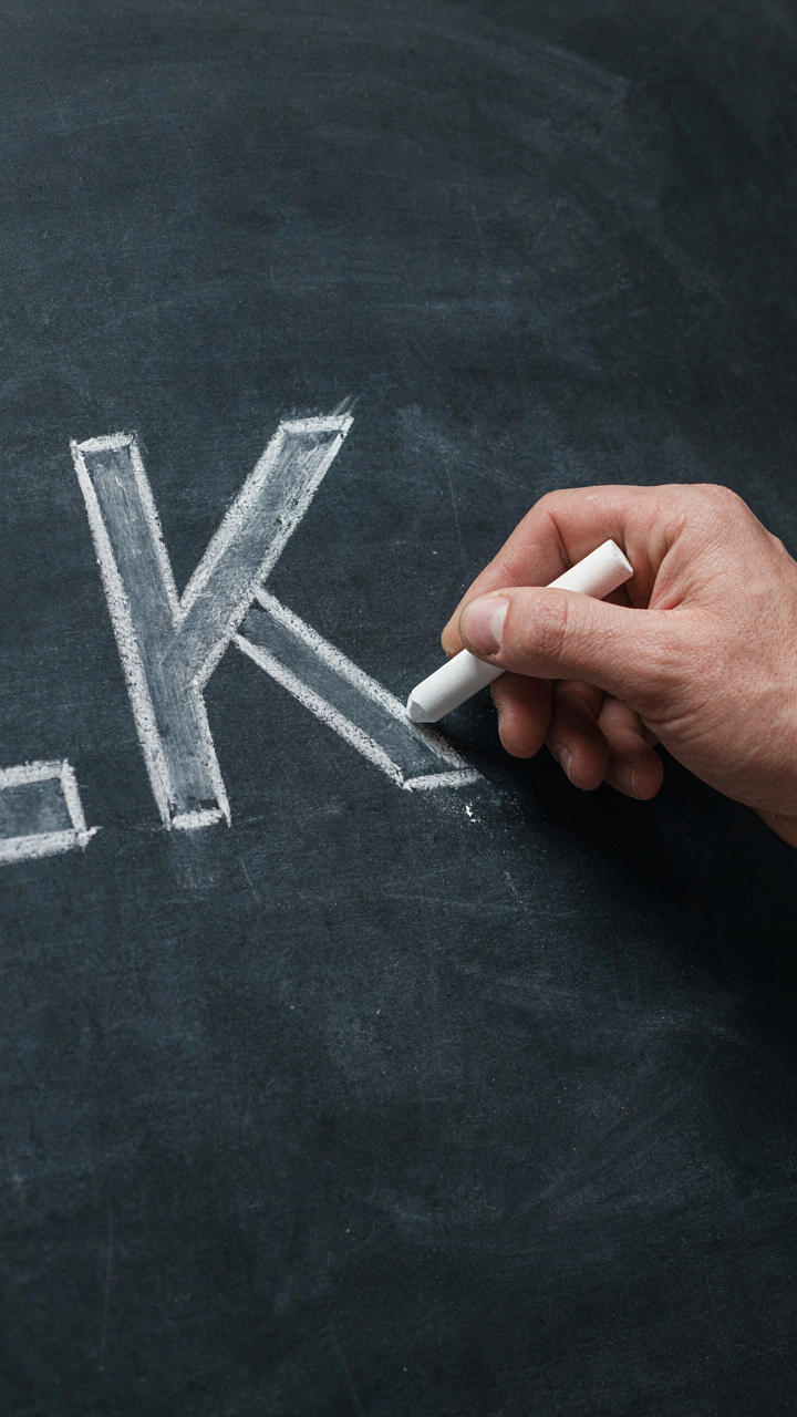
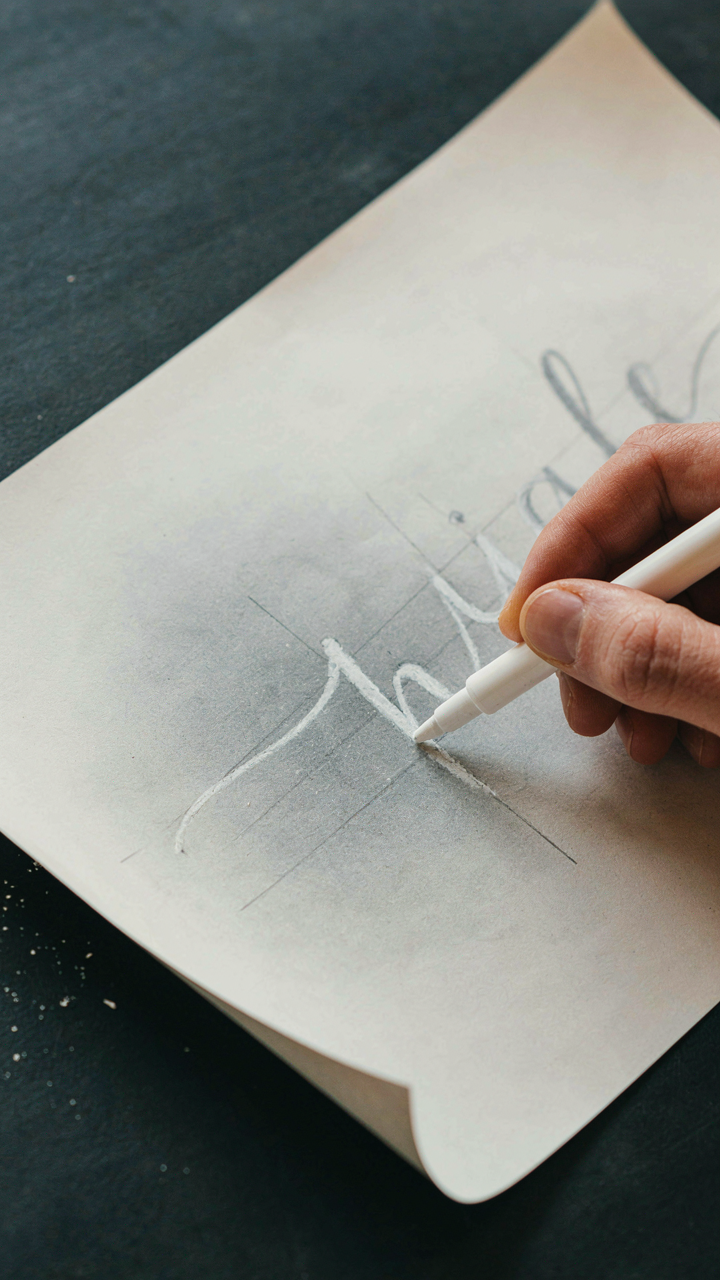
Most people think hand lettering requires natural talent. It doesn’t. It requires tracing and repetition. The real skill is consistency, not artistic flair. Draw guide lines first with a ruler and chalk pencil. Then letter between them. Your letters will stay uniform because the lines force alignment. This method works for anyone who can hold a tool steady.
Start with block letters if you want speed. They’re forgiving. Practice the same word ten times on scrap board before touching your final sign. You’ll naturally improve after the third repetition. Your hand develops muscle memory. Use chalk markers or liquid chalk pens for clean edges. Regular chalk smudges and fades. The tool matters more than talent here.
The “Diy Chalkboard Sign” Engineering: Structural Integrity For The Long Haul
Frame Materials That Actually Hold Weight
You want the sign to look intentional, not like it’s about to collapse mid-ceremony. That fear of failure drives frame selection more than aesthetics do. From a structural engineering perspective, your frame is the load-bearing system, and the chalkboard surface is the load itself. Wood absorbs moisture and warps. Metal rusts or bends under tension. The frame choice determines whether your sign stands for photos or becomes a disaster.
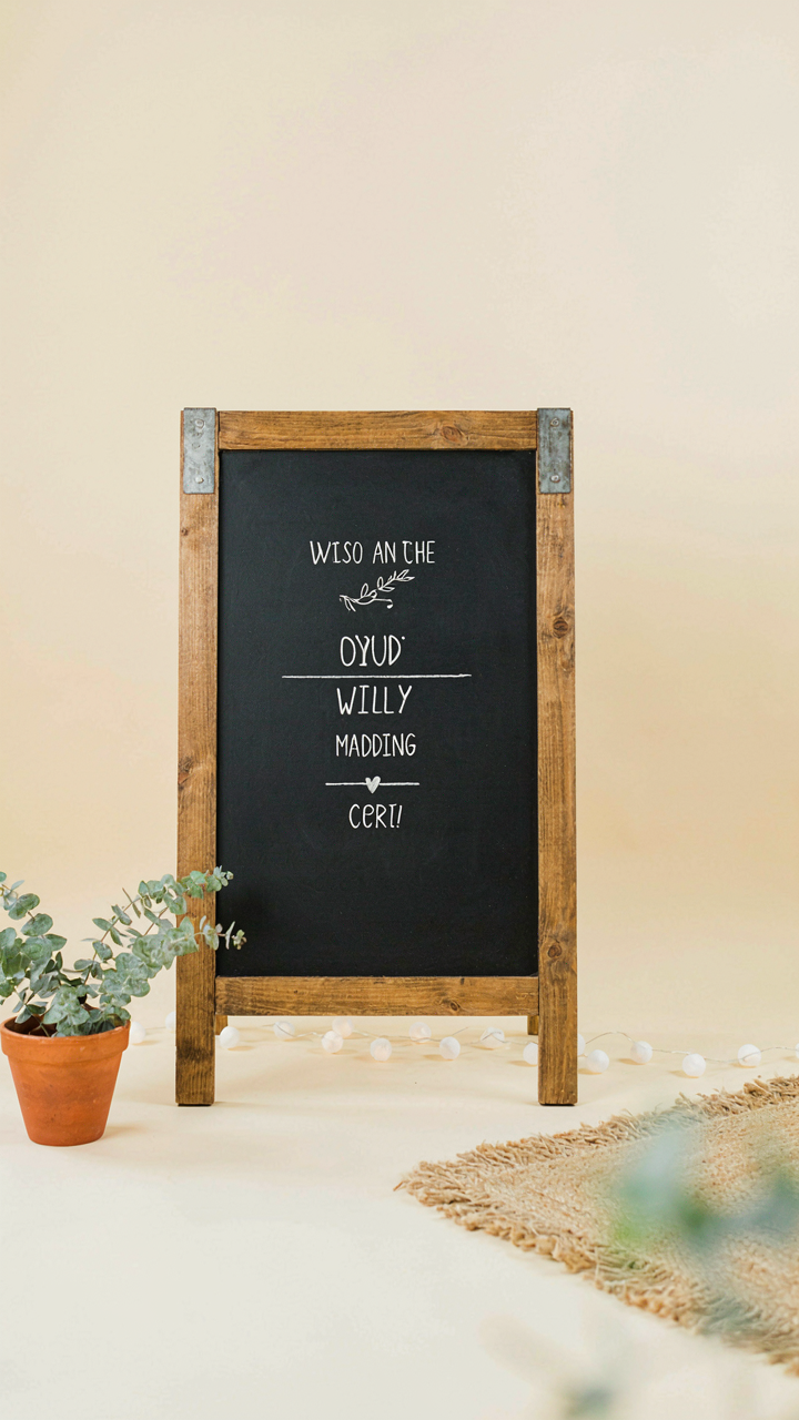
- Reclaimed wood with steel brackets: Combines vintage appeal with genuine stability. Steel L-brackets distribute weight at connection points rather than relying on wood joints alone, preventing sagging over time.
- Composite MDF with aluminum edging: Resists warping from humidity and temperature swings. Aluminum rails provide lateral support and won’t corrode, making it reliable for outdoor or extended indoor displays.
- Solid hardwood with mortise and tenon joinery: The strongest wood-only option. This traditional joinery creates mechanical locks that resist racking, though it requires skill or professional assembly to execute correctly.
- PVC or composite plastic frames: Won’t rot or rust, but they flex under lateral force. Use only for small signs under 15 pounds or as interior-only displays where wind load is zero.
- Welded steel tube frame with powder coating: Maximum durability for outdoor venues. Powder coating prevents rust and the welded joints eliminate connection failure as a failure mode.

The frame’s dimensions matter more than material choice alone. A 24-inch by 36-inch sign needs different bracing than a 48-inch by 60-inch one. Calculate your chalkboard weight first, then size frame members to handle that load plus a safety margin for wind, impact, or someone leaning on it during setup.
Gravity, Balance, And Why Your Sign Tips Over
A DIY chalkboard sign fails because of one principle: the center of mass determines stability, not the frame’s appearance. When you place the chalkboard surface in front of the support structure, you’ve created a lever. The weight of the board acts downward at a distance from the pivot point, generating rotational force that topples the entire sign. This is basic lever mechanics applied to wedding staging.
The solution is counterintuitive. Move the support structure forward, not backward. Most people build frames that sit behind the board, which makes tipping inevitable. Professional displays mount the frame so the mass center stays directly over the base footprint. If your sign measures 24 inches wide and 36 inches tall, and you’ve mounted a 8-pound chalkboard on it, the frame base must be wide enough that the combined center of mass never moves beyond the support perimeter. Test this by tilting the completed sign slightly. If it wants to continue falling, your base is too narrow or your frame is too far back.
Wind load compounds the problem. A sign in an outdoor venue experiences lateral force that shifts the center of mass outward. A 2-foot by 3-foot board acts like a sail. The taller and wider your sign, the more base width you need. This is why A-frame designs and tripod stands work better than single-leg pedestal designs for anything over 30 pounds or in venues with air currents. Build or purchase a base that measures at least 60 percent of your sign’s width. If your sign is 30 inches wide, your base footprint needs to be at least 18 inches deep front to back.
Beyond The Basic “Diy Chalkboard”: Adding Unexpected Edge
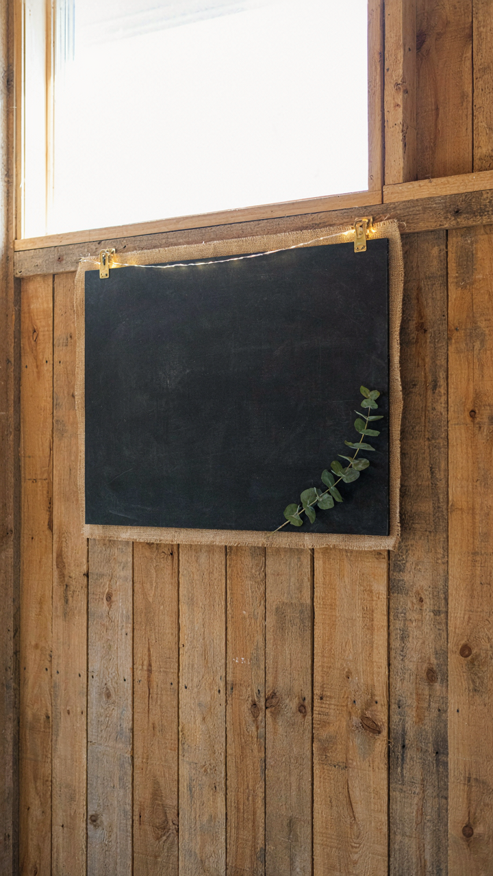
Texture Layers Beat Paint Alone
You want people to notice your sign and assume you hired a designer. That’s the real reason you’re reading this section. The mechanism is contrast: your eye locks onto material shifts faster than it registers color or text. Most DIY chalkboard signs stop at black paint on wood. That’s visibility, not impact.
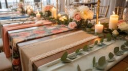
Add a secondary material to create depth. Wrap burlap or linen around the chalkboard frame’s edges. Attach a thin steel strapping or copper wire horizontally across the board itself, leaving the chalk surface intact above and below. Mount the finished board on reclaimed barn wood or pallet boards for a layered base. The texture doesn’t need to be ornate. One deliberate material choice outperforms three mediocre ones. Guests register the craftsmanship immediately, even if they can’t articulate why.
Strategic Light Placement For Legibility
Lighting solves two problems most DIY builders ignore: visibility at dusk and mood. A single LED strip mounted above the board’s top edge, angled downward, eliminates shadow and glare. Warm-toned LEDs (2700K to 3000K) keep the aesthetic coherent instead of harsh. Cold white light washes out the board and reads sterile.
Position the light source six to eight inches above the chalkboard surface, running parallel to the top edge. This angle illuminates text without creating hotspots or making the board look like a restaurant menu board. Battery-powered LED strips rated for outdoor use remove the need for electrical work or extension cords. Test the setup during late afternoon before the event to confirm text remains readable and the light enhances rather than distracts from the overall display.
How To Make A Chalkboard Welcome Sign: Efficiency Without Compromise
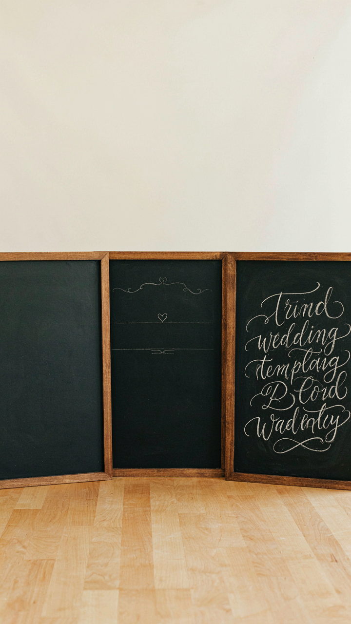
Work In Batches, Not Steps
You want to feel productive without actually wasting the entire weekend. Here’s the mechanism: assembly line thinking borrowed from manufacturing eliminates the friction cost of context switching. Instead of completing one sign end-to-end, you batch identical operations across multiple boards. Cut all surfaces first. Prime all surfaces second. Design all layouts third. Paint all text fourth.

This cuts setup and cleanup time by 60 percent. Your brain stays locked into one task mode instead of reloading between cutting, priming, designing, and painting. You also catch mistakes in one phase before they compound across ten boards. If your primer isn’t drying fast enough, you discover it on board two, not board nine.
Design Your Template Before You Touch Materials
Most people sketch on the board itself, which turns your sign into a testing ground instead of a finished product. Design the layout on paper or digitally first. Measure your board dimensions exactly. Map where text sits, how much white space exists, and whether your lettering fits without cramping or overshooting edges.
Use the template as a stencil or transfer guide. Tape it to the board and trace lightly with chalk. This removes guesswork and guarantees consistency across multiple signs. You paint from certainty, not from hope that your hand-lettering will land in the right spot. The template becomes your contract with the final product.
The “How To Diy Wedding Signs” Blueprint: The Anti Template Approach
Steal Like An Artist, Adapt Don’t Copy
You want permission to copy something because it removes risk. That’s the real motive here. But copying is how you end up with a sign that looks competent and forgettable. Adaptation is how you steal leverage from existing work without becoming invisible. Think of it like sampling in music: the best producers take a recognizable element, strip it down, and rebuild it into something that couldn’t exist without the original but doesn’t echo it. Your chalkboard doesn’t need a fresh concept. It needs a borrowed element remixed through your couple’s actual story.
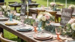
Look at what works in wedding chalkboards you’ve seen. Not the aesthetic. The mechanism. Maybe one uses negative space to make text pop. Another uses size contrast between headline and detail. A third repeats a visual motif across multiple signs. Take one mechanism, apply it to your couple’s inside joke or family tradition, and build the design from there. You’re not copying the sign. You’re copying the principle that made it function, then serving a different purpose with it.
Prototype, Refine, Then Commit To The Final
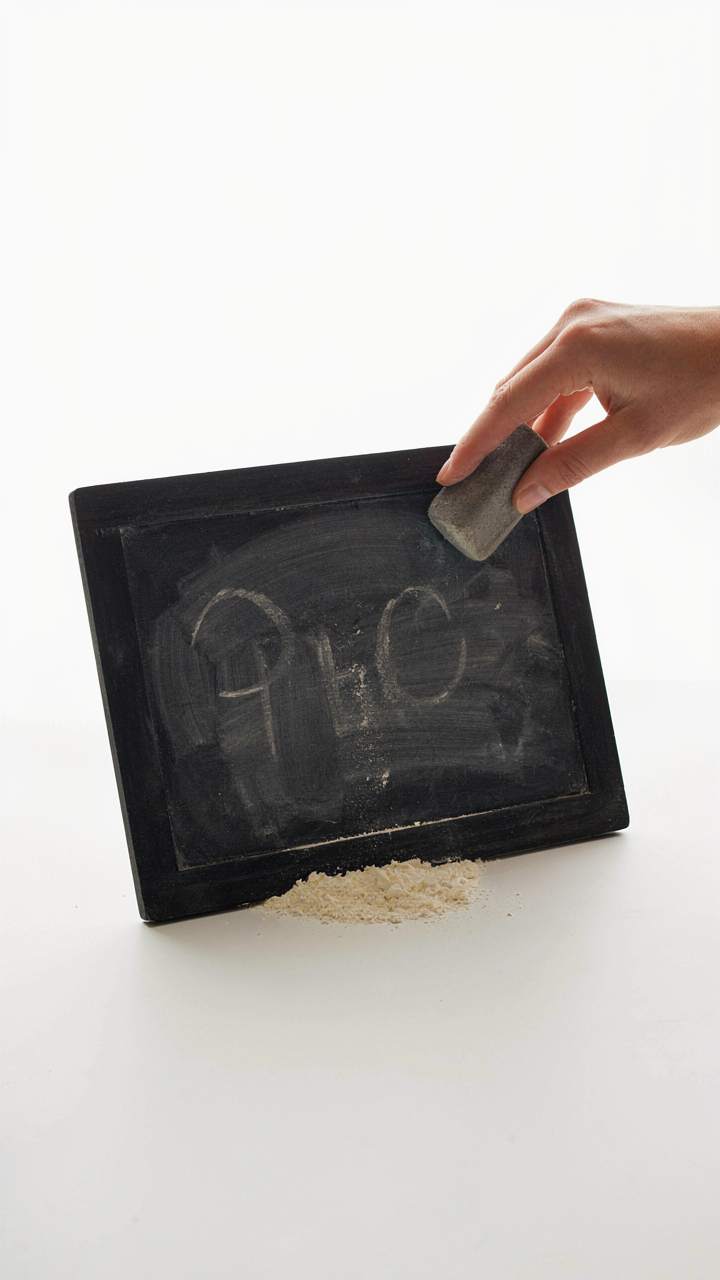
The common advice says sketch first, then execute. That’s backwards for chalkboards because your surface is forgiving and erasable. You should do rough drafts directly on the board or on cheap poster board the exact size of your final surface. This reveals problems that sketching never will: text size looks different at arm’s length versus three feet away, chalk behaves differently than pencil, and spacing mistakes become obvious only in context.
Do three versions minimum. First draft is messy. Second draft integrates what you learned. Third draft removes everything that doesn’t serve the message. Only after the third iteration should you commit to the final board and start with permanence in mind. Use chalk markers for the drafts, not permanent chalk, so you can erase and restart without wasting material. Once you move to the final board, you stop experimenting. The refining stage has ended. Speed and precision take over.
Preserving Your Masterpiece: Weatherproofing For Wedding Chalkboard Signs
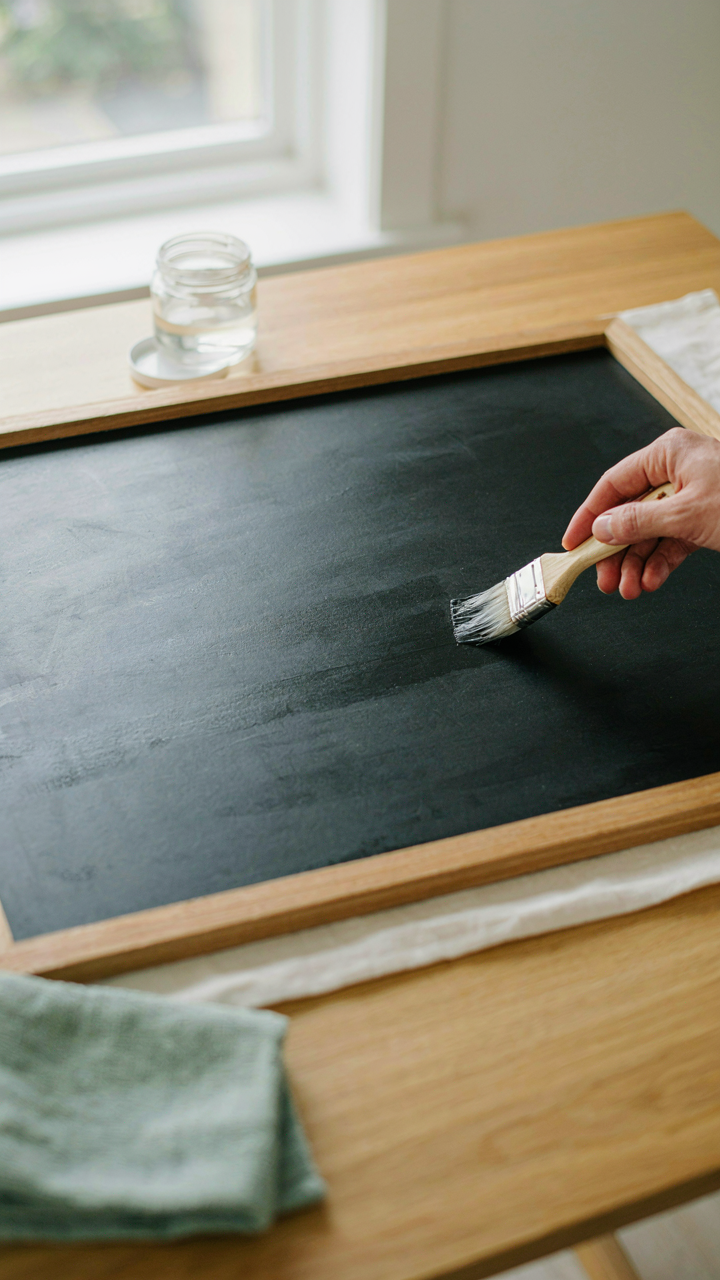
Choosing The Right Sealant Finish
You want your sign to last because throwing away a handmade piece signals you didn’t value the work. The real mechanism here is that chalk is porous pigment sitting on a porous surface, and moisture moves through both freely. Sealing with matte polyurethane creates a moisture barrier without the reflective gloss that reads cheap under wedding photography. Apply two thin coats with a foam brush, waiting 24 hours between applications. Matte finish absorbs light rather than bouncing it, which means text stays readable in photos and the sign reads intentional instead of plastic-coated.

Glossy sealant rebounds light and creates shine that photographs poorly outdoors. It also yellows faster than matte when exposed to sun. If you must use gloss, reserve it for indoor-only boards. Matte polyurethane costs the same, cures faster, and performs better in the field. Let the final coat cure for 48 hours before moving the board. The sealant hardens as water evaporates, not through air drying, so humidity matters more than ventilation during curing.
Moving And Placing Without Damage
Transport causes most chalkboard sign failures because nobody treats it like a finished product until it fails. Use a rigid box or plywood sheet to keep the board flat during movement, never leaning it or stacking weight on top. Pressure from a corner or edge transfers through chalk and cracks the board itself. Drive slowly to rough destinations. At setup, place the board on a level surface first, then check that it won’t slide or tip with light wind pressure. If outdoors, stake it or brace it from behind. Rain will still hit a sealed board if it’s angled wrong, so face it perpendicular to the expected wind direction and away from roof runoff. The sealant protects against moisture but not against standing water pooling on horizontal surfaces or wind-driven rain at sharp angles.
The Real Obstacle Isn’t Your Budget; It’s Your Permission To Be Truly Original
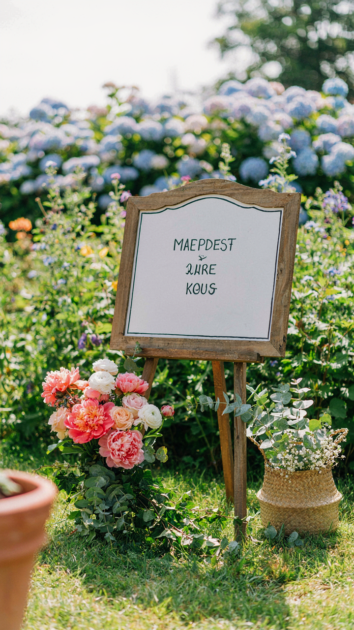
Most couples copy what they see on Pinterest because copying feels safe. They mistake templates for taste. A DIY wedding chalkboard sign stops mattering the moment your guests forget it existed. What stays with them is the weird, honest thing you made that nobody else would dare make. Stop asking what looks “wedding appropriate.” Open Canva right now and write the first line that actually made you laugh. That’s your sign. That’s your wedding.