The “First Impression” Fallacy: Why Your Welcome Sign Wedding Diy Needs A Purpose
Information Architecture Before Decoration
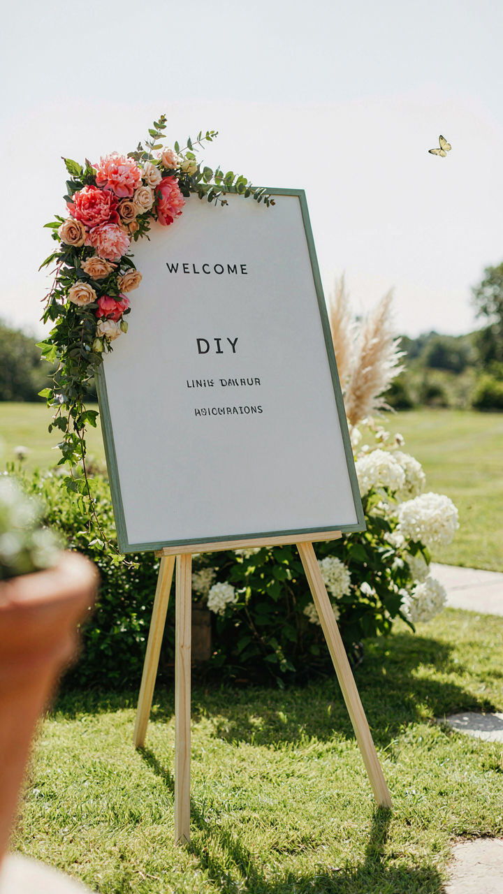
You want your sign to look good because you’re afraid guests will judge your event as cheap or poorly planned. Here’s what actually matters: a welcome sign is a wayfinding tool first, decoration second. Borrow the concept from information design—the field that maps data flow. Your sign functions as a decision point. Guests arrive confused about where to go, what happens next, and whether they’re in the right place. A sign that looks beautiful but doesn’t answer these questions wastes wall space and creates friction.
The common advice is backwards. Most guides tell you to lead with “Welcome” and make it huge. Wrong. Lead with the information that solves a problem. Put arrival instructions, parking details, or ceremony location at eye level. Put the decorative “Welcome” text below or beside it. Your guests don’t need to feel welcomed—they need to know where to stand and what to do next.
Setting Expectations Through Deliberate Tone
A welcome sign sets the operational tone for your event, not an emotional one. Tone in this context means the implied rules and energy level guests will experience. A formal script font with gold leaf says “This is structured. Arrive on time. Follow the program.” Hand-lettered casual script says “This is relaxed. Mingle. Move at your own pace.” The sign communicates these expectations before a single word is spoken. Most couples pick the aesthetic they like and ignore the behavioral signal it sends.
Choose the sign’s tone to match your actual event format, not to look Pinterest-worthy. If your reception is tightly scheduled, a formal presentation prevents guests from showing up late or treating it like a casual hangout. If you want people to relax and connect, casual lettering and materials signal permission to do that. The mechanism is simple: tone consistency between the sign and the event flow reduces guest confusion and creates alignment between expectation and experience.
Unconventional Canvases: Redefining The Diy Welcome Board
Salvaged Materials: Utility Over Pinterest Perfection
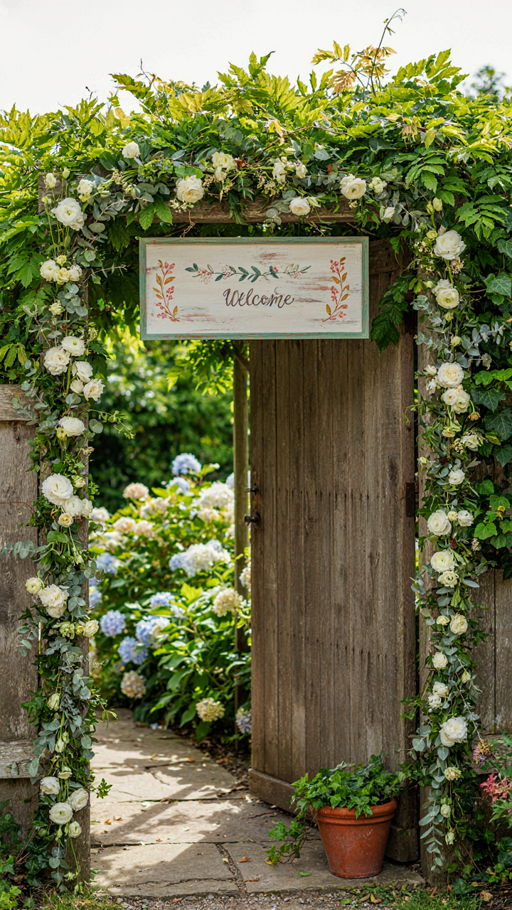
You want salvaged materials to feel intentional, not cheap. That’s the real fear driving this decision. The mechanism is simple: contrast. When guests see a weathered barn door or reclaimed wood against manicured event decor, their brain registers authenticity instead of budget constraint. The difference is deliberate placement and finishing.

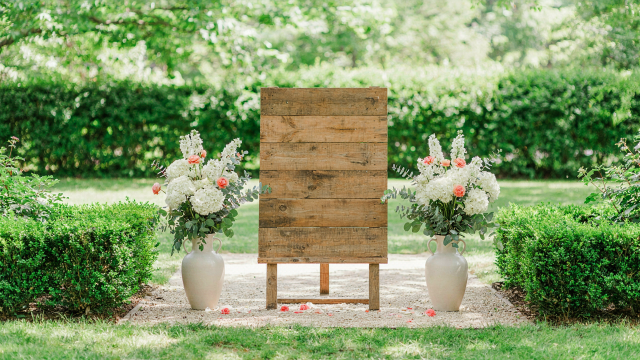
Salvaged wood works because it has texture and history baked in. You don’t need to sand it smooth or stain it to match your color scheme. The imperfections become the design. Attach your lettering directly to the surface. Use materials that were meant for that object originally, not borrowed from elsewhere. A hand-painted sign on old barn wood reads as craft. The same sign on a clean plywood sheet reads as DIY compromise.
Unexpected Objects As Display Surfaces
This is where most advice fails. People say repurpose anything. That’s wrong. Not every object works. The rule from industrial design applies here: form follows function, then function gets hijacked for new purpose. Your welcome sign needs to be readable and stable first. Only then does the object choice matter.
A ladder, vintage window frame, or antique door frame functions as a natural boundary. Guests understand it marks a transition. Attach your message to the frame itself, not floating in front of it. The object does the work of signaling entrance. Your text just clarifies what the object already communicates. Wire or chain suspended between two points requires tension to stay readable. Test the setup before the event. The mechanism that makes this work is visual weight distribution, not novelty.
The Minimalist Mandate: Maximizing Impact With Your Diy Welcome Sign
Cut The Noise First
You want people to think your sign is sophisticated, not cheap. That’s the real driver here. The mechanism is cognitive load. Every word you add splits your guests’ attention and makes them work harder to extract meaning. Your brain processes information hierarchically, not equally. One strong statement beats five mediocre ones. Most DIY welcome signs fail because they’re trying to say everything at once: the couple’s names, the date, a quote, directions to parking, hashtags. Remove that impulse now. Strip it down to what stops people cold. A single line of text, well-executed, reads as intentional. Multiple lines read as panic.

The math is brutal and simple: fewer words means larger type at the same physical size, which means readability from distance. Guests read your sign in under three seconds while walking past. You’re competing with their phone, their conversation, their fatigue from travel. Give them one thing to land on. Your sign should function like a headline, not a body paragraph. Test this by standing fifteen feet away from your mock-up and squinting. If you can’t read the core message in one glance, you’ve added too much text. Delete until only the essential remains. That constraint forces you into better design decisions.
Blank Space Wins Fights
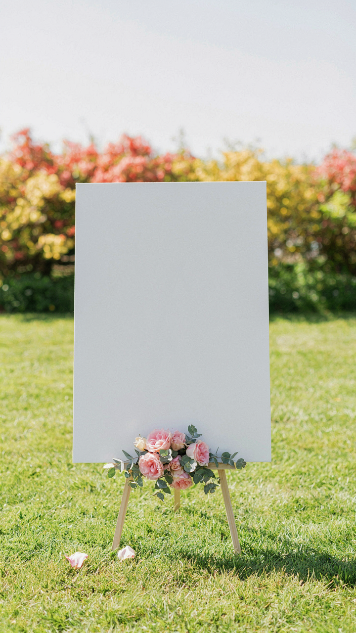
Negative space isn’t decoration. It’s visual dominance borrowed from graphic design’s grid system. The grid principle states that elements gain power through isolation, not proximity. In a welcome sign, this means surrounding your text with deliberate emptiness to create psychological weight. Every inch of white or colored background you leave untouched becomes an active player in the composition, not wasted real estate. This is counterintuitive for DIY creators, who default to filling every gap. They layer clipart, add borders, throw in decorative elements. They’re afraid of emptiness. They shouldn’t be.
A sign with generous margins and breathing room between text elements reads as confident and expensive. It forces the eye exactly where you want it. When you pack a sign tight, the design screams “I was unsure so I filled the void.” Paint a 4×3 foot board and use 18 inches of margin on all sides. That leaves a 1×1 foot active zone. Your text lives there alone. The material itself (wood, cardboard, foam board) becomes part of the visual statement through its absence of clutter. This principle works on every budget. The constraint creates the clarity.
The “Cognitive Load” Protocol: Guiding Guests, Not Confusing Them
Clear Directives First, Decoration Second
You want your sign to look good because you’re afraid guests will judge the execution. The real problem is different: your sign competes for attention in a chaotic moment. Military doctrine calls this the “commander’s intent”—one clear objective, everything else supports it. Your welcome sign has one job: move guests from confusion to action. Every element either serves that or it doesn’t.

Most DIY signs fail because they treat the sign like a canvas for ideas instead of a control system for behavior. You pile on fonts, colors, and “cute” details. Guests stand there decoding instead of moving. Strip it down. One primary directive dominates the sign. The directive answers: where do I go, what do I do, or what matters right now? Everything else is subordinate to that single command.
Information Hierarchy Stops Scanning Eyes
Guests don’t read your sign linearly. Their eyes land on the biggest element first, then cascade down based on visual weight. You control where attention flows by controlling size, color contrast, and position. The top third of your sign must contain the single most important piece of information.
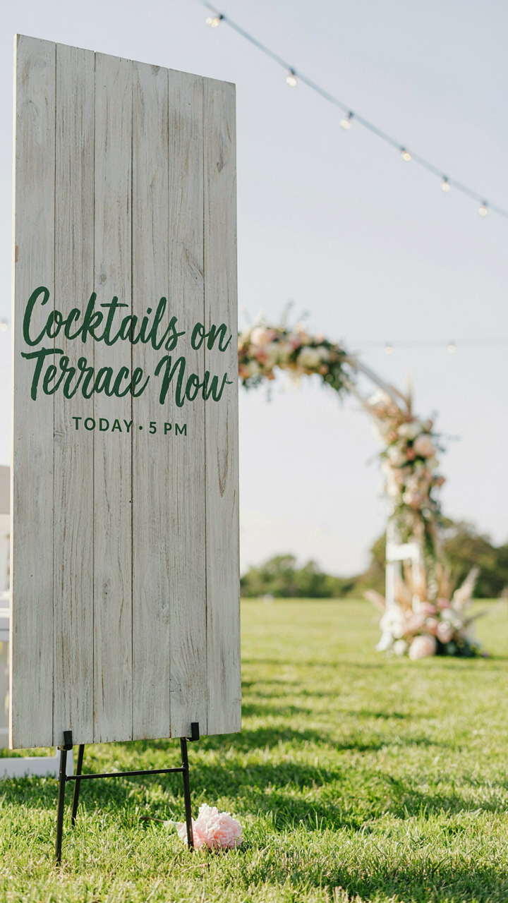
Common advice says “make it balanced.” Ignore that. Balance is for interior design. Hierarchy is for function. If the sign says “Welcome to Sarah and Tom’s Wedding,” that’s wasted real estate. They already know whose wedding it is. Put the actionable information first: “Ceremony starts at 4pm, lawn to the left” or “Cocktails on the terrace.” Secondary details go below in smaller text. Guests process the critical information, then they move.
Beyond Calligraphy: Authentic Lettering With Chalk Markers
Why Imperfect Lettering Works Better
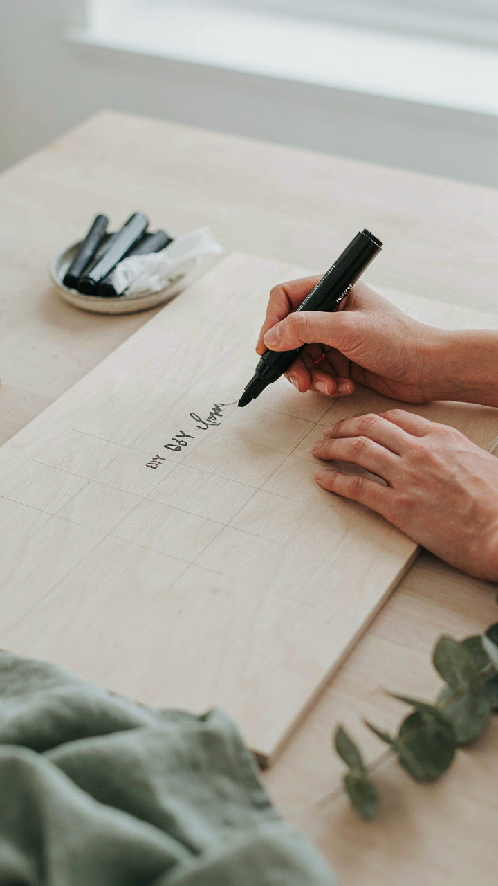
You want your sign to look professional without paying a calligrapher. That’s the real fear underneath this section. Here’s the mechanism: imperfection signals authenticity in a way perfection cannot. Design history shows us that hand-lettering movements from the Arts and Crafts era onward rejected industrial uniformity precisely because humans noticed the difference. Your wobbly letters aren’t a failure. They’re proof someone made this by hand for this specific event.

Chalk markers make imperfection an advantage because the medium itself resists precision. The soft tip catches paper fiber. The chalk dust creates slight variations. You cannot produce machine-like consistency unless you fight the tool, and fighting it makes the work visible. That visibility is what guests read as care. Start with cheap chalk markers on cardboard scraps first. Watch how the imperfections emerge naturally. That’s your style, not your mistake.
How To Build Legibility Into Hand Lettering
Most DIY wedding sign lettering fails not because it’s imperfect but because it’s unreadable. People skip the actual structural work and jump to decoration. Legibility in hand-lettering depends on three mechanical factors: consistent letter height, adequate spacing between words, and stroke weight contrast. None of these require artistic talent. They require a plan before you touch the marker.
Use a pencil to grid your sign lightly first. Mark horizontal lines for x-height, ascenders, and descenders. Space your words by measuring the width of your capital O and using that as a gap unit. Keep your stroke pressure constant by holding the chalk marker at a fixed angle—roughly 45 degrees works across most marker types. Test on a sample board, measure what worked, then transfer that exact spacing to your final sign. The sign reads well because you built a system, not because you were born artistic.
The “Unseen Hand”: Engineering Your Wedding Entrance
Placement As Silent Director
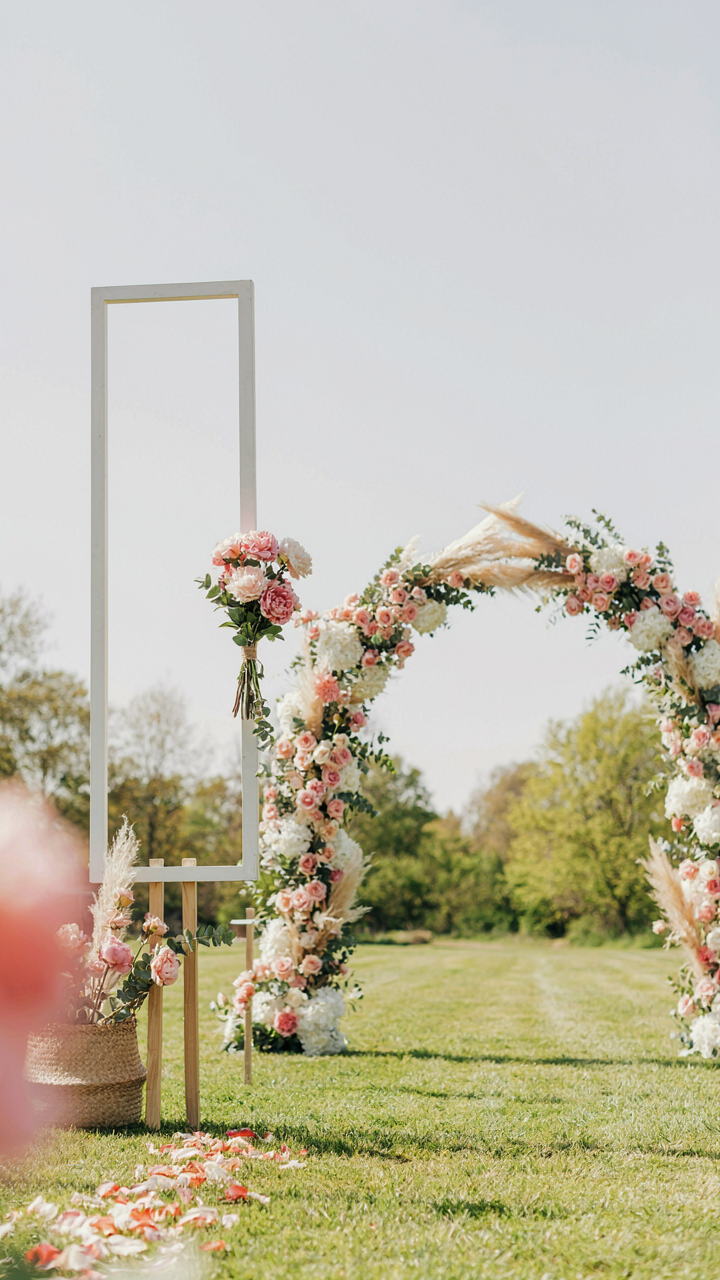
You want your sign noticed without looking like you tried too hard. The real motive here is control—you’re deciding what your guests see first, which shapes their entire emotional entry into your event. Placement isn’t decoration. It’s architecture. Think of it through spatial hierarchy, borrowed from urban design: the principle states that humans move toward clarity and visual weight. Your sign becomes the focal point only if you eliminate competition for attention. Most DIY wedding signs get buried because they’re placed where guests have already committed to a direction—mid-aisle, after they’ve already chosen a path. That’s failure.

Position your sign at the entry threshold, where decision happens. This is the moment before guests commit to walking forward. Place it at eye level, roughly 5 to 6 feet from the ground, perpendicular to the primary approach angle. If your entrance has multiple paths, the sign sits at the natural convergence point, not off to the side. Use contrast between your sign’s background and its surroundings to lock visual attention. Test the sightline from 20 feet away before finalizing placement. Move it if guests walk past without pausing.
Guiding Guests Seamlessly
The common advice says “make it pretty and welcoming.” That’s incomplete. What actually matters is preventing cognitive friction—the mental cost of figuring out where to go next. Flow management in event design uses the principle of least resistance: people follow the path requiring the least decision-making energy. Your welcome sign does double duty here: it confirms guests are in the right place, and it telegraphs where they move next.
Your sign should exist in visual sequence with directional cues that follow it. If guests read your welcome message, what’s their next action? Do they see arrow signage, a clear pathway, or another visual marker? Without this chain, your sign becomes a dead end—they stop, read, then look confused about what happens next. Integrate your sign placement with the actual flow of foot traffic by marking the route before the sign, at the sign, and immediately after. This removes the pause. Make the next decision obvious through positioning, lighting, or subtle directional elements. Test this by watching someone unfamiliar with your setup walk through the entrance cold. Their hesitation reveals where your flow breaks.
Durability Over Decoration: Building A Diy Wedding Sign Holder That Lasts
Materials That Withstand Weather
You want your sign to look nice in photos, but what you actually need is for it to not collapse halfway through the ceremony. The real mechanism here is load distribution: physics tells us that a structure fails when stress concentrates at weak points rather than spreading across the frame. Most people build signs that look solid but crumble because they picked materials based on aesthetics instead of shear strength.

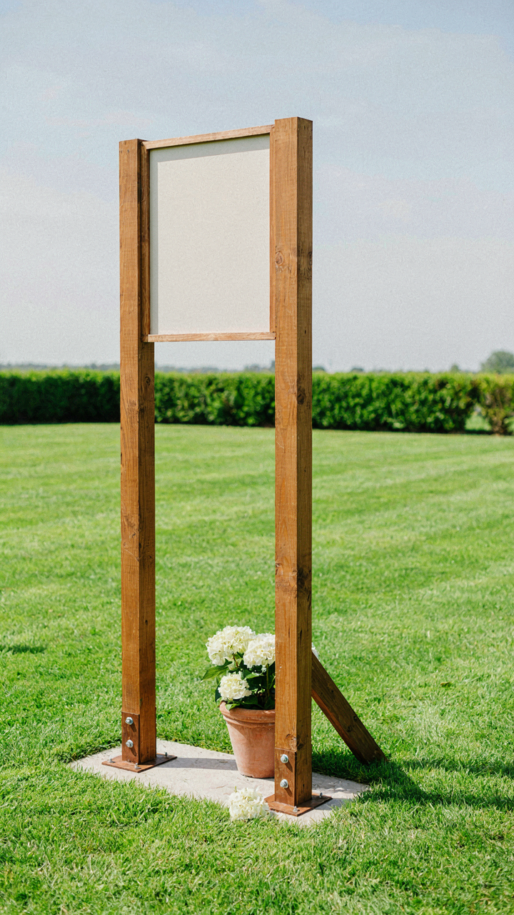
Pressure-treated lumber resists rot better than untreated wood because it’s been injected with preservatives that kill the organisms that break down cellulose. For outdoor displays, two-by-fours are the minimum thickness. Steel angle iron works if you’re welding, but most DIYers don’t have access. Plywood delaminates in moisture. Corrugated plastic holds up longer than cardboard but won’t support heavy signs. The real answer: build the frame from treated wood, then face it with whatever material matches your aesthetic.
How To Build For Stability
The most common mistake is underestimating wind load. People build tall, narrow signs without diagonal bracing, then act surprised when weather knocks them over. Stability requires three things working together: wide base, low center of gravity, and triangulation.
- Cross bracing with angle: Run diagonal supports from top corners to opposite bottom corners using half-inch treated lumber. This prevents racking, which is the side-to-side twisting that destroys signs faster than anything else.
- Concrete footings: Sink posts minimum twelve inches into concrete. Soil alone won’t hold anything in wind. Mix concrete properly: too thin and it cracks, too thick and water pools on top and freezes.
- Weight distribution: Widen your base to at least half the height of the sign. A six-foot sign needs a three-foot-wide base. This is leverage working against you, so you compensate with geometry.
- Hardware redundancy: Use galvanized bolts and lag screws rated for outdoor use. Don’t cheap out on fasteners. They corrode and fail silently. Check every connection point before the event.
- Ground anchors: If moving the sign post-ceremony, install anchor plates that bolt into concrete rather than relying on friction alone. This lets you reposition without rebuilding the base.
Bolt everything instead of nailing. Bolts hold under vibration and wind stress. Nails gradually work loose. For signs that stay put longer than one day, add a diagonal strut from the top of your frame to a ground anchor point, creating a triangle. The triangle is the only shape that doesn’t deform under load without one of its members snapping first.
The “Echo Effect”: Extending Your Wedding Welcome Signs Diy Theme
Carrying Your Design Language Through The Space
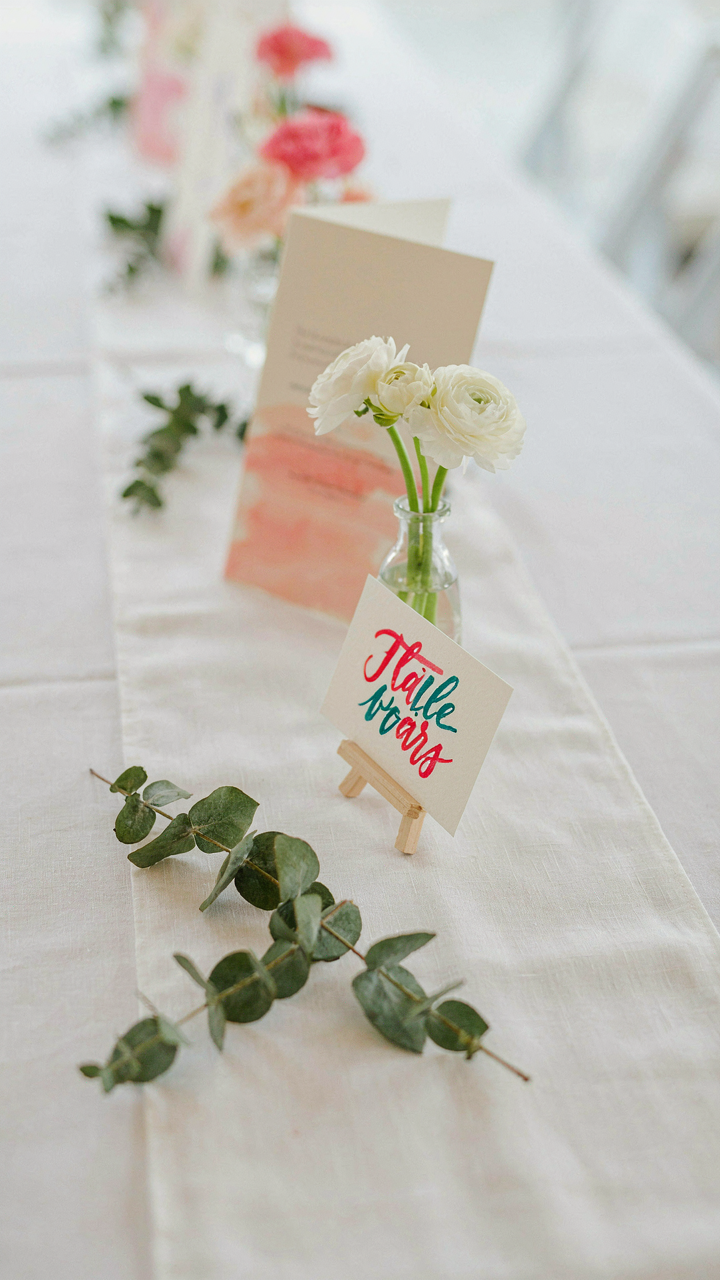
You want guests to remember your wedding as intentional, not cobbled together. Here’s what actually matters: your welcome sign isn’t the artifact. It’s the first statement of a visual system guests should recognize repeated everywhere they look. This is the principle of coherence in environmental design. The mechanism: establish one dominant visual element on your welcome sign, then deploy it identically at the reception entrance, table numbers, and program cover. Repetition builds recognition. Recognition builds the perception of polish.

The mistake most people make is treating the welcome sign as a standalone piece. It sits at the entrance, does its job, then disappears into irrelevance. Instead, extract the core design decision from your sign and force it to work in three other places. If your welcome sign uses hand-lettered script on kraft paper, your table numbers use the same script. If it features a specific color combination, that pairing shows up on programs and place cards. The scale changes, the context changes, the core language stays constant.
Small Details That Anchor The System
Stop thinking “decoration” and start thinking “visual grammar.” You’re not adding flourishes. You’re establishing a vocabulary that appears consistently enough that guests register it, even subconsciously. One single repeating element works better than five different details. A border treatment, a specific font weight, a color accent, a geometric shape. Pick one from your welcome sign design and embed it into three secondary pieces.
The execution is straightforward. Photograph your welcome sign and identify which visual element does the heavy lifting. Extract that element. Use the exact same dimensions, orientation, or proportions in the next application. This isn’t decoration by accident. This is systematic design repeated deliberately. When a guest moves from entrance to table to program, they encounter the same grammar three times. That repetition is what makes handmade feel intentional instead of rushed.
Rejecting Cute Wedding Ideas: Crafting Authenticity
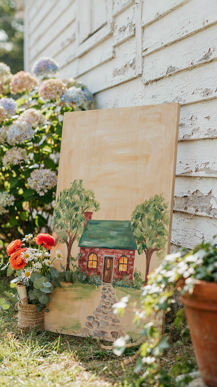
Stop Copying What Works For Everyone Else
You want permission to make something that doesn’t look like every other wedding sign because you’re afraid it won’t work. Here’s the mechanism: trends exist because they’re safe, not because they’re right for you. Your sign becomes invisible the moment it matches the aesthetic of fifty other weddings. The goal isn’t cute. The goal is recognition.

Your unique aesthetic isn’t discovered through Pinterest boards. It’s defined by what you actively reject. Write down three design directions you see everywhere and commit to avoiding them entirely. This forces specificity. If you hate calligraphy script on wood, use it nowhere. If you dislike rustic staging, build something else. Constraint creates identity faster than inspiration boards ever will.
The Story Behind Every Design Choice
Borrowed from architecture: every structure needs load-bearing walls that justify its existence. Your sign’s design elements are the load-bearing walls. Each one must carry weight by connecting to something real about your relationship or your day. Decoration without narrative is just noise.
The difference between a forgettable sign and one people remember is simple: they know why you chose what you chose. Maybe you used your childhood home’s front door color because both of you grew up on the same street. Maybe the material comes from something you actually own. Maybe the handwriting is genuinely yours, not a font you downloaded. The specificity is the entire point. Build the sign backward: start with one true story, then design around it.
The Real Obstacle Isn’t Your Budget; It’s Your Willingness To Dictate The Experience, Not Just Decorate It
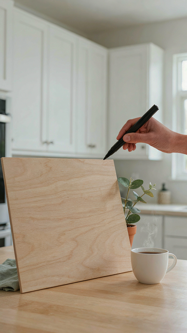
Most couples treat a welcome sign like decoration when it’s actually your first chance to set the tone. You’re not just saying hello. You’re telling guests how to feel before they walk through the door. A DIY sign forces you to make real choices about your wedding’s personality instead of defaulting to whatever Pinterest says looks nice. Pick up a marker and a piece of wood today. Don’t overthink it. Your guests will remember the sign that actually felt like you, not the one that looked professionally made.