Introduction
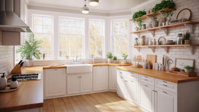
Your living room serves as a welcoming space for family and friends, and choosing the right color combination plays a crucial role in setting the mood. Vibrant colors can energize a room, while softer shades promote relaxation. Understanding color theory and the way colors interact can significantly enhance your living room’s appeal. This article explores various color combinations that cater to different styles and preferences.
From bold accents to subtle hues, we will provide ideas to refresh your living room’s aesthetic. You’ll learn how to mix colors effectively and utilize both basic and extended terms of color theory. Prepare to embark on a creative journey that will inspire your design choices and help you create a space that reflects your personality.
Understanding Color Theory in Interior Design

Basics of Color Theory
Color theory involves understanding how colors interact and the emotional responses they trigger. Interior designers rely on this knowledge to create inviting spaces that resonate with people’s feelings. There are three main categories of colors: primary, secondary, and tertiary. Primary colors—red, blue, and yellow—serve as the foundation. Mixing them produces secondary colors like green, orange, and purple. When you blend primary and secondary colors, you create tertiary colors like red-orange and yellow-green.
Color Harmony and Its Importance
Color harmony refers to the balance and relationship among colors in a palette. A harmonious palette can create a sense of unity and comfort in a living room. Designers use various color combinations to achieve this balance, such as complementary (opposite colors) or analogous (colors next to each other on the color wheel). Understanding these concepts allows you to transform a living room into a vibrant and refreshing space.
Key Elements of a Vibrant Color Palette
Understanding Saturation, Brightness, and Contrast
A vibrant color palette combines several key elements: saturation, brightness, and contrast. Saturation refers to the intensity of a color. Highly saturated colors appear vivid and energetic, while less saturated colors feel softer and muted. This energy can invigorate your living room, making it feel more alive.
Brightness, on the other hand, deals with how light or dark a color is. Bright colors create an open, airy atmosphere, making the room feel larger and more welcoming. A balance of both bright and dark shades adds depth, enhancing the overall visual appeal.
Contrast plays a crucial role in creating drama and interest. Placing light colors next to dark ones creates a striking look that draws attention. Using these three elements together can dramatically refresh your living space, making it feel more inviting and lively.
Choosing Colors Based on Room Function
Influence of Function on Color Choices
The function of your living room significantly influences your color choices. A space for relaxation might benefit from soft blues or greens, creating a calm atmosphere that invites rest. For an area designated for entertaining, vibrant yellows or oranges can energize the space and encourage conversation. Think about how you want the room to feel during various activities.
Practical Tips for Selecting Colors
When selecting colors, consider the activities you’ll perform in the living room. For family movie nights, warm neutrals with bold accents can promote coziness. If you host book clubs or game nights, consider a cheerful color scheme with contrasting elements. Always test paint samples on your walls to see how the colors interact with natural light and furniture. A well-chosen palette not only enhances aesthetics but also matches your lifestyle.
Popular Color Combinations for Living Rooms
Bold and Bright Color Palettes
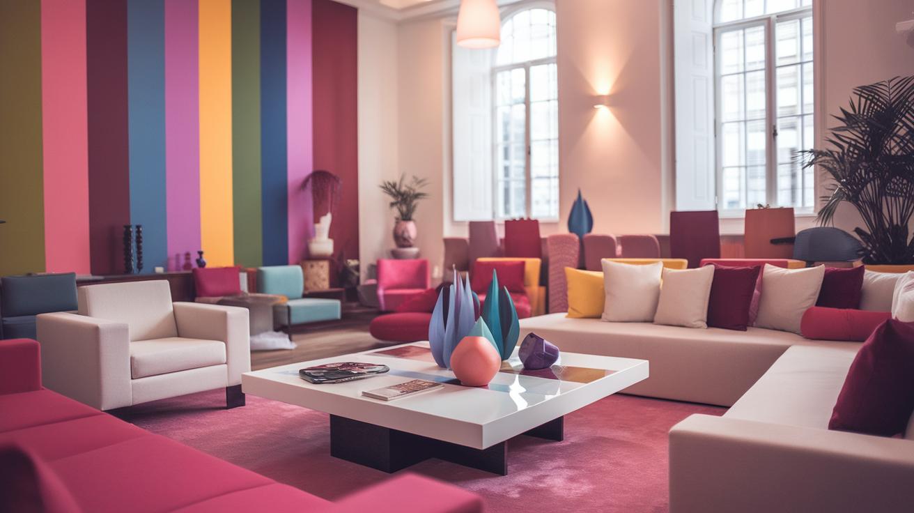
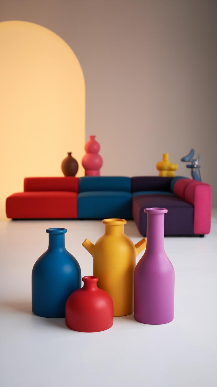
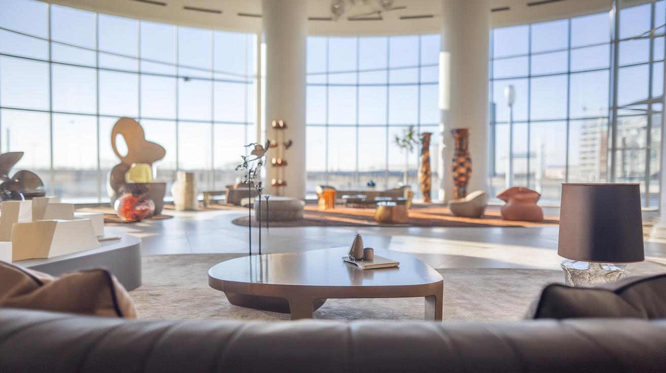
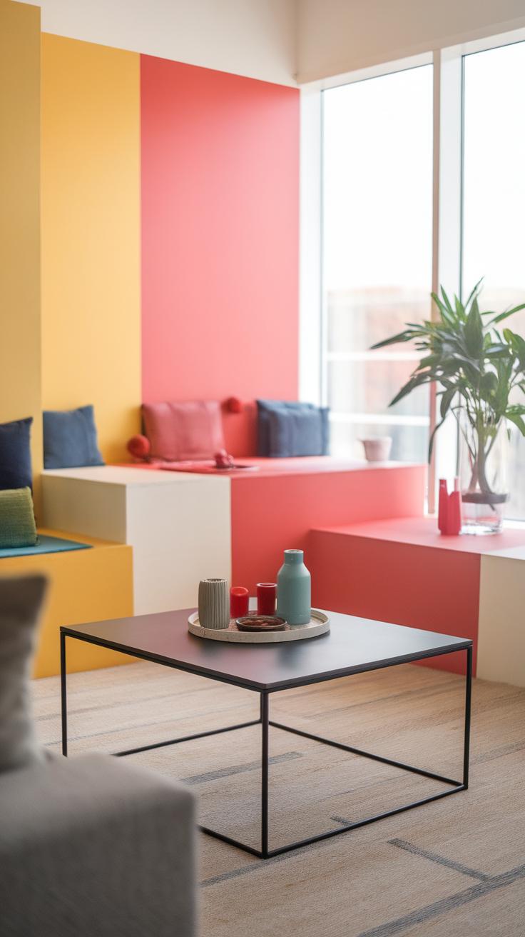
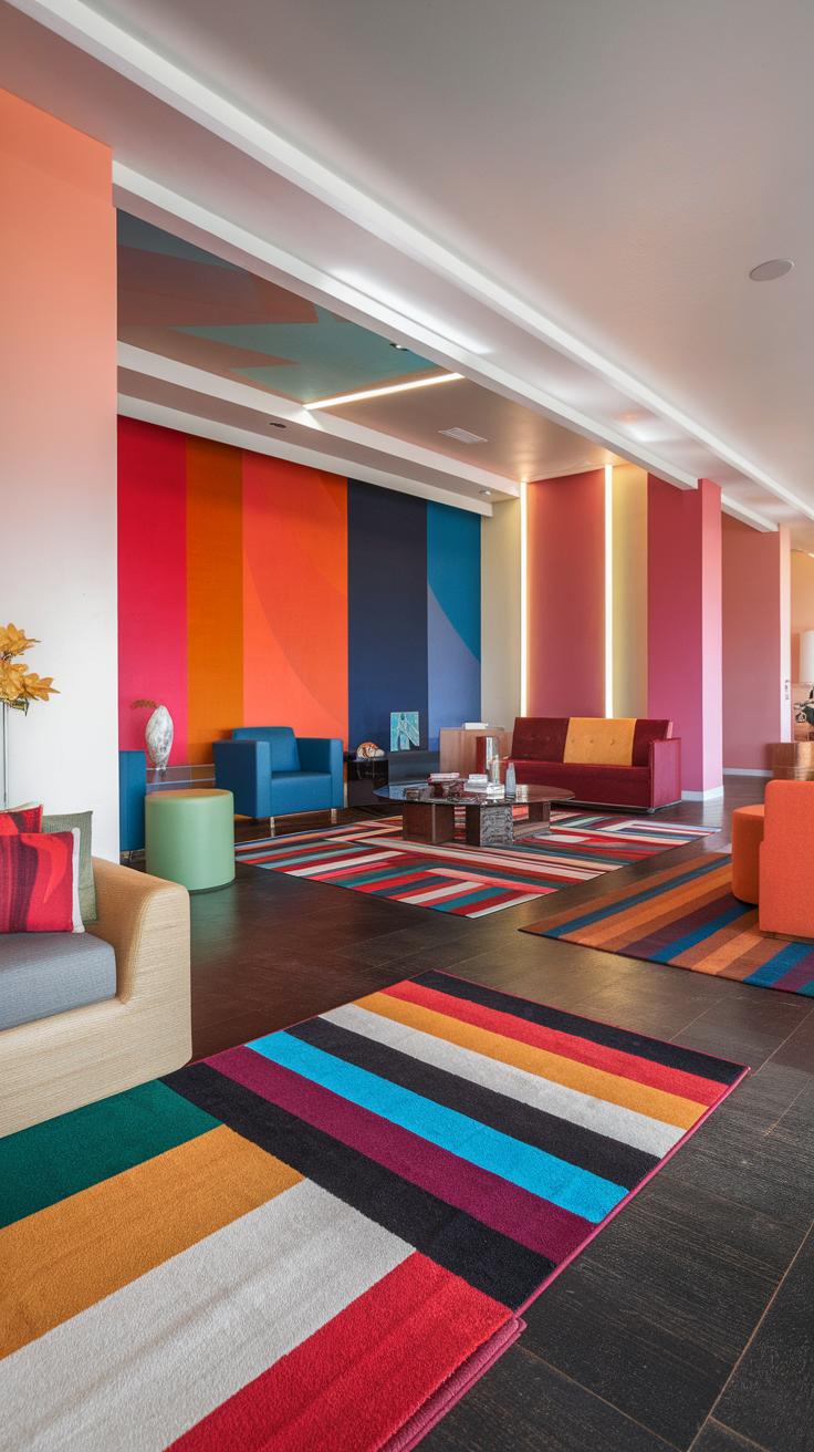
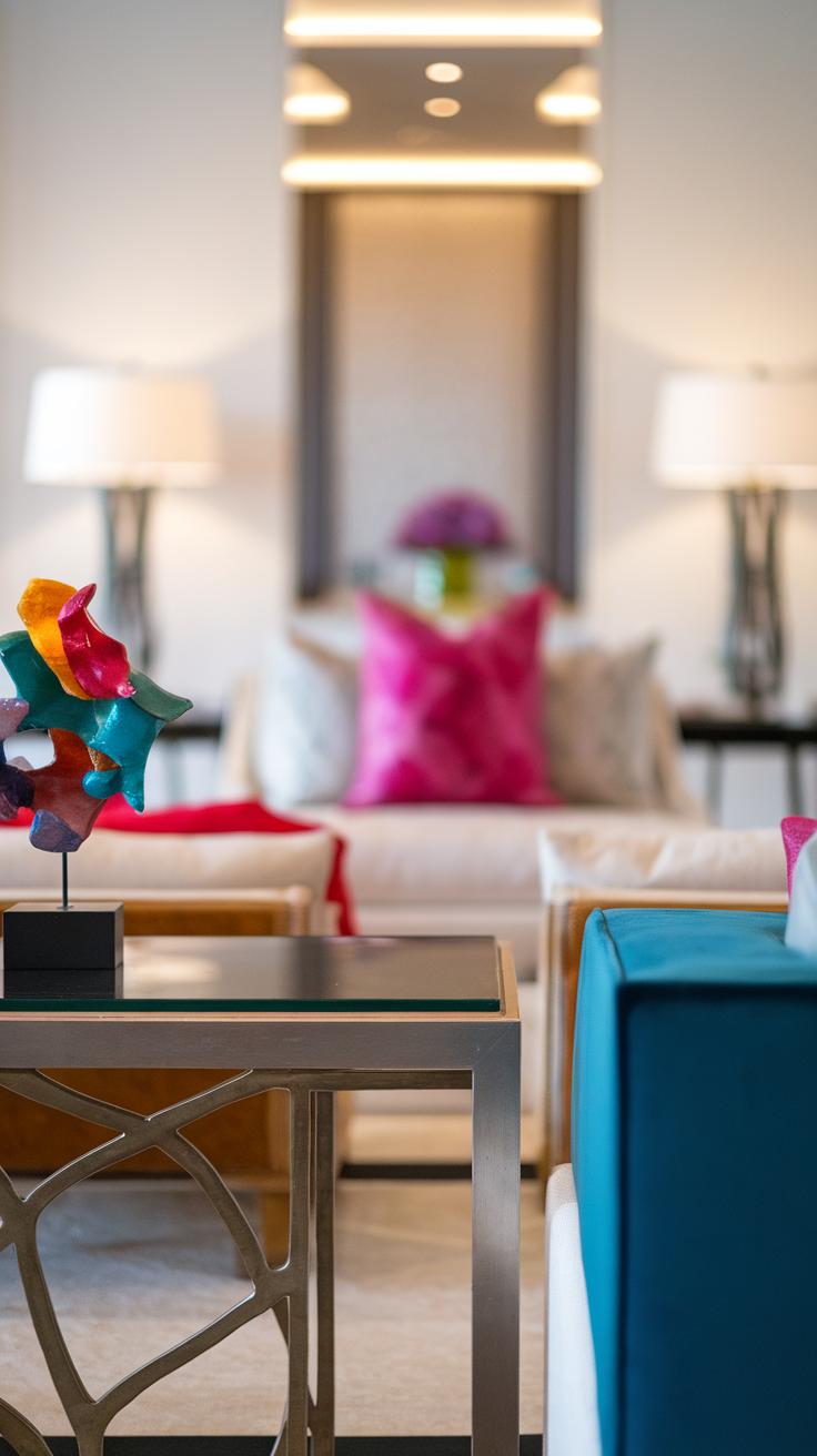
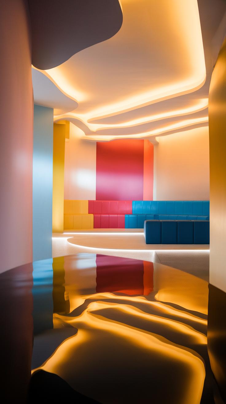
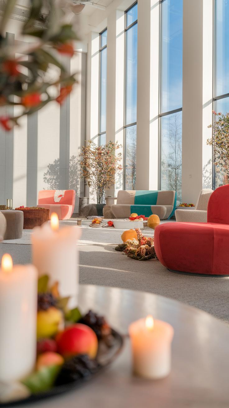
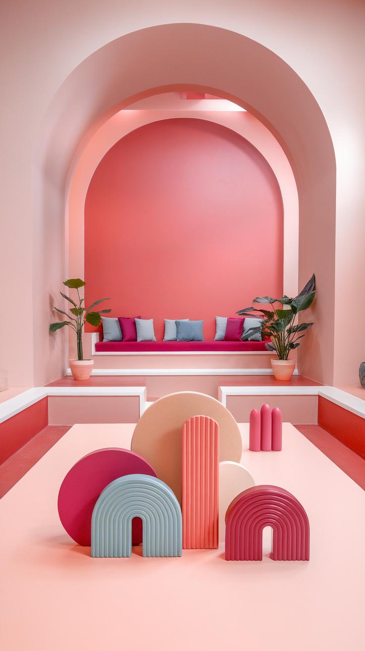
Bright shades can energize a living room and create an inviting atmosphere. A classic combination of deep navy blue and vibrant yellow brings sophistication and cheerfulness. Navy acts as a strong backdrop while yellow accents add warmth and light. Another striking duo includes emerald green and coral. Emerald green evokes nature and tranquility, while coral introduces a fun pop of color. These combinations work well for those who want to make a statement without overwhelming the space.
Subtle and Soothing Color Schemes
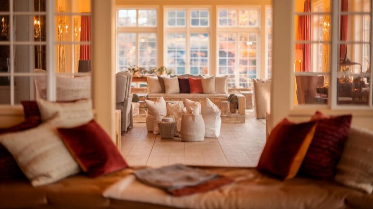
Neutral colors offer a calming environment and suit various design styles. A blend of soft gray and warm beige creates a cozy haven perfect for relaxation. This combination enhances natural light and adds elegance without overpowering the room. Another soothing option is pale lavender paired with cream. Lavender infuses a gentle touch of color, while cream keeps the overall atmosphere light and airy. Subtle palettes like these foster a peaceful ambiance, ideal for hosting gatherings or quiet evenings at home.
Accent Colors and Their Impact
Understanding Accent Colors
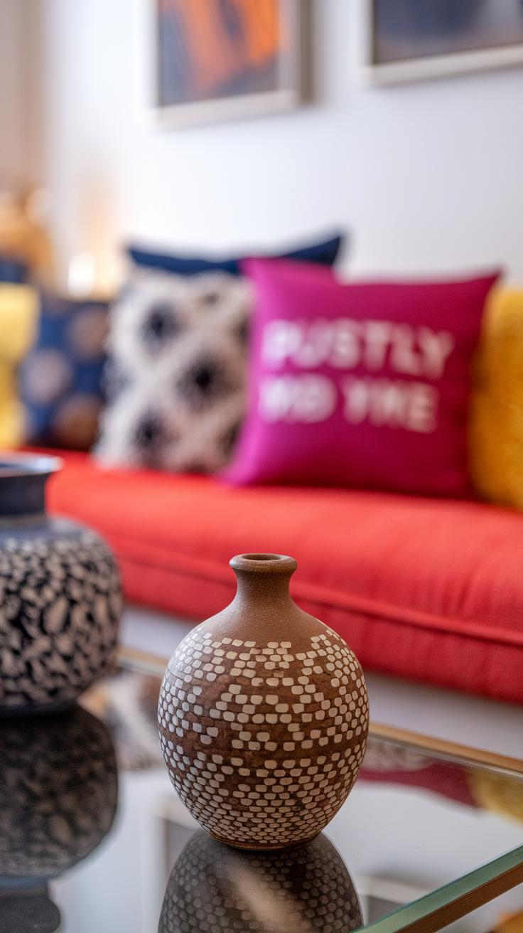
Accent colors play a vital role in living room design, adding depth and interest to the overall look. They contrast with main colors, helping to highlight certain features of the room. For example, if your main wall color is a soft gray, using bright yellow or deep navy as an accent can easily make the space pop. These colors can be featured through furniture, cushions, art, or curtains. Choosing the right accents allows for a playful twist in an otherwise subdued scheme.
Using Accent Colors Effectively
To effectively utilize accent colors, start by determining your primary palette. Once that’s set, select one or two accent colors that complement your main choices. Place accents strategically in the room to draw attention without overwhelming the space. For instance, a bold red rug can energize a neutral-toned living room. Balancing the proportions of main and accent colors creates harmony and invites comfort, helping guests feel welcomed. This approach makes your living room feel lively and refreshed while maintaining cohesive style throughout.
Using Textures and Patterns Enhance Your Living Room with Color Interaction
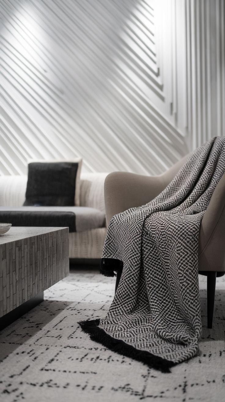
Textures and patterns play a key role in living room design, interacting beautifully with colors to create a vibrant atmosphere. Different materials, such as soft fabrics or sleek metals, can affect the overall look and feel of the room. For example, pairing a plush velvet sofa in a rich emerald green with geometric patterned throw pillows instantly adds depth and warmth. By mixing textures, you avoid a flat appearance and give your space more character.
Choosing patterns also adds visual interest. Opt for large prints on curtains or area rugs to create focal points. When selecting color combinations, aim for balance; soft, neutral tones can complement bold patterns effectively. Using these strategies helps you achieve a harmonious and inviting environment that reflects your personal style while keeping the space lively and engaging.
The Role of Lighting in Color Perception
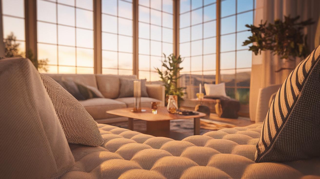
Lighting profoundly influences how colors appear in your living room. Natural light, bulbs, and their temperatures can alter the mood and perception of color, shifting the entire feel of the space. For instance, daylight carries a cooler hue, which can make whites and blues seem vibrant and fresh. On the other hand, incandescent lights cast a warm glow, intensifying yellows and oranges and creating a cozy atmosphere.
When planning your color palette, consider the lighting throughout the day. Test paint samples on walls at different times to see how colors evolve with changing light. Pair your chosen colors with appropriate lighting fixtures to enhance your design. Try mixing different types of lighting, such as warm, soft lights for relaxation and brighter lights for activities. This approach ensures that your colors shine beautifully in every hour, creating a lively and inviting living room.
Seasonal Changes and Color Trends Refresh Your Living Room with Seasonal Palettes
Spring and Summer Color Palettes
Seasonal changes greatly influence color trends for living rooms. Spring invites light and pastel hues. Soft shades of mint green, pale yellow, and delicate lavender can create a welcoming atmosphere. These colors evoke the freshness of blooming flowers and sunny days. As summer approaches, consider bolder options like coral, turquoise, and sunny yellow. These vibrant tones can energize your space, making it feel lively and cheerful.
Fall and Winter Color Palettes
Autumn brings warm and earthy shades. Rich oranges, deep reds, and chocolate browns mimic the beautiful foliage. These cozy colors create a comforting and inviting setting, perfect for gatherings. Winter calls for cooler palettes. Look for icy blues, crisp whites, and soft greys. These colors reflect the tranquility of winter, allowing for a serene retreat. Adjust your color choices with the seasons to keep your living room feeling fresh and aligned with nature’s rhythms.
Incorporating Personal Style into Color Choices
Choosing colors for your living room allows you to showcase your personality. Think about what colors make you feel comfortable and happy. If you love nature, greens and browns might resonate with you. If you prefer a more vibrant atmosphere, bold colors like orange or teal can create excitement.
Test out different combinations by using paint swatches or digital apps that let you visualize colors. Arrange colors not just based on trends, but on what feels right for you. Consider meaningful experiences, such as a favorite vacation spot or a cherished memory. These inspirations can help guide your choices, making the color palette truly yours.
Be open to mixing styles, too. If you adore modern design but have a soft spot for vintage, blend colors that reflect both. Layering different shades within a similar color family creates depth while honoring your unique taste. Remember, this living space should be a true reflection of you.
Final Tips for a Successful Color Combo
To create a successful color combination in your living room, start by choosing a main color that reflects your style. Select a vibrant shade that excites you, such as a deep blue or a lively green. From there, identify two or three complementary colors. These should contrast the main color while still working harmoniously together. Use color wheels as a resource, as they show how colors relate.
Limit the number of bold colors to avoid overwhelming the space. Balance the bold choices with neutral shades to ground the room. Paint swatches on the wall or use fabric samples to visualize how colors interact. Pay attention to lighting, as it changes how colors appear at different times of day. Finally, remember that incorporating personal items, like artwork or family photos, can elevate your color scheme while reflecting your unique taste.
Conclusions
In conclusion, selecting the right color combination for your living room can dramatically change its atmosphere. By understanding color theory and applying practical tips, you can create a harmonious space that truly feels like home. Vibrant color combinations not only enhance visual appeal but also connect with emotions, making your living room a sanctuary for relaxation and social gatherings.
We hope this article has inspired you to experiment with color palettes that resonate with your style. Refresh your space with the vibrant ideas discussed, and enjoy the process of transforming your living room into a reflection of your personal taste.