Introduction
Your front garden is the first thing guests and neighbors see. Choosing bold colour schemes for it can make your home stand out and feel inviting. Colors draw attention and express style, so they matter a lot in garden design.
In this article, you will learn how to select strong colors that work well in front gardens. We will explain color basics and show ways to combine colors to create eye-catching landscapes. By the end, you will have simple ideas to boost your garden’s curb appeal and make planting fun and easy.
Understanding Colors and Their Effects in Garden Design

The Color Wheel and Primary Colors
The color wheel is a simple but powerful tool that helps you organize and choose colors. It’s a circle showing the relationship between colors, starting with the three primary colors: red, blue, and yellow. These are the base colors that can’t be made by mixing others. Once you understand these, you can explore secondary colors—green, orange, and purple—created by mixing the primaries.
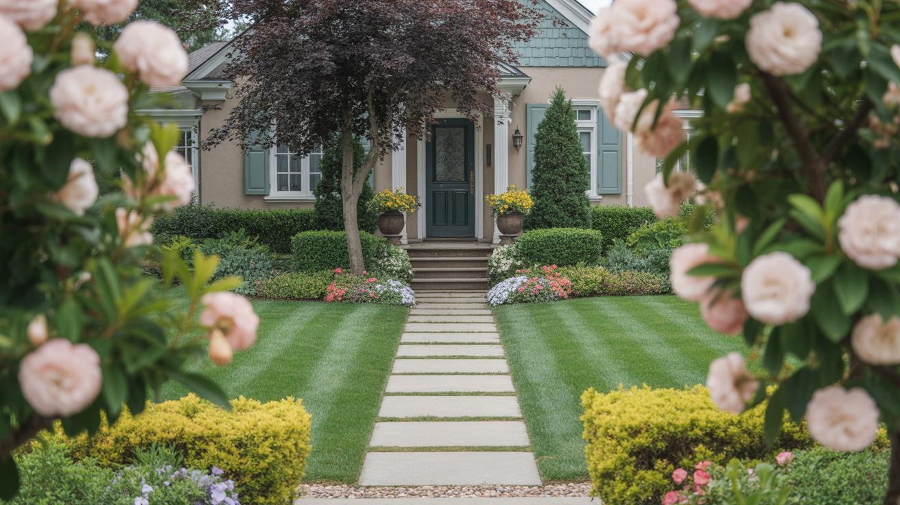
When planning your front garden, think of the wheel as a guide. You might pick plants or decorations from opposite sides of the wheel to create contrast, or adjacent colors for a more calming effect. For example, pairing blue flowers with yellow pots can create an eye-catching yet harmonious view. It’s less about rules and more about what catches your eye and feels right for the space.
Emotional Impact of Colors
Colors stir feelings and grab attention in ways you might not expect. Red, for instance, often catches the eye first. It can bring energy and warmth to your garden, but using too much might feel overwhelming. I once tried a red-themed front garden, and while it was bold, I noticed visitors felt something intense and almost urgent about it.
Yellow, on the other hand, tends to feel cheerful and inviting. It can lift moods without demanding too much focus. Blue is interesting—many find it calming and cool. You might think it creates distance, but it can also make your front garden feel spacious and restful. Of course, these feelings depend on context and personal association, so consider what resonates with you.
Thinking about color in your garden means paying attention not just to the plants, but to how these shades influence your day-to-day experience—and those of visitors. Which moods do you want your garden to evoke? That question might be more layered than it seems at first.
Choosing Colors That Match Your Home and Personality

Matching Colors with Your Home’s Exterior
When picking bold colors for your front garden, it’s not just about grabbing shades you like. The garden should somehow echo your home’s exterior. Think about the house color, the materials, even architectural details. For example, a brick home often pairs well with warm tones like deep reds or burnt oranges in planting or garden accents. On the other hand, a cool-toned facade, like gray or blue siding, might suit brighter, cooler garden colors such as purples or teals.
Also, consider textures and finishes. Matte walls and glossy window frames interact differently with surrounding colors. If your house has stone cladding, harsher earthy colors might compete rather than complement, so bringing in softer, contrasting bold hues can create balance. There’s no rigid formula here—sometimes unexpected combos work better, but it helps to think through what feels connected rather than starkly separate.
Expressing Your Style through Color
Your front garden can reveal a lot about who you are. Are you someone who likes strong statements or more playful, surprising angles? Bright yellows and hot pinks might show bold confidence, while deep blues and purples could express calm intensity or mystery. Think of your garden’s colors as extensions of yourself—what feelings or ideas do you want to share?
Try to match bold colors with a theme or vibe you enjoy. If you like a modern, minimalist feel, maybe limit yourself to two or three bold accents so the effect stays sharp. For a cottage-style home, rich but somewhat muted tones might suit a softer, romantic look. I’ve seen gardeners pick colors they love only to realize the contrast with their house feels off. It’s okay to start with a small plant or ornament in a bold color first—almost like a test before committing.
Ask yourself: does this color excite me just because it’s trendy, or because it truly fits the way I live and the mood I want outside my door? Your garden says something about you every day, even if you hadn’t planned it so deliberately.
Planning Your Garden Layout for Color Impact
When you’re working with bold color schemes, how you arrange your garden can make a big difference. It’s not just about throwing bright plants together and hoping they look good. The layout needs to support those colors, letting them shine without overwhelming the space.
One principle is to think about balance but not in a perfect, mirror-image way. Place groups of color in spots that catch the eye naturally, like near the entrance or beside a pathway. You might cluster a few fiery reds in one corner, then soften things with calmer tones nearby. This contrast can actually help the bold colors pop more.
Grouping plants by color helps too. Sometimes using similar colors together creates a bigger block of impact. Other times, sharp contrasts—like orange next to deep purple—grab attention instantly. It’s about which effect you want: harmony or vibrancy. I found that mixing both, carefully, can keep the garden interesting without it feeling chaotic.
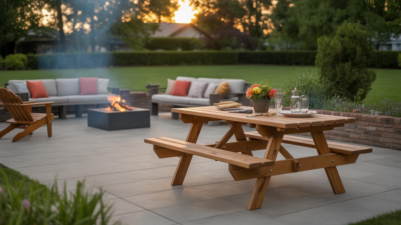
Paths and borders aren’t just practical; they frame your color choices. A dark stone path next to bright yellows pushes those yellows forward, making them feel almost brighter. Edging plants or low hedges gently contain your color groups, defining the shapes and keeping everything from blending into a confusing mess. I’ve tried lining a flower bed with smooth concrete edging before, and it gave the colors a kind of neat, gallery-like focus—like the plants were artwork.
Have you tried stepping back and looking at your garden layout from the street or front door? That fresh view often tells you whether your bold colors are working together or fighting each other. Sometimes a small shift in plant placement or a new border can change everything.
Plants That Provide Bold Colors All Year Round

You want your front garden to catch the eye every season, right? That means choosing plants that don’t just bloom once and disappear. Some plants keep their color through tough seasons, while others shift in interesting ways, giving you variety without losing impact.
Flowering Plants with Bright Colors
Think about flowers that don’t just pop in spring but make a statement over months. For example:
- Rhododendrons bloom in spring with large, bright flowers in pinks, reds, and purples. Their flowers last a while, but the leaves also stay green all year.
- Geraniums surprise you with prolonged bright pinks, reds, or purples right through summer and, if conditions allow, a late burst in fall.
- Marigolds hold their fiery oranges and yellows from late spring to the first frost, demanding little fuss.
Flowers like these add bold splashes, but their color intensity can fade slightly after peak bloom.
Foliage Plants and Evergreens for Color and Texture
Colors don’t just come from flowers—you can’t overlook leaves. Some plants have leaves with rich hues or changes that keep things interesting:
- Heucheras, with their burgundy or lime-green leaves, bring a splash of color even when nothing’s flowering.
- Japanese maples offer deep reds and oranges in fall, and their delicate leaves add texture year-round.
- Boxwoods keep dense green through winter, so you don’t lose structure or color when other plants rest.
- Berberis bushes show off purples and reds in their foliage throughout growing seasons.
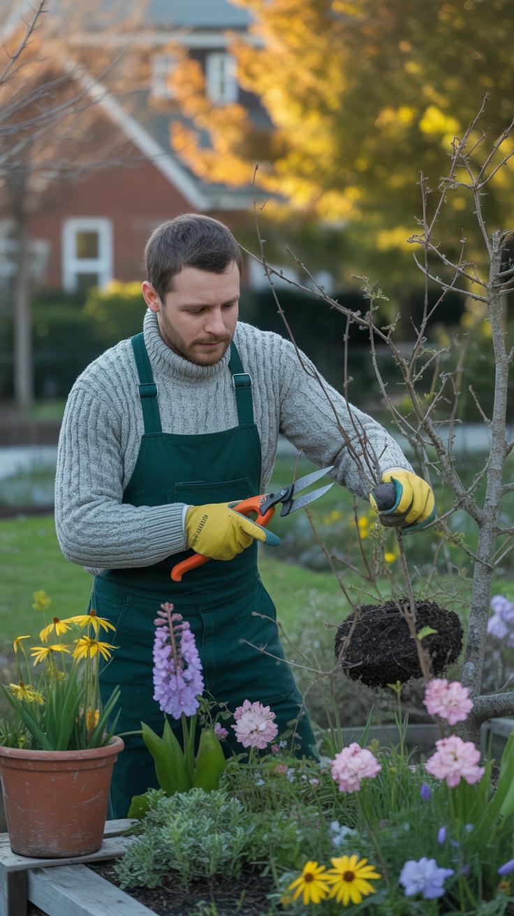
Mixing these with flowering plants creates balance. You have something colorful, even when blooms are sparse. Good care? Just the basics—regular watering, mulching, and occasional trimming for shape should do.
Could you overlook these plants just because they don’t flower? I’d say no. Sometimes, vivid leaves offer a steadiness that flowers can’t match, and that steadiness helps your bold color scheme hold strong year-round.
Combining Contrasting and Matching Colors
When choosing colors for your front garden, the way you combine them can either bring harmony or make a strong statement. It’s about balance, but not always predictability. You might want areas that flow gently into one another or parts that catch the eye immediately.
Using Complementary Colors for Bold Contrast
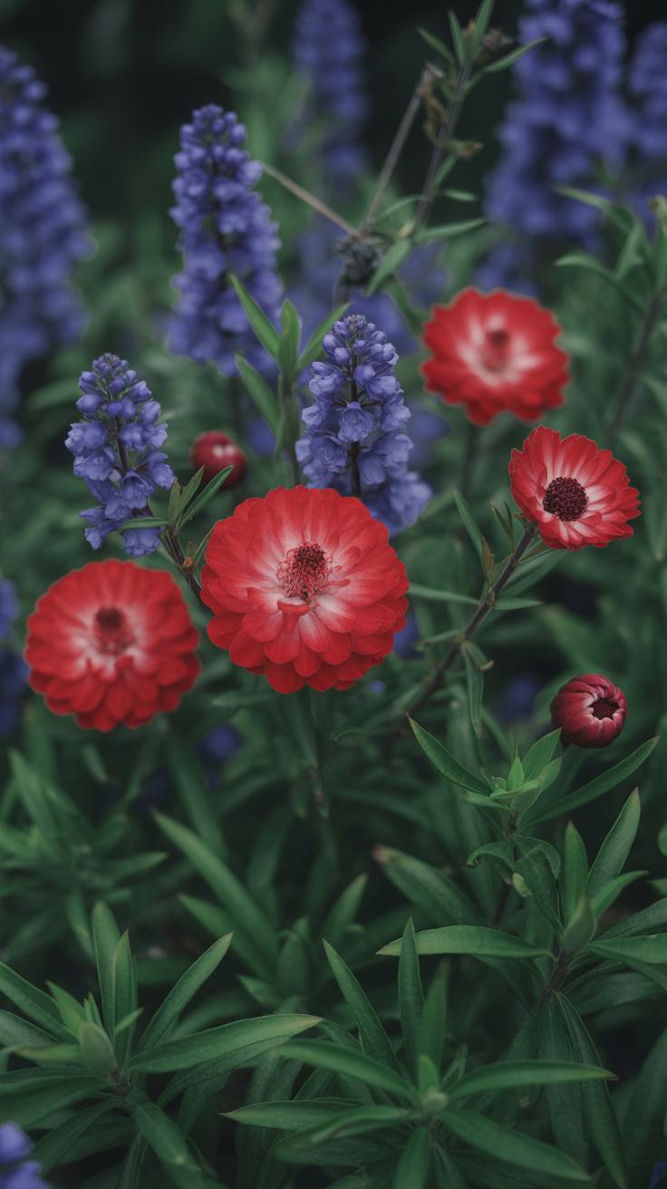
Complementary colors sit opposite each other on the color wheel. Think red and green, blue and orange, or yellow and purple. Placing these colors together in your garden creates an intense contrast that really stands out. For example, planting bright orange marigolds beside deep blue salvia can give your bed a lively, energetic feel.
When applying this idea, keep in mind:
- Use one color more dominantly, while the other supports as a punch of contrast.
- Try pairing flowers with foliage in complementary shades for depth.
- Spotting a burst of a complementary color near your entryway can draw attention without overwhelming.
Still, too much contrast everywhere could feel chaotic—maybe you want boldness in just certain spots.
Creating Smooth Transitions with Analogous Colors
Analogous colors are neighbors on the wheel—like red, red-orange, and orange. These combinations blend softly, helping different garden zones flow together without sharp breaks. You might plant a series of flowers that shift from pink to coral to peach along a path, guiding the eye gently.
A few tips to consider:
- Use at least three hues to keep things interesting without becoming monotonous.
- Mix in varied textures and leaf shapes to prevent colors from blurring into one big patch.
- This approach works well if you want your front garden to feel calm and welcoming, rather than dramatic.
It’s tempting to think analogous schemes are “safe,” but with the right mix, they can still surprise. The choice depends on whether you want your garden to shout or whisper its colors.
Adding Hardscape and Accessories to Support the Color Scheme

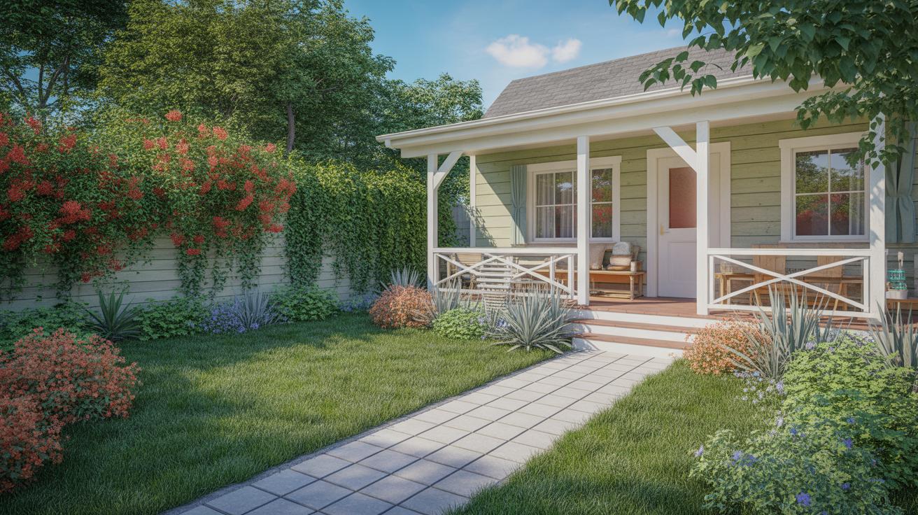
Paths, fences, furniture, and garden ornaments don’t just fill space in your front garden; they act as the stage where your bold colors perform. When you choose a bright red or deep blue planting scheme, think about how a simple gravel path or a dark wooden fence might quietly hold the scene. Sometimes those neutral tones help your colors pop more than another splash of color might.
On the other hand, if you want to push the intensity, furniture or fences in matching or complementary colors can really anchor your scheme. Imagine a bright yellow bench set against purple blooms. It’s striking but can run the risk of feeling overdone if not balanced well. I’ve seen gardens where a bold, painted metal gate repeats the same vibrant teal found in the flower beds, and it makes everything feel intentional, not accidental.
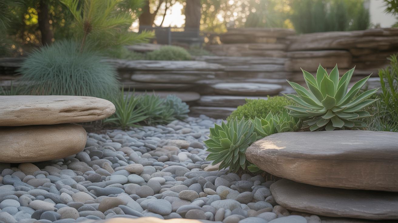
If you’re unsure what to choose, think about the material too. Stone, wood, metal, and concrete each reflect or absorb color differently, which can soften or sharpen the look. Don’t be afraid to mix materials, but keep the overall feeling in mind. A smooth concrete path might contrast nicely with rustic plantings, or a natural wood fence might coexist better with lush greens and hot reds.
Choosing Hardscape Colors That Complement Plantings
Picking colors for paths, fences, or patios means asking yourself: Do I want these elements to blend in or stand out? Neutrals—grays, tans, black, or white—tend to let plants steal the show by providing calm backdrops. They’re like the quiet friends at a party who let everyone else shine. I often recommend starting here if you’re experimenting with bold plants for the first time.
But bold colors for hardscapes can work, too—if done carefully. A deep navy path or vibrant red fence might echo or contrast your plant colors, adding a layer of depth. I once tried a cobalt blue gate against a garden rich with yellow sunflowers, and it created a playful tension I didn’t expect. That said, bold hardscape colors are riskier. They can compete with flowers or feel jarring without enough breathing room.
Using Garden Ornaments to Add Interest and Repeat Colors
Garden art, pots, and lights give you chances to play with your color scheme beyond plants and hardscape. Small touches, like terracotta pots painted bright coral or metal sculptures sprayed in lime green, can draw the eye across the garden and create subtle echoes of your main palette.
Repeating colors through ornaments also helps unify the space. If you pick a couple of accessory colors, use them in multiple places—hanging lanterns, birdbaths, or even colorful stepping stones. The repetition ties scenes together, and it prevents bold colors from feeling scattered or random.
Sometimes it’s fun to contrast ornaments against plantings, too. A shiny silver sculpture near a cluster of hot pink flowers can create interest without overwhelming. Lighting is another powerful tool here—colored bulbs or soft white strings can either highlight colors after sunset or soften their intensity.
Maintaining Colors Through Changing Seasons
Keeping your front garden colorful all year demands a bit of foresight and willingness to experiment. You can’t just plant a bunch of spring bulbs and expect the color to stick around until winter. Instead, think in layers—different plants should take turns stealing the spotlight as seasons shift.
Choosing plants that peak at various times is key. For example, crocuses and daffodils brighten early spring, while summer’s fire can come from dahlias or bright zinnias. Autumn brings asters or chrysanthemums, and for winter? Evergreens with colorful berries, like holly, add interest where most flowers fade.
Try mixing foliage that changes hues over the year. Japanese maples show reds and oranges in fall, while grasses catch frost and add texture. Sometimes, I’ve been surprised how much a well-timed shrub with red stems—like dogwood—can lift a dull winter scene. It’s easy to overlook these subtler color shifts, but they matter. Could your garden work better with a mix that nods to each season’s mood?
Hardscape you’ve added—like paths or fences—can act as neutral backdrops to make seasonal colors pop throughout the year without clashing or looking empty during low bloom periods.
Troubleshooting Common Color Challenges in Front Gardens
Clashing colors in front gardens can sneak up on you, even when you’ve thoughtfully chosen your palette. Sometimes, what seemed like a good idea on paper ends up feeling overwhelming. If red and orange are fighting for attention, or if too many bright hues create visual noise, the space loses its charm. To keep things balanced, try limiting your palette to two or three main colors and use others only as accents. Mixing cool and warm tones carefully can prevent that clash, but it’s easy to overdo.
Fading hues are another issue. Sunlight, rain, and time can drain a plant’s once-bold colors faster than expected. Choosing long-lasting blooms helps, but don’t forget to refresh parts of the garden as needed. Replacing a fading shrub or swapping out seasonal flowers can breathe new life into the design.
And watch out for color overload. Too much going on risks tiring the eye. Sometimes less really is more. Select key spots for your boldest colors and balance them with greenery or muted tones. You might find, as I did, that stepping back regularly and looking at your garden from the street can help you notice when things get too busy.
Keeping front gardens colorful is an ongoing effort. Plants age, weather changes, and tastes shift. Staying flexible and willing to tweak your choices over time will keep your garden feeling fresh—without becoming chaotic or boring.
Conclusions
Using bold color schemes in your front garden is a great way to create visual interest and add personality to your outdoor space. Choose colors that match your home’s style and climate. Mix and match plants, flowers, and hardscape elements to bring the colors to life.
Remember, your front garden sets the tone for the whole home. With some planning and creativity, you can design a space that welcomes visitors and feels like your own special place. Start small, try different color combinations, and keep your garden lively year-round.